.

summertime and the livin's easy...

whether you’re listening to Ella Fitzgerald or Sublime, while lazing in the hammock, with a cool glass of lemonade (or sauvignon blanc ;), welcome to summer!!

a few weeks ago, i had the honor of being on a speaker’s panel at america's mart talking about outdoor design! the editor of atlanta magazine HOME asked me to participate, based on the fact that i was also designing one of the outdoor spaces in this year’s modern style showhouse and she thought it would be a good fit. my initial response was “of course, absolutely, i’d love to!!”, but then i thought, wait, you don’t design outdoor spaces, what do you know??!! but then i poured a tall glass of sb, turned up the itunes, and thought, no, you do have this, this is dream land! designing for outdoor spaces is perfect!! i’m going for style, comfort, patina, and truly being one with the elements. sure there are sooooo many more products that are weather resistant, but part of the reality of using things outside (especially in atlanta where it rains more than maybe anywhere in the usa in the summer…) is that things will either completely fall apart or they will develop a beautiful patina and that’s part of the design!

for outdoor spaces, i want everything. i want fire, water, twinkly lights, easy access to bug spray, preferably a cabana boy to fetch me my cocktail… ok, i’m stretching the fantasy now, but essentially, I want livin’ easy. it shouldn’t feel overworked or desperate. it’s weathered, it’s comfortable, it’s a wonder of nature amidst man-made products. maybe it’s a confluence of styles that come together because your spouse decided to invite half the neighborhood over for a bbq and drinks at the last moment and you’re throwing together make-shift seating arrangements?

when i look at the pics i’ve saved for this blog, essentially everything i love for outdoor designs, i’m quite shocked i haven’t already moved to the mediterranean. my last full house project included the covered patio and i definitely wanted it to have a mediterranean feel. the picture below was part of the marketing for the talk at america’s mart :)

Blog-summer.jpg

on to some prime examples of the essentials of outdoor design as i see it…


Blog-water.jpg

first things first, water is a must!!! if i happened to have a quarry in my backyard, you best believe i’d convert it to a swimming hole straight away!

Blog-dining.jpg

after you’re done swimming or otherwise exerting all your energy not to drown, you need a tranquil setting to rehydrate and fuel yourself!! outdoor dining spaces have sooooo many options!! but must include: incredible foliage, whimsy, fabulously individual chairs, and a natural sophistication.

Blog-fire.jpg

fire is good! how wonderful are the memories that consist of making s’mores over an open flame??!! that is truly the stuff childhood is made of! so, although my dream backyard is far more haughty than the ymca camp i attended, perhaps my offspring will still look back on their experience with a slightly more humble eye, and reflect, but at least we used the fair trade chocolate that was on sale.

Blog-seating.jpg

so once the s’mores are perfected and ready to be consumed, you need a place to lounge. creating a destination is key to the experience. this is one place i love to see more interesting and original designs! especially if you’re only buying 2 or 3 pieces. go for it!! splurge a little if you’re getting something that is unique (and comfortable and not going to melt the second it gets wet…)


Blog-small-spaces.jpg

some of you may be throwing poison darts at me because you’re in a condo, apartment, or an otherwise small space that doesn’t have a quarry as it’s backyard… but guess what?? you too can have gorgeousness for the summer!! i have always said the best thing about smaller spaces is it gives you the ability to splurge a bit more, because you’re buying less stuff!! in smaller spaces, it’s all about texture, texture, texture! buy the best you can afford because you’re using it everyday and you will appreciate it and it will last!!

easy is enjoying what you have, it actually lasting (or not and you don’t care), and friends and family wanting to come back for more!

me and my back yard, we got this relationship…

beijos,

beth

it's a blitz...

is it a football blitz (tis the season, you know)??? it is meatloaf’s ballroom blitz??? an eastern european cheese-filled pancake??? (actually that’s a blintz…)

no. it’s a media blitz for beth kooby design!!! no tackling, awkward dance moves, or blood sugar checks required!

the past month or so has been incredibly ah-mazing in terms of media coverage for me and i am so grateful and overjoyed!! we’ll work backwards. most recently, styleblueprint.com published an article featuring my wonderful marietta house project. field editor/writer, lisa mowry, did such a nice job of highlighting the best photos of the project mixed with my journey from healthcare to full-time interior designer.

here’s the link to the digital article: https://styleblueprint.com/atlanta/everyday/a-warm-and-soothing-home-with-bright-design-details/

Beth.Kooby.1101.Burnt.Hickory_5-1200w.jpg

earlier this year, i was honored to be a part of atlanta’s first ever modern showhouse, sponsored by atlanta magazine home and a part of the modern atlanta design festival. the fall issue of the magazine features the showhouse and all the spaces, including the master suite i designed!!

blog-home.jpg

if you know me, you know i am obsessed with tile! like, i could live in a tile store!! along with the showhouse spread what’s even more awesome is that i was interviewed and featured in the same issue gushing about my favorite places in atlanta to shop for the perfect tile!!


blog-home-tile.jpg

in case you want to go all digital, atlanta magazine home’s online version is here: https://www.atlantamagazine.com/homeandgarden/where-to-buy-chic-tile-in-atlanta-according-to-designer-beth-kooby/

a big thanks to another local magazine, atlanta home improvement, for including me in their cohort of professionals with something relevant to say about renovation!!

here’s the link to the digital version, highlighting my 2 cents on smart decisions in bathroom renovation: https://issuu.com/atlantahomeimprovement/docs/my-home-improvement-1118-1218/60

on a side note, instagram is pretty amazing, if you didn’t already know. any likes, follows, shares, whatever, only serves to help me in the one-up-manship with my middle-schoolers and the social media popularity contest. so i need you people!! please follow me or at least comment (positively :) on any post where i or my designs are mentioned :) my kids need to understand i dominate that world, they don’t need to waste their time stressing about their numbers… they need to simply be good people.

special thanks to circa lighting and kitchens post daily for sharing some of my stuff :)

as a good polish girl, i love a tasty blintz, but as an interior designer, honored by the attention and recognition, i’m running with the blitz!!!

beijos,

beth

wow, what a year...

a year ago today, 10.10.17, i not only closed on the house we’ve been renovating for the past year, but i also got engaged to the wonderful man i now call my husband!! the engagement part was a complete surprise, even though we felt strongly enough about each other that we were buying a home together! we got engaged around 9 in the morning and the rest of the year has been an utter whirlwind!! it’s pretty much been a sprint from one major event to another!

there’s also been a lot of travel! as you know, my dad died last november, the day after my daughter’s birthday (still thanking god he somehow, perhaps subconsciously/intentionally, willed that to be), so that took us to charlotte for the funeral, back to atlanta so i could install my client’s house, up to madison, wisconsin, then baraboo, for the burial, then to chicago for the post funeral party, cause that’s what good catholics do ;)…

devil’s lake in baraboo, wi; where i grew up going with my grandparents, and where my dad grew up going with them, too, and close to where he is buried

devil’s lake in baraboo, wi; where i grew up going with my grandparents, and where my dad grew up going with them, too, and close to where he is buried

it was then on to charleston, sc for new years, orlando, fl for kbis (kitchen and bath industry show), charlottesville, va, back to charlotte, the beach for 4th of july, kohler, wi, finally our delayed honeymoon to nyc, madrid, and portugal, finishing up with a family weekend in maryland!! talk about frequent flyer miles!!

and that was just the travel!! other huge events included prepping and selling mr wonderful’s rental property, me participating in atlanta’s first ever modern showhouse (which opened the week before our wedding :), our wedding in our backyard, signing the lease on an office space at adac, my son’s bar mitzvah, and all the while trying to complete the massive renovation of our house!!

it has indeed been a crazy, nutso year of mostly fantastic opportunities and exhilarating times. it is truly amazing how life goes. sometimes very methodical and planned. sometimes as a huge surprise! one of the things i feel i haven’t done so well this past year is to really cherish all these moments and experiences. it really has felt like a sprint from one major event to the next! i tried so hard to really savor our time on our honeymoon and to slow down and soak it all in. i do feel we did a pretty good job of that, but damn if we didn’t get home and hit the ground running, back to the crazy!! i am blessed i have a man who can suffer through the chaos and also sit with me on the porch with a glass of wine and watch the nighttime bugs dance around the streetlight, reminding me to slow down.

thankfully, i also have pictures, since my advancing age is not being kind to my memory… so, here’s a little highlight reel of the past year :)

blog-kbis.jpg


kbis is an international kitchen and bath show with all the latest and greatest products! so many awesome things to see and people to meet! there were many highlights, but i really enjoyed the color! from the faucets to the custom art overlay on a super bad-ass fridge!!

the most memorable highlight though, was getting to take my picture with the crew from this old house, one of my dad’s favorite shows :)

blog-kbis-TOH.jpg

lots of press for the showhouse, which was amazing!!! such an honor to be with some very exceptional and talented designers for this!!


blog-home-spring.jpg
blog-HOME-fall.jpg

the fall issue was extra special because it also included a spread with me dishing on my favorite places in atlanta to shop for tile. y’all know (especially if you follow me on instagram) that i sold my soul to tile a loooong time ago!!! i love it so!

blog-wedding.jpg

prepping for our wedding in our backyard was no small feat. the look on my face after we exchanged vows was sheer admiration for this man who means so much to me and my kids and also just happened to completely transform the backyard (before and after pics, of the same area, above)!!

blog-beach.jpg

the beach is my happy place and it got even happier this year as we got to spend the week with my husband’s family!! there was fishing, corn hole tourneys, pool swimming, kite flying, body surfing, intense puzzle solving, pool shooting, and good eating. it was everything i ever wanted a family beach trip to be!!

blog-BM.jpg

next up, my son’s bar mitzvah!!! he has practiced his torah portion for about 10 months, volunteered with the atlanta food bank, and written a beautiful d’var torah (a teaching on his torah portion). he. did. amazing. i could not be more proud of him. it was a long, painful lead up, with lots of complaining and procrastination (this was not unexpected, but torturous none the less), but wow, did he knock it out of the park!!! he plays soccer and is a big fan of atlanta united, so our theme for his party was “dylan united”!! the top picture is of his friends watching the video montage of his life. it was really such a fun night of music, bowling, and love!!

blog-kohler.jpg

i had the honor of being invited to kohler, wisconsin for “the kohler experience”! i’m a huge kohler fan and use their products whenever possible! after the trip, i found myself doing shots of their cool-aid and want to have another child just so i can name it “kohler”. that’d be cool, right??!! anyway, it was a great trip, very educational, inspirational, and i met some super awesome design ladies!!! making new friends in one’s adult years can be hard, so when you get the chance, grab it and hang on tight!

if you follow me on instagram, you’ve probably already seen the posts from our honeymoon, so i won’t repeat them here. they really need to be a separate post… so many wonderful sights and tastes!!! we are definitely going back to lisbon in the future!

we went up to maryland the weekend after we returned from our honeymoon for a family weekend at mr wonderful’s oldest brother’s farm. talk about a fantastic time!! for us, for the kids, for bonding, for laughing, for fishing, for playing volleyball in the mud, for making s’mores over the bonfire, for not severely injuring ourselves climbing the ladder in the barn…

wow. i am immensely grateful for the past year. i knew i was a lucky girl when he proposed to me, but i never could have imagined just how lucky! what a year…

beijos,

beth

happy father's day...

this year, father's day is the epitome of bittersweet.  as you may recall, my dad died last november.  a month before, my man had asked my dad for my hand in marriage.  the end of my last conversation with my dad before he died was him asking if my fiancé was "handy".  at the time, i sorta crossed my fingers and said , "of course!"...

so let's take it back...

Beth-and-dad.jpg

back in 1997, i had moved to hoboken, nj.  the next year i bought my first home.  it was an apartment in a brownstone.  it was a total mess and i was so excited to be able to make it my own.  my dad came up to help me start the demo and the first words out of his mouth were "what the hell have you done??"  slightly confused, i said "i bought a dump and it's perfect!!!"  i expected my dad to see the potential and believe that i would make it fabulous.  i actually did and it started me down the road of serial renovator.  my apartment was on the third floor and i have the fondest memories of my dad and i chucking debris out the back window into the backyard of the building, then going downstairs and throwing the debris over the fence into the construction dumpsters on the property behind mine ;)  he taught me i could do anything and for that i am forever grateful.  

2 weeks ago, the modern style showhouse opened and i am incredibly honored to be one of the designers participating.  3 years ago, i participated in the aso designer showhouse and my dad was able to attend the opening night celebration.  it meant the world to me to be able to show him, hey look, whether it's a dump or a highfaluting mansion, i have a vision and can do it.  

my space in the modern showhouse is one of the owner's suites (bedroom, bathroom, and closet).  my initial scheme was black and white, so i thought, why not honor both my parents, both of whom have been tremendous influences on my life and careers (i've had multiple ;). 

MSH-phots.jpg

that's my mom on the right (duh) and my dad on the left.  my mom actually took the photo of my dad in the 70's and it's so rolling stone magazine i can't stand it!!!  i am so blessed to appreciate both my parent's influences and know they must be smiling down on me!!

but back to being handy and the question of whether my fiancé is or not...  i was married to this man last weekend and in the month and a half prior, he nearly-single handedly turned our backyard from over-grown ivy jungle to romantic, civilized gorgeousness!! so, yes, dad, he's handy and then some!  he is my partner in renovation, in life, and now in parenting.  he too, deserves a happy step father's day shout out.  on this bittersweet day, i'm leaning more sweet :)  as much as my kids are sad to have lost their grampa, they are also thrilled to have gained a step dad.  one who's ready to demo, dream, construct, and garden through life!

Beth and Dan backyard.JPG

so happy father's day to all the men who have an impact on some child's life.  you are influential, you are needed, you are remembered and celebrated, and you are appreciated.

beijos,

beth

happy new year...

happy 2018!!!  2017 was quite the roller coaster for me personally.  from getting engaged and buying a house that needs a total gut job to my dad dying.  it has definitely been a year of highs and lows!  what has been consistent is continuing to build my business and having the pleasure of working with such fun and daring clients!  i am truly grateful for the creative freedom given to me and to getting to know some very wonderful people :)

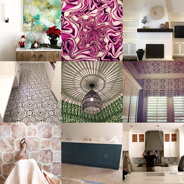
instagram is a great historian.  below is my best of 9 instagram posts for 2017 (the ones liked the most by followers and random people).  in review, i see a year of color and pattern and happy and fun and fresh!!  exactly how i want my designs to be.

7 of the 9 photos are from my project in marietta.  it has been a project full of color and fun, like wallpaper on the laundry room ceiling!!  the cabbage picture is from an evening of cooking a new recipe with my daughter.  i am over the moon she wants to cook with me!  the black and white floor tile is in a former client's new home (it was a year of ups and downs for her, too!) and I'm so glad i was able to help make her new space be better suited to her style!

while instagram followers have their favorites, i have my own... and here they are:

blog-instagram-2017-people.jpg

i don't usually take pictures of people.  i don't think i'm a very good portrait photographer.  i like the weird, artsy shots.  but these i like a lot!!  the first is a selfie while watching the solar eclipse.  that was a far cooler experience than i thought it would be!! and the black circles rounding my head just cracked me up ;)  cause, you know, i'm the sun ;) !!  the middle picture is simply perfection in timing (if i do say so myself).  a nun in bogota, colombia, looking up at the phenomenal light in the sky (one of my memories of that trip in june was the stunning light from above).  i still wonder what was on her mind. the third shot is of my daughter on a carousel across the street from the eiffel tower!  i took her to paris for spring break and neither of us will forget that trip!!  to me, the shot is a perfect juxtaposition of childhood fun and historical beauty!!

the upper left shot is from a trip to hilton head with my kids, a place we go every year. even when it's overcast, the beach is my happy place!  upper right is a "through the bramble" shot of the beach at tayrona national state park in colombia.  i have a thing for silhouettes and this one is extra special, since i survived the caimans and alien centipedes to share the photos ;)  the bottom left is one of the many gorgeous, colorful doors in cartagena, colombia!  the color combo shows up later in my marietta project master bathroom!!  the yellow umbrellas in the bottom right are from ladybird cafe on the belt line in atlanta.  this particular night, my love and i were enjoying the perfect weather and just being with each other!  and i love the contrast of the yellow and black!

i am so grateful for all the experiences of 2017, the beautiful and the sad.  it's what makes life meaningful and interesting.  i wish you all beautiful memories and sincere moments, whether you find them in your home, on another continent, or just hanging out!

beijos,

beth
honey, can you take the trash out...

my intentions were pure.  to blog once a week about the renovation of my new house to be.  and then bad shit happens.  like, your dad dies.  yep.  that happened 4 days after my last post.  i was really hoping he'd be able to follow along on the renovation documentation, but i guess it just won't be via blog subscription now.  words will come regarding his life and death, but i really can't find any for right now, so i'm just going to stick to talking about the house, for the moment. 

if ever there was a time to want to smash some walls, saw something down, or simply go ballistic on some caddywumpus architecture, now would be the time :)

i even got my daughter involved!  never too early to addict my children to renovation ;)

NRS-sienna-demo.jpg

bear with me as i post the demo in progress shots.  as you can imagine, since i'm behind in posting, there's a bit of a time lapse!  this is not hgtv, it really didn't all happen in just one episode ;)

let's start with the trash and work our way back a bit!  throughout the few weeks of demo, there have been such volumes of trash, i thought we might actually be buying the dump, after all the fees we've paid!?

NRS-demo-trash.jpg

we recreated this scene about 5 more times!!!  because of the way our driveway dives down into the backyard and that the house is on a busy 2 lane street, there was no place for a dumpster, so the construction crew has been hauling everything away on a trailer and in pickup trucks!  I know the neighbors have been thrilled with the trash mounds! we're hoping to win them back with equal amounts of alcohol in the near future ;)

NRS-apt-demo.jpg

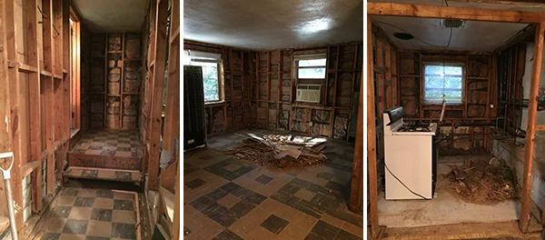
down in the apartment we started with the removal of the nasty-ass carpet (in a basement people!!!) only to discover what appeared to be asbestos tile!  yay.  how do i know this you ask??  because i've dealt with asbestos tile before and this looks just like it :(  i called in the remediation team for an assessment and quote on removal.  they were wonderful and speedy and know how to read...

NRS-asbestos-sticker.jpg

we were going through the lower level so they could take samples of what was suspected to be asbestos, when we came across this sticker on the coverings around the water pipes in the basement.  duh.  we got a good laugh.  no need for fancy sampling, the sticker says it all!!

$6500 later, all the asbestos has been removed and properly discarded.  apparently, i will receive a letter from the epa in several weeks stating i have properly removed the asbestos.  not sure there's anyone left in the epa to actually sign a letter, but i'm hoping so!

NRS-kitchen-dr-demo.jpg

back upstairs, the plaster walls are coming down!  This shot is from the dining room looking into the kitchen.  most of the walls and ceilings are cracked and since plaster is such a pain to deal with, we're taking it all down.  definitely not the most earth-friendly way to renovate, but it really is just a necessary evil...

NRS-kitchen-demo.jpg

above is the kitchen demo!  this was one of the only spaces in the house that had been updated and while i still feel a bit guilty about taking out all those perfectly fine cabinets, i'm gonna feel a whole lot better when my gorgeous new kitchen is in place and we're all hanging out, cooking together, laughing, enjoying the best food ever made!!  ahhhh :)

i recently was at the house for a site visit and a unknown woman was walking around inside with one of the carpenters.  i immediately thought i was in trouble for something (yes, personal issue, calling therapist now...)!!  turns out she's from a wonderful volunteer organization, more for atlanta!  they are a non-profit charity that helps low income families and the homeless in the metro atlanta area with food, clothing, and shelter.  and they take donations of things like cabinets!!!  they even hauled them away for us!  i am truly so glad the cabinets will be put to good use!!  please go to their website to see if you might be able to help!

NRS-back-door-demo.jpg

thanks to my construction guys, they were able to busta move on the rear security door, since i never could find the key for it!  they also busted up the floor that was about 4" off level!  again, for some reason, like with the oversized freezer in the basement, i was looking for dead bodies under the floor boards... there were none, btw.

NRS-demo-baths.jpg

on the left is the hall bath (the one that had the misaligned black dots on the floor).  of course, those tiles turned out to be sitting on another layer of tiles over a thick bed of concrete!!  you'll see pictures in another post of the sagging beams underneath the floor!

on the right is the kids bath and what will be our laundry closet.  sooooo looking forward to the kids doing their own laundry :)

NRS-demo-ceiling.jpg

at this point, things are starting to get full on cray-cray.  all the ceilings, except the kitchen, were plaster and cracked, so we knew they had to go, but it was pretty amazing to see everything so open!  mr wonderful starting pressing to just make the entire main floor one continuous room.  i hated to shoot him down, but no, that's not happening. some houses are better with separate rooms and this house is one of them.  since the tv will be in the front living room and the kids bedrooms are in the back of the house (which isn't very far away), i'll be replacing the door to the main hallway to hopefully dampen the sounds of late night cheering come football and basketball season ;)  i am replicating the tudor arch between the living room and dining room between the dining room and kitchen and the kitchen and main hall, so the flow, in general, will feel more open.

NRS-guest-demo.jpg

you can see more of a progression in the above pics.  that's the guest bedroom/office on top, before the ceilings came down.  and below is all the bracing we had to do to keep the roof from caving in.  literally!!  you can also see the start of the floor framing for the lovenest upstairs :)

NRS-master-demo.jpg

the grand finale!!  the upstairs will go from storage attic to master lovenest!!  yay us! framing of the new floor joists has already begun and i can't wait to show you all the progress that has happened since i took these pictures!!  stick around for more renovation fun!  i think my dad would be proud so far :)

beijos,

beth


commit me...

does anyone even remember me??  probably not, as even i had to look up my password to log in to create this blog post!!  it is truly crazy how time flies and this year seems to have flown faster than ever!  perhaps because it's been a good year?  a year with super fab projects wrapping up and a lot of work spent on one big one!  i also started dating a wonderful man and you know what they say, "time flies when you're having fun!!".  well that and to actually have a social life again means there's not much time left for important things, like blogging ;)

anyway... a little over a month ago this wonderful man proposed to me (and i said yes!!!!) and we bought a house!!!  the man has some well-earned patina and i am whole-heartedly committed to him.  the house needs a little work!  and when i say a little, i am grossly understating it ;)  think, no central air, radiator heat, all plaster walls (with cracks for extra character), floors so out of whack no drinking is necessary to embarrass yourself at a dinner party, electrical wiring that could start the next burning of the south...for this, you may need to commit me :)  fortunately, i like a good deal and i will never back down from a worthy challenge!!  i also decided now, more than ever, was a perfect time to make a recommitment to my blog and bringing you all along for the ride of my personal renovation of this hot mess to be love nest of a project!  take a gander at the before pics and please check back (the goal is a once a week update on the house) for more fun in renovation and a potential fashion show featuring this season's straight jackets!

NRS-front.jpg

quaint, traditional tudor built in 1938 with pretty good curb appeal...will probably paint the brick (cause i'm not a fan of the multi-colored brick), remove shutters that don't actually fit the windows, swap the colonial windows for diamond grills, and coax a lovely vine up and over the 2 left windows.  

NRS-LR-+-pre.jpg

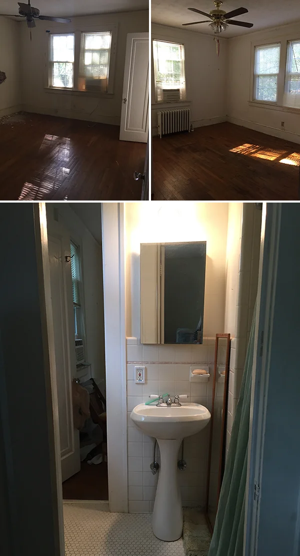
top left is the view from the living room into the dining room.  the wallpaper is actually kind of sweet and i'm gaga over that arch!!!  the paper is going (cause the walls and ceiling need to be redone!), but the arch will just get pushed up, since it's a little low right now.  i'm also going to have the same arch on both the walls leading into the kitchen. upper right is the living room with confused fireplace, that also seems to really want to be in the basement below, as it's angling for it!  the screened in porch, where not a damn thing is plumb.  not floor, not screen framing, not ceiling.  the last pic is the extraordinarily deep linen closet and the telephone shelf!  which i debated for about a second and a half to keep, then decided our washer and dryer would be much more satisfying in this space, so that was that!  buh-buh nostalgia, hello washer and dryer between kids rooms which means kids can now do their own laundry!!  score!!!

NRS-kitchen-pre.jpg

above we have the kitchen, which must have been renovated sometime in the past 20 years, i'd imagine.  really not in bad shape, but there's some kind of dead animal smell and i live to design kitchens, so this is going.  debating on keeping the original hutch.  i see the left door was open at first, but now i cannot get it open to save my life!

NRS-kids-space-pre.jpg

in the back of the house are 2 bedrooms with the smallest jack and jill bath ever!  while the tile in the entire house has really held up nicely and it doesn't look that bad, it's got to go, to make way for a slightly bigger bath and much cooler tile.  i'm hoping awesome surroundings will distract and prevent the heathens from injuring each other too much in the battle for the mirror in the coming teenage years...

NRS-hall-bath-pre.jpg

what will be the guest bath was the master bath.  again, the tile work has held up, but the black dots on the floor are not properly aligned and it's slowly killing me...  yet another check mark on the "do we commit her" questionnaire :)

NRS-upstairs-pre.jpg

come on upstairs to the attic!  usually, i'm pretty creeped out with attics and basements, and this house was no different, but i'm committed to making this the best love nest ever, so i sucked it up and ventured upstairs!!  on the left will be our master bathroom and on the right will be the bedroom.  this space is probably the most work that needs to be done, but the roof pitch is so high that we don't need to do anything to the roof, just insulate and put up some walls!!  gonna be an oasis!!

NRS-basement-pre.jpg

what may turn out to be one of the best attributes of this house is that it's already zoned as a duplex!  the lower level contains a basement for the main house and an apartment!  mr. wonderful jokes that there may be a clown colony living down there and he may have been right at one time, but not now!!!  i had to hire a junk removal company to clear out all the stuff that had consumed the basement!!  i took it upon myself to face my own fears and (slowly) open the extra large deep freezer (seen in the lower left pic) to check for dead bodies...  i honestly thought i might find one!!  the dark, creepy room entrance on the lower right is actually the coal room, where the coal for the fireplace was delivered! back in the day!  the other pics are of the apartment in all it's pine wall paneled splendor and minty fresh bathroom tile!!  ahhh....  yep, that's going!

so there's a little overview of the house i have committed to making a home for my groom-to-be and my kids.  i've also committed myself to getting back at this blog thing and honestly, there's not a more perfect subject matter than one's own home to blog about, so let's do this!!

i'm committed...

beijos,

beth


kiss me i'm o'strowski...

happy st. patrick's day!!  believe it or not, several times in my life i've had people ask me if i'm irish.  really??  wrong "ish" people!  my maiden name is ostrowski and it's polish, not irish!  but, growing up in the south, i'm accustomed to people having no idea what to make of my last name, so i just roll with it :)  i do love green, though.  it's my favorite color!  so today, you can kiss me if you're feeling amorous, or if you love green, or just because!!

here's a little hit of green for this festive friday!!

top left art by ruud van embel (amazing!!), bottom right by dale chihuly (totally different medium, equally amazing!!)

top left art by ruud van embel (amazing!!), bottom right by dale chihuly (totally different medium, equally amazing!!)

beijos, 

beth

tell me about it, stud...

my favorite movie is "grease".  no judgement!  one of my favorite moments in the movie is when sandy gets all dolled up in black leather a la "greasers" style and shocks the hell out of danny.  while he's standing there, jaw on carnival floor, pink ladies in the background egging her on, she drops her cigarette on the ground, stamps it out with her high heeled shoe, and says "tell me about it, stud".  cue the visual...

there's a lot of bravado in design.  and there's a lot of "i'll be whatever you want just to get the job".  i'd like to think people hire me because i'm true to myself, without a lot of hype or divaness (i made that word up, but i like it;).  in the movie, sandy attempts to transform herself into what she thinks danny is looking for, a feminine version of his blue-collar, rough and tumble, greaser self.  the similarity here is that, every time i tour a new client's project and it's just at the stud phase, i cannot stop my inner voice from screaming "tell me about it, stud"  (get it??  studs.  tell me about it, stud!)  wanting to be what they want me to be, only to realize they hired me to be me, cause they like me and they like my style, just as it is.  but it's still fun to roll out, in my mock sexy voice, "tell me about it, stud"!

all of that, just to introduce a new project i've been working on and am over the moon excited about!!!!!  super cool couple, with 2 kids, plans for at least one more, in marietta, building their dream home!

progress has been made since i've started working with them, so some of the pictures have updated shots!

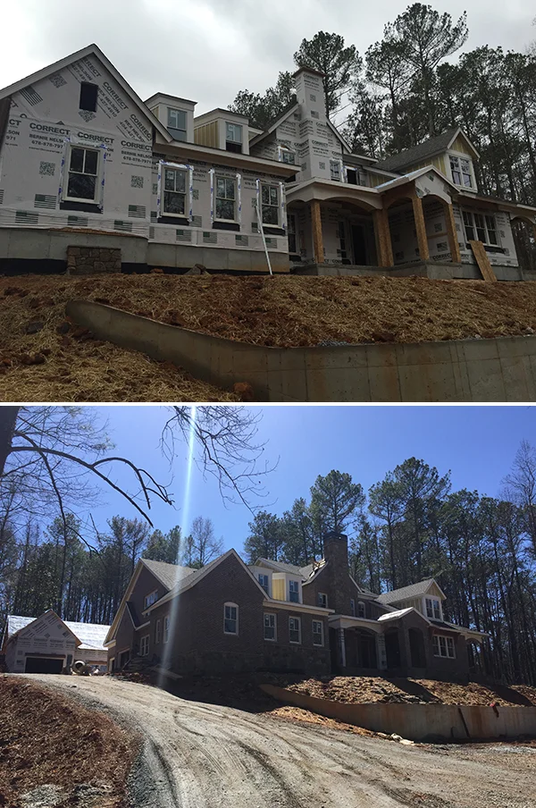
here's the outside.  oh yeah, it's a bigun!!!  did i mention how supremely cool they are?? that's really the best part :)

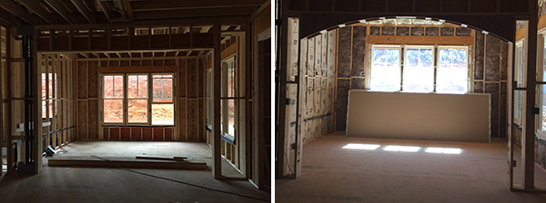
this is the kitchen with the garage on the other side of the studs.  the lady of the house has requested that when people experience the kitchen, they exclaim "this is the tits!!".  i have never heard that phrase, but ok, i'm on it!!!  let's make it happen!  custom cabinetry, gorgeous island, francois and co metal hood, high-end appliances, 10-foot ceilings, hand-painted portuguese tile on the backsplash...

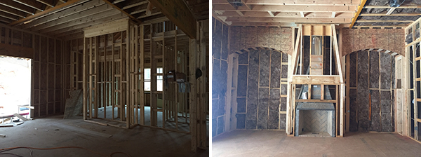
just off the kitchen is the dining room.  the original plans had a squared off wall divider, but after some thought (and my love of consistency), we decided to stick with the arch theme we have elsewhere in the house!!

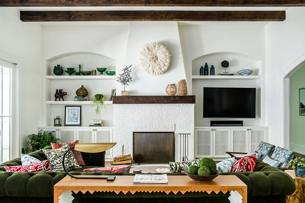
also off the kitchen is the living room.  when we first met, there was just going to be a fireplace wall, maybe with some bookshelves.  oh no.  let's do this!!  we're going brick fireplace surround, plaster tapered flue surround, oversized open shelving, and custom base cabinetry with a slight moroccan thang going on...

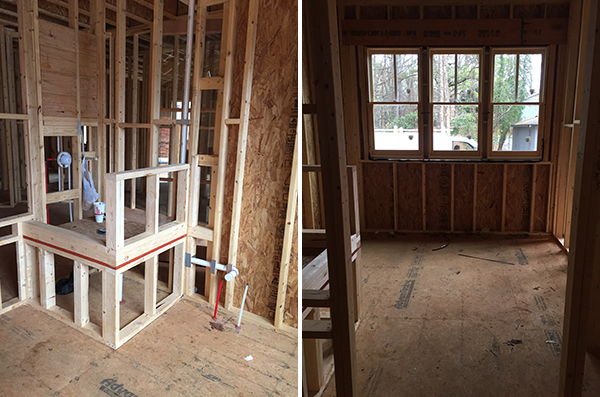
the master bath suite will have a free standing tub (hopefully my favorite interpretation from waterworks!!!), custom double vanity, beautiful shower, and extra style in the over-sized walk-in closet!!

the stairwell will hopefully be more than just an exercise in going up stairs.  i have millwork fantasies here...it just has to fit in the budget!  on the upper level, we have the perfect wall for large scale art and an uber-feminine window seat/i have all the time in the world to lounge kinda space :)

also upstairs is the main tv room and the kid-only accessible play room (complete with stars on the ceiling lighting!!!)

back downstairs we have the laundry room, complete with a dog wash station!  they don't have a dog at the present, but that doesn't mean we can't plan for future spot's spa-like bathing area!!  this will be a fun and colorful room for task-driven activities. reminder: my motto is: design should be fun, so let's do it!

there's a kick-ass back porch, complete with dining area and relaxing by the fireplace area!!  here are some progression pics :)

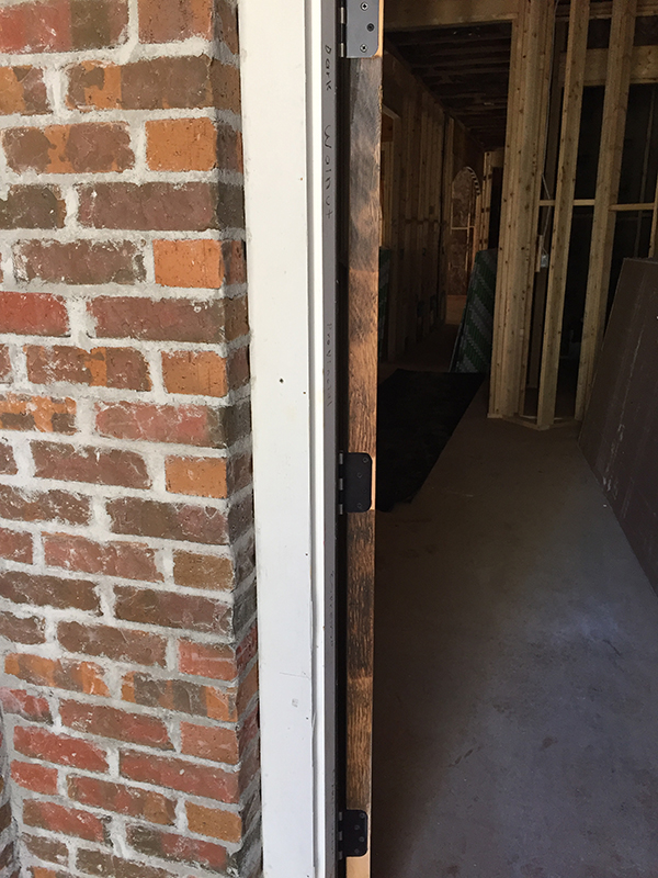
this shot is a reminder that no matter how on top of everything your designer is, sometimes you just need to play with stuff in real time.  like staining the edge of the door with the options.  provincial it is!!!

i am so excited about this project and about these clients.  they really are super cool and i am honored that they are entrusting me with their dream house.  one of the most exciting things is we're going to store everything (we have to furnish the entire house as well :) until they are ready to move in, so my goal is to do the big, fun, fancy reveal in the end. not just to you, but to them!!!  fingers crossed this really happens!!!  and of course, to blog about the entire process!  tell me about it, stud ;)

beijos,

beth


happy valentine's day...

to all you lovers and those hoping for love!!  love can sneak up on you when you are just not looking for it.  when you'd given up, perhaps, or when you think you just don't have the capacity.  it can come from out of the blue or it can be right under your nose for years...  

i am a hopeless romantic, so even when single, i still think celebrating love is a good and necessary thing, not just today, but everyday!  love to me is playful, honest, a little bit gritty, adventurous, and makes you feel all sparkly inside!!

i was so excited to learn that clients of mine recently got engaged, after 6 or so years together, building a home together, and traveling the world together!!  they will be married in an intimate ceremony in their home and have a blow out party with their friends in another country (belize to be exact!!), because, why the hell not?!  

even if you're not getting engaged today, happy day of love, wherever you find it and wherever it takes you!!

beijos,

beth

best of instagram 2016...

2016 has been a wonderful year (despite all the deaths and you know, politics...)!!  it's also been an incredibly busy year and I have been truly blessed with some fantastic clients and projects!  you'll have to just believe me on that, since I've blogged about next to nothing this year!  but i promise, it's a new year, and there are quite a few final photos to be taken and quite a few more new projects gettin' going!!!!  yay!!!

anyway, back to instagram!  i've never really used it to promote my business.  it's always been more of a "here's where my artsy, weird, eye goes and the things i find visually interesting".  as i round up the top ten instagram shots, it would seem the people who connect with my account prefer shots of things i've actually designed!  i'm cool with that, but i'm still gonna take pics of moss, and shadows, and leaves, and broken eggs...

let's get to it!  there were a few ties, so please don't think i drank my math skills away last night.  i'm aware there are more than 10 pics in my top 10 :)

#10

these happen to be two of my favorite spaces!!  on the left is the finally finished modern house (stay tuned for some hopefully reeeeeaaaaallllly exciting news about this project!!!!!  i am bananas over that floor!  on the right, is the master bedroom of a client i've been working with for most of the year renovating the entire condo and now we're onto furnishings and decor!!  the whole combo is divine and we don't even have the mattress or bed linens, yet!!

#9

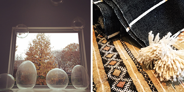
if you follow me on instagram, you probably know i'm crazy over these glass bubbles i had custom blown for my uber cool clients.  i have to take a pic everytime i'm over there, i love them so!  this shot is in the fall and the coloring of the trees is perfection!  on the right are two of the rugs i brought back from morocco that i used in my office refresh. apparently, lots of other people like rug closeups, too :)

#8

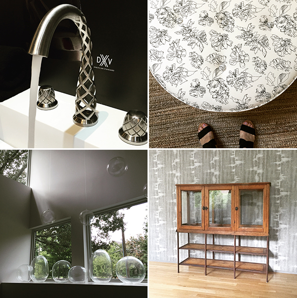
as you can see, 4 pics scored the #8 slot!  funny to me that they all seem to go with each other quite nicely!  the top left is a crazy, funky, new faucet from dxv (the water comes up through the pattern, people!!!).  i took that on my trip to nyc, courtesy of ferguson's first look program!  honored to have been a part of that!  top right is a custom ottoman for a fun redecorating project i did in the spring!  (feel free to take a gander at the post about it here).  bottom left are those fabulous bubbles again, but from springtime!!  in the lower right is the sensational antique library cabinet in front of the super duper "reptilian" wallpaper in my uber cool clients' dining space!!!  in case you're wondering, it's now filled with custom-potted foliage :)

#7

this is the full size!  instagram crops to a square, so lucky you!!!  you get to see it in it's entirety!!

this is the full size!  instagram crops to a square, so lucky you!!!  you get to see it in it's entirety!!

this is a painting my mom did a loooong time ago.  my mom also died a looooong time ago and this piece was on the wall in my aunt's home, also for a looooong time.  each time i visited her i'd ask if i could have it and each time she said "no, when i die".  sadly, my aunt died waaaaaaay too soon.  i didn't need this piece that badly :(  but now i do have it and it continues to be, as it always has been, an inspiration to me!  i see a person leaping from the earth to heights unknown, but joined by, or protected by, a dove (perhaps spiritual??), both soaring to something big and beautiful (like the sun!!  or maybe that's blood...either way it's lovely to me! ;).  my mom was such a skilled watercolorist!  something that i will most likely never be (i prefer acrylics, but haven't painted in years).  but that doesn't mean i can't aspire to the beauty in this piece.  i still miss my mom so much and it thrills me that i can share her work on instagram and know that so many other people think it's beautiful, too :)

#6

love this shot!!  i've been working with this awesome couple for a while now and we've been inching along.  this is an "almost done" shot of part of their revamped master bedroom, complete with custom cloud-like drapery and custom side tables!!!

#5

in case you've dozed off, here's a power shot of color from this fall!!  i took this while visiting one of my good friends from childhood, while we were walking in her neighborhood!  pretty sure there's no filter on this, just nature in all it's colorful glory!!

#4

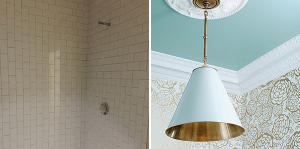
now, you know i've got a thing for bathrooms... like, i could probably live in most of the ones i design!!!  on the left, is a shower in progress for the early teen boy of the house, who actually cares about design!  his bathroom may be my fav space in the entire house thus far (and i've designed the entire house!!)!  on the right, is the ceiling shot from one of my powder baths in the 2015 aso designer showhouse and gardens.  i couldn't share any pics of it until the spread in traditional home (yeah, that one ;) came out this spring!!! what's even more fun about instagram is when other grammers share your pic and it gets that many more "likes".  case in point, this picture was shared by hyggeandwest (the lovelies that make the wallpaper i used) and circa lighting (where the amazing light came from).  their shares had a total of 1589 likes!!!!  holy love fest, batman!!!

#3

many things make me laugh.  this really makes me laugh!  i thought it was sweet that my daughter left one of her barbies to dry next to the faucet.  she almost seems to be taunting anyone brushing their teeth with that damn perfect smile, but that's an issue for another blog...or maybe my therapist, but whatever!  Glad to know, there are others who share my humor and liked this shot enough to land it in the #3 spot :)

#2

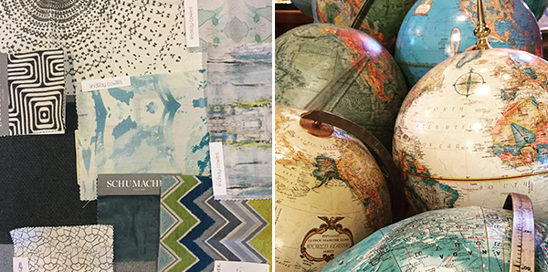
the tie for #2 is a nice testament to me really liking to have fun with design!!  on the left are the fabrics for the teenage hang out room i'm designing for some awesome clients!! along with the parents, we had input from 2 of the 3 teens who will get to hang out here and i feel really good about the vibe!!!  on the right are the globes for the huge open bookcases in the living room of the unusual live/work building i finished last year!  the one with the metal facade fireplace between the huge open bookcases!! :)  also on the list for final photos!!

and finally... #1

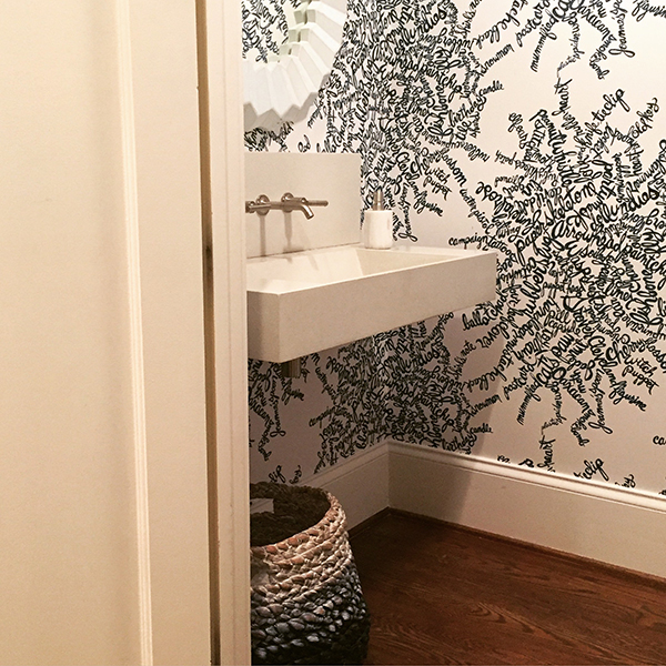
this gem right here is beyond fabulous to me and i'm sooooo glad others agree!!!  in reality, it's right up the hall from the cloud-like master bedroom in one of the other shots, but more edgy!!  i can only pray the final (read, professional shots) turn out even better!!! rooms like this also remind me how truly exciting my job is and how sincerely grateful i am to have clients who let me push the boundaries just enough to create something really special!!!

so there you have the top 10+ instagram shots of bethkoobydesign from 2016.

here are my favorites:

so my favorite instagram posts of 2016 highlight some of the most meaningful things to me.  i find nature awe-inspiring and cherish the times when i can just wander and take it all in.  i'm also amazed at the power of my phone to take such phenomenal photos!!!! above are pics from 3 different seasons, which is also kinda nice.  it's really been a wonderful year, the whole way through.  i'm a huge fan of shadow pics and having my daughter next to me (not in my shadow, mine you!) at the beach, going along with the artsy shot, 'cause she "gets" it, too, is just peachy keen :)

i hope you've had a beautiful 2016, too!  i wish you all love and peace and colorful, fantastic memories for 2017!!!

beijos,

beth


happy holidays...

2016 is coming to an end and i am so very fortunate to have so many wonderful friends, clients, and colleagues.  there is much to celebrate!  thank you all for the special roles you have in my life, business, and heart.  cheers to time with loved ones and best wishes for the year to come!!

beijos,

beth

anything's possible, lady...

if you have worked with me, you've probably heard me say this in relation to what can be done in design and construction.  at it's core, it's really an obnoxious phrase that was said to me a loooong time ago, by some contractor, who, after I explained what I was trying to accomplish (something apparently never done before.  ever. ;), said "anything's possible, lady", while holding up his fingers, making the universal gesture of $$$.  sigh. why must i be so out of the box??  ;)

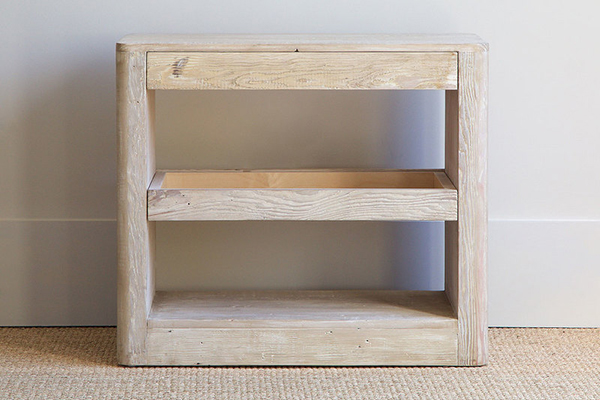
alas.  sometimes custom is really the only way to go.  because you're special, you can afford it, you, too, think outside the box (or want others to think you do;), you're different, or perhaps,  your designer has looked at 124 other night stands and still nothing fits the bill (seriously)!

regardless of reason, i love, make that really love (!!!!!!!) doing custom stuff.  like, it's the dream, bomb, and f'shizzle all in one!!!!  this week has been particularly heavy on the completion or final decision making of several custom pieces i have in the works. hopefully, you will stick around to see all of these in their individual photo shoots...

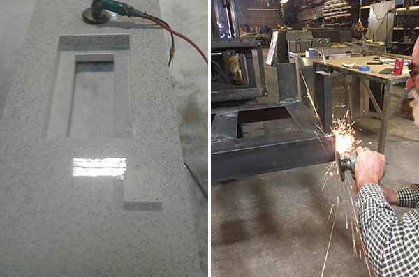
first up is a fire box coffee table for my uber cool modern house clients.  no pressure here. only the company holiday party at their house and there's all kinds of scrambling and weekly conference calls (husband's picture is next to type a on wikipedia and has managed to wrestle me into weekly calls to keep everything on target :).

on the left, is the terrazzo concrete top in the polishing process.  there will be a firebox that drops  down in the middle there!!!  fun with fire!  on the right is my favorite metal guy showing me the difference of the "smoothed" weld vs the "raw".  twice after this i've had to go back and pick a powder coat color so everything will be a consistent color... this piece is going to be ah-mazing!!!!

same uber cool house is the custom 7' long metal planter for the niche next to their indoor fireplace!!!  cascading foliage will inhabit the box, bringing life to the living room!!!  this is just below the glass bubbles (if you're a true bkd fan ;)

over in the midtown high-rise, we have a couple of custom pieces happening.  we ordered the chairs on the left in a beautiful cloud-like fabric and the art on the right is being reframed!  framing always makes me super nervous.  you just get to see one little bitty corner and it's f'ing expensive!!!

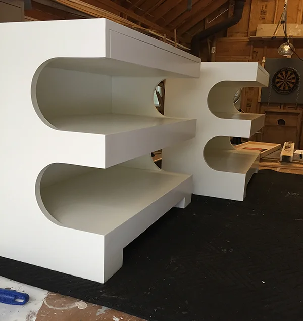
in the same home, we've had this piece out on approval as a tv stand contender and decided the shape/design is awesome, but the color is off.  so.... anything's possible, lady!  stain that shit a lovely light grey and it. will. be. fabulous.

another newer client of mine had started the process of a custom dining room table with the incredible jp mcchesney when he realized he needed help picking out final colors and like, everything else ;)  we've got the color and he should be eating at his "adult" table this week!!  just need to find him something to sit on...

the other incredible modern house is inching slowly toward completion (believe it or not, not everyone has the means to knock absolutely everything out at once - this is real life people.).  i had ordered the pompom curtains from anthropologie, but they were never delivered and then they were no longer carrying them!  no!!!!!  what's a girl to do?!  have them custom made!  duh. anyway, they look so lovely in the master bedroom.  i was a tad nervous they might look childish, but they really don't.  ethereal and whimsical at the same time!!

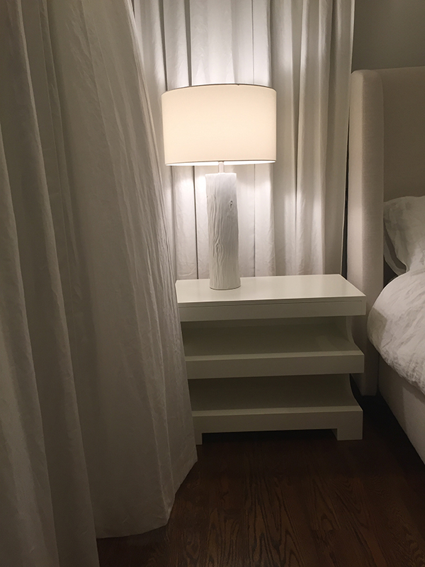
one of my other truly awesome clients had a birthday this week!  so why not give her a pic of the just about finished custom nightstands for the master bedroom (yeah, the one that could have had 124 other nightstands...).  custom doesn't always have to be something completely different that anything you've ever seen (although, honestly, my favorite line for any tradesperson to say to me is "i ain't never seen that before."). sometimes, it's tweeking a piece to get the dimensions just right and maybe changing the texture and color.  and the depth of the drawer.  and adding a concealed pull.  and adding legs to accommodate the in floor vents.  ok, maybe it is completely different??

finally, we have something for me!  that's right!!  my new place!!  i'm getting a little cra-cra and recovering my sofa cushions with this ridiculously silly, yet cool, stick bug fabric and i'm trimming it with brush fringe (for a slightly traditional feel, cause i moved into a 1920s apartment and i'm channeling a more traditional lady of the house :)

yes, this was all really the past week.  i'm exhausted.  fortunately the tea leaves at the bottom of my wine glass tell me all will turn out phenomenal and perfect and on time and within budget and my clients will think i'm the most creative, effective, fabulous designer alive!!

after all, anything's possible, lady!! ;)

beijos,

beth

bake me a cake...

as fast as you can ;)  last week was my daughter's birthday and last weekend we celebrated with a party, including (of course!!) cake.  because i have been soooo busy lately, and I'm still discombobulated from moving, the day before the party i realized i hadn't asked her what kind of cake she wanted!  one of the things that is very important to me as a mommy, and is now tradition, is that i make my kids' cakes.  i love doing this and especially after last week's depression-inducing election, i really needed to release my inner pastry chef!!  (if you are an actual pastry chef and you're reading this, please, please, please, you have my upmost respect and i am, in no way whatsoever, truly comparing myself with you :)  i usually bake the cake the day before, but have all the decoration stuff planned out at least a week ahead, cause there's usually "stuff" involved...

so i get her on the phone (she was at her dad's) and she tells me she wants a multi-level, multi-flavor cake, with trees, like a jungle, and texture, and toys...  so, forget the inner pastry chef.  this is where my aries personality comes out.  oh, you wanna throw out that kinda last minute challenge little girl??  it's on!!

let's start simple.  hats off to betty crocker, she did it again!  and just to up the challenge a tad, this is the first time baking in my new apartment, so just a little extra stress with the oven.

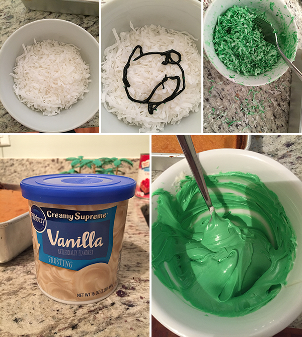
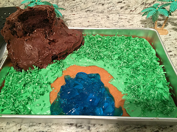
so my plan is to go with the jungle theme and work in a volcano for the multi-level, as well as a jello "water" feature for a lower level and more texture!!  oh yeah.  i'll use the toy trees from the dinosaur set i bought her a few years ago for the dinosaur themed bday!  the jungle floor will be vanilla cake covered in green coconut flakes, and the volcano will be chocolate.  boom!!  multi-flavors coming atcha!!

blog-cake-2.jpg

well, my goal with the chocolate volcano was, well, not quite this.  in my head, it's a smooth mountain, that's easy to frost and actually looks like a volcano.  what i started with was this above...

what then happened looked like a giant turd sitting on vanilla cake :(  i'm getting a little nervous at this point, thinking, omg, this looks like a giant turd, i'm screwed.  the frosting is not going on nicely and again, the visual... :(

it was really too early in the day to start drinking so i did a brief prayer summoning the spirit of betty crocker with a side of comstock cherry pie filling and pushed ahead...

transforming ingredients (and by transforming ingredients, i mean add food color and change the color ;) is a creative release, so now i'm feeling a bit more confident!!  look a that green!!  if that doesn't say jungle ground cover, i don't know what does??!!

at this point, i've just kept piling on the chocolate frosting to help smooth the volcano out and it's definitely helped!!  i move on to digging out my water feature and pull the blue jello out of the fridge to find that it has indeed congealed!!  it's nasty though and i apologize to any of the parents who's kids ate this...

my daughter wants texture... ok sista, i'm bringing the texture!!!  we've got jello water, coconut ground cover, and a smoothed-out volcano turd!!  ha!!

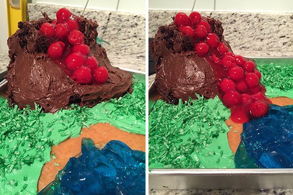
things are getting real serious now.  i've opened the cherry pie filling and am thoroughly enjoying the process of placing the filling atop the volcano and watching it meander down the side (just like real lava!!!!!  just like it!!!)  so you could experience this captivating time along with me, i took a video!!  but, alas, i suck at audiovisual, so the video is not uploading.  envision, if you will, cherry pie filling slowly cascading toward the jello pool!  and me standing there, like the complete dork i am, whispering, "genius"!!!

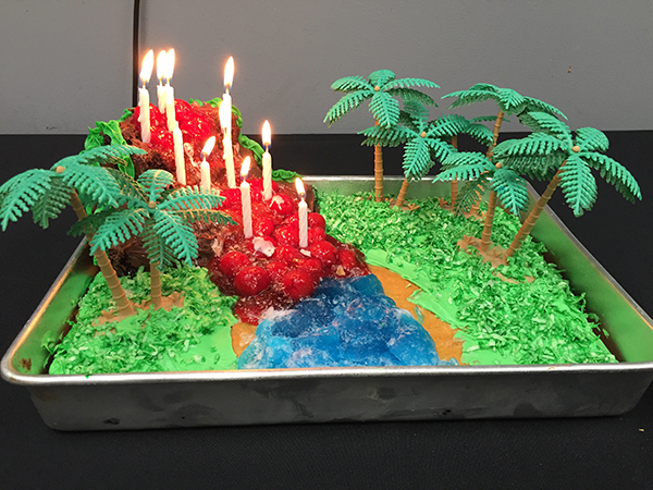
the biggest challenge was getting the cake, in one piece, with nothing toppling, to the party!  as you can see above, i managed to do that, too :)  and my little jungle monkey loved her cake!!!!!

after standing at the entrance welcoming party guests, while holding the cake with one hand, for 15 minutes, I asked the "party supervisor" where our room was, so i could put the cake down, cause all i need is to trip and drop the damn thing!!  we don't have the room for another 1-1/2 hours, but they will put it in the refrigerator until we're ready. ummmmm, ok.  but, seriously, heads will roll if anything happens to the cake.  just saying.

here we are about to sing happy birthday!!  you may notice the cake seemed to suffer a bit of climate change??  they put it in the freezer instead of the fridge, so everything was frozen!!  nice.

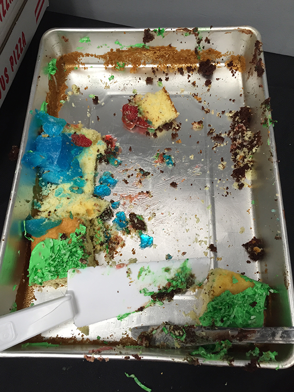
these kids apparently could care less about the temperature differences and just enjoyed eating it!!  and i couldn't be happier! :)  happy birthday to my beautiful daughter!

beijos,

beth

happy halloween...

hello there!!!  let me tell you, life is crazy up in here!!  moving, traveling, very, very busy with clients...  life is truly wonderful, but really hard to keep on track sometimes.  my fantasy blog post is an update with snippets of all the awesome projects i have going on right now, but that would take a lot of time that i just don't have right now.  so, what i can give you, is an ode to orange post :)

i'm not a huge orange fan, but i did manage to find some pics that are far more treat than trick!

the foliage changing color in the fall, oh yes please!!  any smeg appliance, so completely adorable in any color, but loving this orange; it's actually somewhat sophisticated, not childish.  a combo of neon and sappy romantic??  sign me up!!  (haha, get it ;)  i could live in a forest of birch trees with crunchy orange leaves as my bed... ok, maybe for just one night.  go on with your out of the box bad self orange cabinets!!!  that is sexy to me.  anything morocco.  i wanna go back so badly!  i grew up drinking orange juice everyday, so to me, it's the nectar of the gods.  even better when it looks like it's being delivered as some sort of peaceful pagan offering!

i hope you all have a beautiful fall and a joyous halloween!!

beijos,

beth
things are just things...

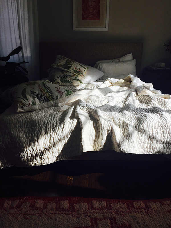
today i let go of a big thing.  my big girl bed.  as some of you may know, i've sold my house (the closing is on monday) and i'm downsizing to a fabulous 1920's apartment, just up the road!  we'll talk about that in more detail later, but right now it's all about my bed.  i woke up at 4 f'ing 30 this morning, with my mind racing with all the things i have to do.  for clients and for myself and my kids as we move forward on this next adventure. from the sweet, perfectly comfortable haven of my bed, i gazed out the window (yeah, no shit it was still really dark and i couldn't see much, but i know what's out there!), i soaked up the shadows on the wall, i smiled at my favorite capiz shell light that hangs over my bed, i rolled over and pretended the stack of (literally 5) pillows next to me was really the physical being that is the love of my life... and i cried.  life has come so far on this mattress.  and with this bed.

i absolutely love this pic of my bed.  i took this one morning when the light was just starting to come through the window (because i have a slight obsession with the beauty of natural light) and i love pictures of unmade beds.  i've never been one to make my bed.  what's the point??  i'm just going to get back in it several hours later!! :)

anyway.  my bed story starts with the mattress actually.  i got it when i was married.  it's 100% natural latex, covered in organic cotton (yeah, cause i'm crunchy like that!).  he didn't like it.  it was too firm.  i ordered a mattress topper (also organic fluff ;) and fancy sheets.  he still didn't like it.  we changed to another mattress but kept this one, which came in handy when i later moved downstairs to a separate room and slept on this mattress on the floor.  sadly, it felt ok.  after i left, this mattress was again on the floor, but this time, of the apartment i'd escaped to.  it felt right.  it was a new chapter and it was all going to be ok.  painful as it was.  6 months later, i bought my house and the first thing i did was order my fancy pants, big girl bed.  it was actually the most money i've ever spent on any piece of furniture in my life!!  but the perfect simplicity...  and the fabulous fabric...  and my mattress fit just right... and after having survived 5 different beds in a disastrous relationship, it was good and right to have a special place just for me. 

this picture is so wonderful, because of many things!!  one.  it shows how early on this was because there are still the totally yucky white blinds on that window!!  two.  that hide pillow was one of the things i brought with me from my old house, because someone else wouldn't have appreciated it.  three.  my daughter is reading to us and my son is doing his absolute best not to jump in and take over (i have video and it makes me cry!!).  four. through the years of being in this house, my kids have wandered into my room to just roll around on the mattress, to read to themselves or each other, or to painfully wake me up at some stupid, god-awful time in the middle of the f'ing night.

when we all had lice.  yes, you read that correctly :(  since my bed is all upholstery, not only did i sleep with my head wrapped in a shower cap, i slept with my head at the foot of the bed where there is less upholstery!  i vacuumed the bed everyday.  there was no way in hell i was getting rid of that bed due to a lice infestation!!  i came out stronger in the end.  and got to keep my bed :)

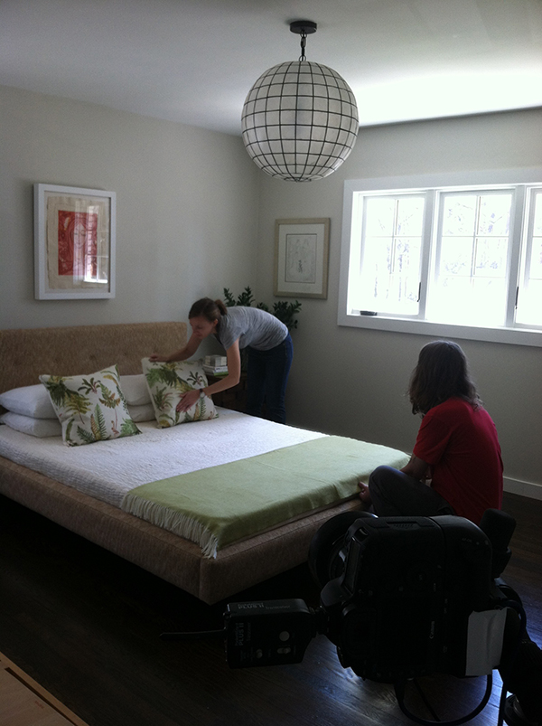
so my bedroom has been photographed a few times for various magazines.  this is funny because it's not landed in one magazine.  ever.  it just refuses to photograph well!  it's been shot with 4 different rugs, different art, different nightstand styling, multiple pillows... all to no avail.  this is the most comfortable place in the world for me and yet, that (apparently) can't be captured on film.

this is my favorite styled shot (thank you jeff herr photography!).  but any picture will probably never really do my bed the justice it deserves.  it's been a safe haven.  a literal shoulder to cry on, as i lay there (going through a divorce, general heartbreak, receiving the call that my aunt was dying after a massive stroke).  it's been a place of renewal (on a nightly basis) and a place of release and intimacy (definitely not nightly, but enough to count ;).

so back to letting go.  my bed really has meant so much to me on so many different levels.  but, today, i sold it and delivered it to a friend, who will probably use it in his rental apartment.  in the end, it's just a thing that can serve someone else in a practical way.  and that's ok.  i will also keep it close to my heart and firm in my memory of good things in my life :).

beijos,

beth

they call me mellow yellow...

ok, not really.  no one is calling me mellow.  ever.  

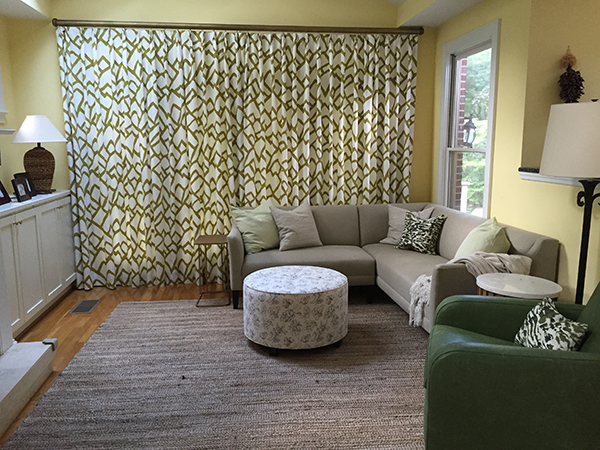
but!!!  here's a cool before and after of a living room where the main objective was to design around the yellow walls.  and keep it cool for adult and youngster guests!  piece of yellow cake.  please...

so above you have the after!  via my totally unprofessional iphone, with no styling whatsoever!!  so, please, no judgment ;)  but take a look at the before and i'd wager you'd think we improved things just a bit!?

so, my clients here are a cool couple, who host regular get togethers with friends and their kids, sometimes just because it's friday and sometimes for things like the oscars!  love these people :)  so the space needed to accommodate multiple ages and stand up to the wear and tear of actual use.

so the "pre" space was a bit heavy and not really fun loving and jovial, like the clients are.  so we changed that!

one of the things that was important for the lady of the house was a comfortable, but stylish recliner, so she can watch her games!!!  that's what i'm talking about!!!  early on in the design process, i was stressing over what was going to work with yellow walls.  it was a true epiphany when the color green came to me!!!  duh.  so anyway, the objective was greens and neutrals, in a more fresh, slightly modern, (but drawing on the clients love of new orleans) way.  if you notice the iron floor lamp, you might pick up on this :)

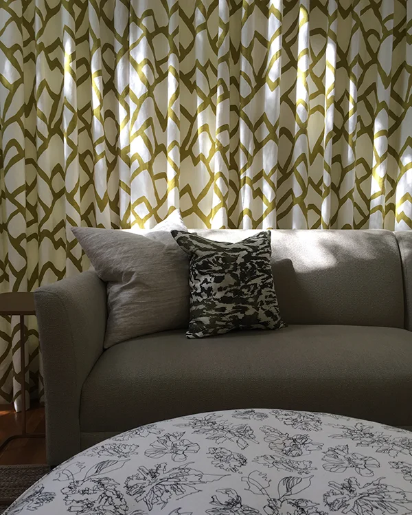
this project was such a great example of mix and match, custom and off the shelf!! and. i. love. that.  above you have custom curtains, in a fabulous schumacher print (zimba in chartreuse...love love love love this!!!!) and a custom ottoman in studio bon "blossom". please, child, let me tell you how i searched for some alternative to this damn fabric.  the swatch card says 3 yard minimum.  perfect.  that's all we need to make the round ottoman.  go ahead and search for a round ottoman.  any round ottoman.  you won't find one!!!!  sometimes, custom is really the only option.  trust me.  anyway.  we go to order the fabric and the company then says the minimum is 5 yards.  no, no, no.  i then proceed to look at every and all black and white fabric to make this ottoman happen.  to no avail.  i then get the brilliant idea to ask to tack on our yardage to someone else's order and voila, our measly 3 yards is ordered and we'e on out way to custom ottoman goodness :)  the sofa is perfect and from crate and barrel.  my go-to for well-made, reasonably priced furniture!  i'll get to that one pillow in a sec...

so on the left is the sensational ottoman (and my feet, but don't mind them ;) and on the right is the stupid, gorgeous, sexy, linen fabric that i just want to roll around in, i love it so!!!  seriously.  i could drape an entire house in this shit and call it a day!  and it's just so perfect in this space!!

so before, we had a sad, but comfortable recliner, that didn't fare so well with visiting family dogs... on the right, is the most expensive recliner ever!!!  this special piece is originally from crate and barrel (because i love them and they make really reasonably priced, high-quality furniture!) and recovered in a fabulous holland and sherry died leather!!!  so ridiculously yummy!!

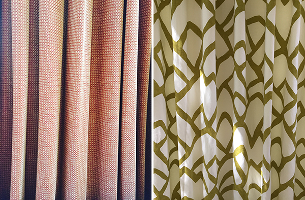
last, but not least, we have the drapes!  on the left is the before.  really not too bad, but heavy and a little frumpy.  on the right, the fresh, young, vibrant schumacher fabric!!  we even kept the antique brass drapery hardware, because i tied it in with a new antique brass side table.  i'm quite pleased with the results and my client is, too!!  we have a few more small accessories to add, but overall, it's a job well done, mostly within budget ;) so mellow ;)

beijos,

beth
 

not winning the one room challenge...

hi there!  my name's beth, in case you've forgotten.  i almost have!  the past couple of months have been a whirlwind of trying to keep up and failing miserably :(  so, it comes as no surprise to me that i didn't win the one room challenge.  why not, you ask??  well, most likely because i didn't complete it on time, duh!  as a refresher, the one room challenge, that i foolishly thought i could easily complete (because i needed to get my office space ready anyway to put my house on the market - yes that's another big thing in my life right now that also happens to be a huge time suck!!!) happens twice a year and involves 20 awesome designers/bloggers being invited to participate in fixin' up one room within a 6 week time frame and then a whole lotta "guest" designers/bloggers can join in the fun as well and do the same.  here are the links to my first 3 weeks... week one, week two, and week three... I have been done with my space for quite some time and had the pictures taken (after the deadline for the challenge), but i just haven't had time to sit down to write a post about it!  behold, the fancy pictures of my office!!  in your face water damage and alien life form!

i really can't tell you what a treat it is to have this space done and looking so pretty! challenge fail or no challenge!  below is a reminder of the before...

ok, compared to the before (with the floors finished) it's really just a room with furniture i realize that, but still, i'm so happy it's done and functional!!  pretty much everything was sourced from things i already owned.  except my new favoritest furniture piece, the metal, perforated door cabinet from pieces, inc!!  such a splurge, but i actually just stare at it sometimes with romantic googlie eyes and sigh a little, i love it so :)

here are some alternate views of the room...

special pieces above include a ceramic, pillow, rug, and throw from my recent morocco trip.  the oly cocktail table taken back from my daughter's room (she's still not happy). iphone artwork by me mixed with actual artists, christian chaize and holly irwin.  vintage chairs, some pillows i made, and the plant i've not only managed to keep alive, but it's somehow grown to the "tree" you see here!!  this is big for me :)

a couple more shots...

what i really love about my space is it's very true to me.  clean, crisp backdrop with layers of texture, color, personalty, and wonderful memories (i have an obsession with tile, so a "display" wall of some of my favorite tiles is completely appropriate!).  the pig canvas on my desk is a blow up of a picture of some graffiti i took in argentina a couple of years ago.  the pig has a respirator mask on and the whole image is splattered in blood, which adds such a grittiness to all the girly in my office, i love it!!!

on the left is a close up of the best cabinet ever hosting a ceramic piece from morocco and 2 leftovers from one of my powder baths from the aso showhouse last year, atop a fabulous tray from anthropologie.  i really love this shot.  it's just such a perfect blend of me!!  to the right is the shrine to tile with a special place for another favorite artist of mine, steve dininno, (truth be told, I also swiped this from my daughter's room, as this is the piece i bought her for her birthday last year at dk gallery!!)

a huge thank you and shout out to my photographer, jeff herr, who took all the after photos!!  and who gave me a bit of a discount for "talking" time, since apparently, i'm quite chatty!  who knew?? ;)  i hope you enjoy the photos as much as i enjoy being back in my office!!

beijos,

beth

for the love of white paint...

hello.  i'm beth, and i'm a renovation addict.  

2 years ago this fall, i discovered severe water damage (think alien life form growing up out of my base boards!) in the lower level of my house, which is my office.  this came on the heels of pretty much completing the renovation of my entire house, which took about 3 years in all.  it was a devastating discovery because i was tired of renovating at the time (i had done a lot of work myself) and i was really looking forward to a clean house. one without boxes and stacks of crap moved from room to room and sheetrock dust everywhere!  so, at that point, i said to myself, that's it, i'm prepping to sell.  shortly thereafter my house (sans the water damaged part) was to be photographed for 3, yes, 3!!!  separate magazines!!  a forth one was added to the mix a little later!!  only 1 of the first 3 panned out, but the forth was the wonderful spread in the 2016 spring issue of atlanta magazine home.  the point here is the renovation of my house has provided everything i wanted it to.  more beautiful pics for my portfolio and the validation of my talent as a designer.  obviously, it's also been a wonderful retreat for myself and my kids as we've made our way through life, post-divorce.  i really couldn't be happier and more satisfied :)  so now, it's really time to sell, because i've been saying this for almost 2 years and i'm emotionally ready!  and because, clearly, i am unable to just stay and enjoy being done :)

there's really just a few things to finish up (stuff you wished you'd done years ago and actually enjoyed all those years instead of finally doing them and the buyer gets to enjoy them!!!).  in another post, you'll see the follow up pics of my office, aka, the one-room challenge i failed at completing on time :(  right now, i am finishing the large closet just off my office space, which also had water damage and floor and wall replacement.  i installed the new base and door trim weeks ago, after the new door was hung and am just painting today.  this should be super easy because the one thing i don't ever pay anyone to do is paint!  i love to paint.  except today.  it's just not going well and i kinda feel like it's similar to hitting rock bottom with an addiction.  i usually paint while listening to music, but what i wanted to listen to wasn't downloading and that just wasn't sitting well with me.  the primer wasn't really going on quite opaque enough for my liking...

and then there's the physical suffering.

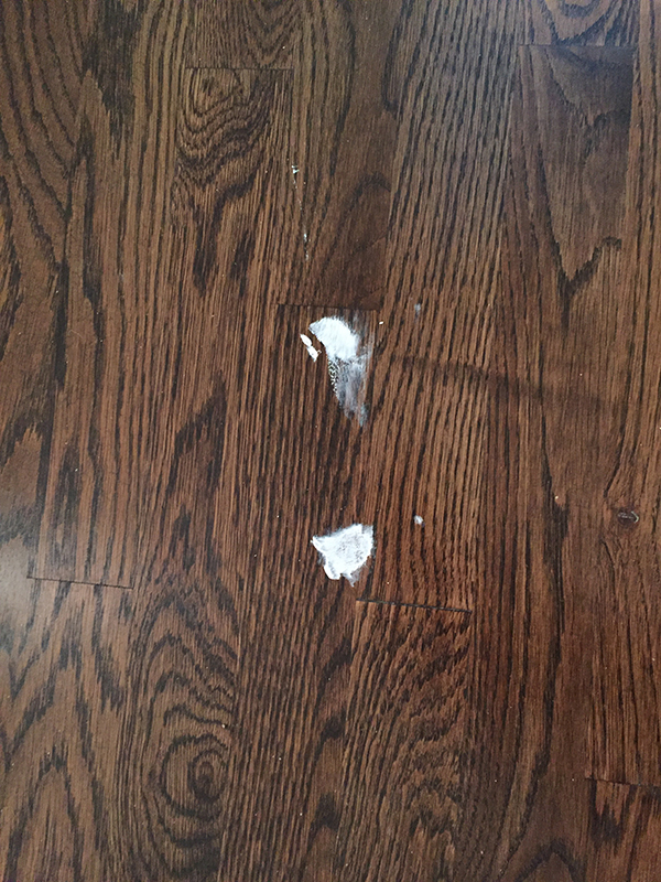
please note the difference in skin coloring between my arms and palms!

please note the difference in skin coloring between my arms and palms!

i am ambidextrous.  a fact i do actually like to brag about.  but here, it's not about bragging, just all about pain.  this is the universe telling me to put the paint roller down and rent a nice apartment, where other people are available on speed dial to do things like, change a light bulb, repaint a wall, fix the dishwasher you haven't used in 2 years because it was leaking because it was never installed properly...

to make matters worse...

you may not see anything wrong in the above picture, but to the eye of a trained professional (resident crazy reno person) such as myself, this roller has an issue.  it was fine for all the priming, but when i started painting the wall with the satin paint, the handle "shrunk" and was all wobbly.  it was truly an equipment battle to the death.  as you can see above, my hands were not winning  :(  i have used this same roller throughout the entire house and was really just a bit emotional with it failing me at the very end!

to top the drama off...

underneath the drop cloth i find this stupidity!!!!  aaaaaahhhhhhh!!!!!  ok, it's really not that bad, i washed it off really easily, but still!!!  just another sign it's time to hang up the renovation hat for now and relax for a bit :)  until, of course, that foreclosure i have my eye on works out or the land lady of the cottage i'm looking to rent lets me retile the kitchen and paint all the walls and change out the light fixtures and the floors may need refinishing...

my house goes on the market the end of this week, so please wish me luck :)

beijos,

beth
 

happy father's day...

happy father's day to the man who passed on the dominant trait of icandoitmyself.  it's just been discovered and it explains so much ;)  my dad is a geneticist and as much as i may try to fight it, the aversion to hire someone else to do something i can do, is not just being cheap, it's genetic.  and i thank him for it.  usually.

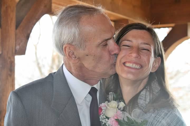
this is one of my favorite pictures of my dad and i.  it was taken at his wedding almost 2-1/2 years ago, a very emotionally charged day!  sadly, i don't have many pictures of all the construction projects i've been involved in with my dad, but that was kinda where i was going with this post...

my parents designed their second house and when the workers were slackin' off in the end, my dad fired them and finished it himself.  it was an awesome contemporary structure on a lake out by the university.  when i was a teenager and things needed to be added, like a floating dock with electrical power and raised wooden walkways, my dad thought it the perfect opportunity to "teach" me how to read a level, how to mix and pour concrete, how to run electrical wiring up to and over water (um, hello, safety?!), and how not to fall off a ladder (something he forgot how to do himself a little later in life...).  that last activity happened only once before i, afraid of heights, refused to ever get on the steep-pitched roof again!!  unfortunately, there seemed to be many opportunities to mix concrete on a saturday afternoon, when i should have been hanging out at the mall with my fiends :(  somehow, dfacs was never involved!

anyway... when i moved north in my late 20s and bought my first apartment, my dad came up to see it (and help me with the demo :) and at first sight said to me, "what the hell have you done?"  it was a dump, it was cheap, and i was so excited!!!  i really didn't understand his question because he had raised me to think i could do anything, that i could do anything by myself, and that, clearly, i could call him and say "hey, dad, wanna come up to new jersey and help me rip out 80 year old pine flooring and toss it out a 3rd story window??!!"  and he would say yes :)

there were many times when i have loathed the doityourself construction gene, but when i now have my own kids and one of them is planning to spend a week with grandpa building an extension on his storage shed, i know there are plenty of good traits and then there are some pretty badass traits like icandoitmyself that will continue to be passed down and it's makes me smile :)

happy fathers day, dad!  i love you and i thank you!

beijos,

beth