.

hey lady, wanna buy a chair...

i love a good deal!  seriously.  even though i am expertly talented at selecting the most expensive piece of whatever in a store!  i happened to be farting around on facebook last week and an ad popped up for 2 chairs on "letgo" dot com.  besides the fact that i immediately launched into a very bad rendition of "let it go" from the disney hit frozen, i was intrigued.  could these be the perfect chairs for my uber hip art fan clients who live on a more traditional golf course???  at only $400 for the pair??  in oatmeal linen?? seemingly matching perfectly with the new bed and overall cloud theme we're going for?!?!  what's the catch?  (warning!!!  if you are vegan or an animal rights activist, you may want to stop reading...)

so here's the chair and the swatch of fabric from the bed.  honestly, perfecto x 100!!  the shape of the chair mimics the shape of the bed, the scale is perfect, given the large size of the room, my client can curl up in a chair with a cup of coffee and peruse the latest fashion magazine while her nails dry... ha!!  that shit's not happening...  she has 3 boys under 10!!  but the thought is nice.

so i contacted the seller (who is actually a reputable designer) and she said it is her brother that is selling the chairs and to contact him.  i make contact and he tells me the chairs are in a storage facility in marietta.  uh.  ok.  tell client and she's immediately concerned we may be tortured and murdered, our remains stuffed in some self-storage locker only to be discovered once someone inadvertently confesses to the gruesomeness...  because why would i ever be anywhere near a self-storage facility in marietta, contemplating purchasing really inexpensive occasional chairs!?  so out of character... ;)

i did assure my client that i really wasn't worried in the least bit about any kind of foul play, but we did have quite the giggles over having 911 on speed dial and which one of us would be sacrificed (somehow i lost...)

so we show up and my client is already like, hey, he's single and kinda hunky, whaddaya think!!??  and i'm like, can we just focus on the chairs?!  we go up to the upper floor unit and the chairs are already pulled out in to the hallway and i'm immediately oohing and ahhing, thinking, this is a great score!!!  client then says, did you not notice what's in the rest of the storage unit??

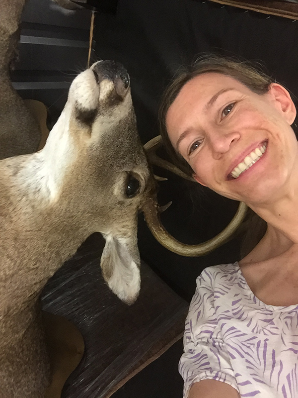
wth????!!!!!  there are deer heads everywhere!!!  and i can't stop laughing.  not because i think hunting and mounting is funny, but because of all the paranoid lead up and here we are, looking at really pretty, perfect chairs for their master bedroom, and there are 15 dead deer heads desperately trying to look at me!  but wait, there's more...

there are fish and a bird.  what's beautiful about all this, is my client says to me, "don't you have another client looking for taxidermy?"  why, yes, yes, i do ;)  i am seriously questioning whether this is the right thing though...

at this point, i can't stop laughing and occasionally have a shutter of omg i'm freaked out right now...  so the only logical thing to do is:

because it's really all about the selfie nowadays, right?? ;)

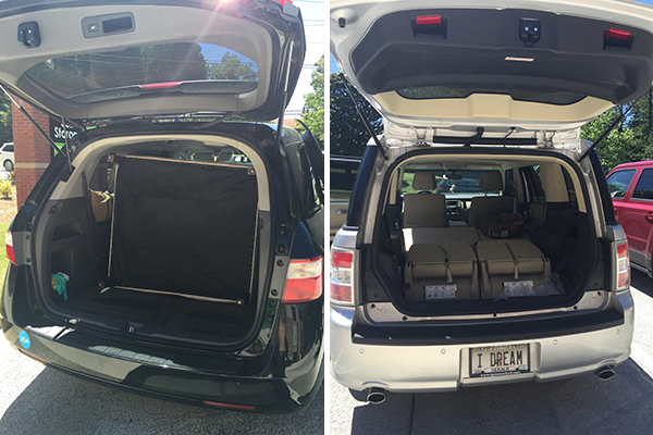
ok, the chairs were a total score!!!  we both came with empty vehicles, thinking we'd each fit one chair into each of our vehicles (i say vehicle 'cause hers is a minivan and mine is a hybrid station wagon/suv).  i had to get a new car last year because my prius battery died (after 9 years...sniff) and i'd been lusting after a ford flex for a couple of years anyway.  it's pretty big and can fit up to 7 people, but let's see how handy it was with chairs today...

on the left, is my client's minivan, comfortably accommodating the 2 chairs.  on the right, my sorry-ass flex accommodating nothing but some bubblewrap in the way back :(

in the end, we were not tortured and freeze-packed in a storage unit in i-have-no-idea-where-i-was-marietta!!  we came away with 2 fabulous chairs for the master bedroom and a selfie of me and a deer head!!!

beijos,

beth



gettin' my foodie on ya'll...

well, thank you, i missed you, too!!!  despite the rumors, i have not shot-gun eloped, been hog-tied, or drown in a big-ole container of sweet tea!  i have, however, been preparing to get my food, drink, and designer prowess on for this weekend's upcoming atlanta food and wine fest!!  a long weekend of all food and drink things southern!! about 2 months ago (i can't even keep track anymore!) i received an email saying i had been selected to be one of the designers doing a vignette at kevin rathbun's "ones to watch" party during the festival!!  shut the screen door!!  i had just parked my car in the deck at atlantic station and sat there blubbering a bit as i reread the email a few times! opportunities like this are fantastic because, as a designer, you have a chance to push some boundaries with your own vision, get your talent and artistry seen, and, since you're invited, it means other people think you're capable+, which is tremendous!!  

so here's the deal.  each designer is paired with an up and coming southern chef. designer designs a vignette from mostly items found at adac (they're sponsoring the event) where chef serves up some amazing dish or two!!  fancy foodies come to taste fantastic food and soak up the beautiful spaces created by the up and coming southern designers!!  i believe there are still tickets available, so get you some, if you haven't already!!!  here's the link to the whole shebang, because it's such an incredible weekend of food, drink, and southern culture (yes, there is such a thang!) you'll want to experience as much of it as possible!!

here's the promo for the rathbun's event...

that's me on the bottom, in the green :)  among some really incredible designers, some of whom also did the aso showhouse with me last year!!!  i really can't say enough how honored i am.  and excited.  and freaking out just a little bit.  my amazing friend and assistant was originally going to help me with some of my install, but is now going to be out of town :(  so cross your fingers that me thinking i can do everything myself translates into me actually succeeding at me being able to do everything myself!!  with the help of some strong moving men, of course - cause some of my stuff's reeeeaaaalllly heavy and i'm not stupid ;)

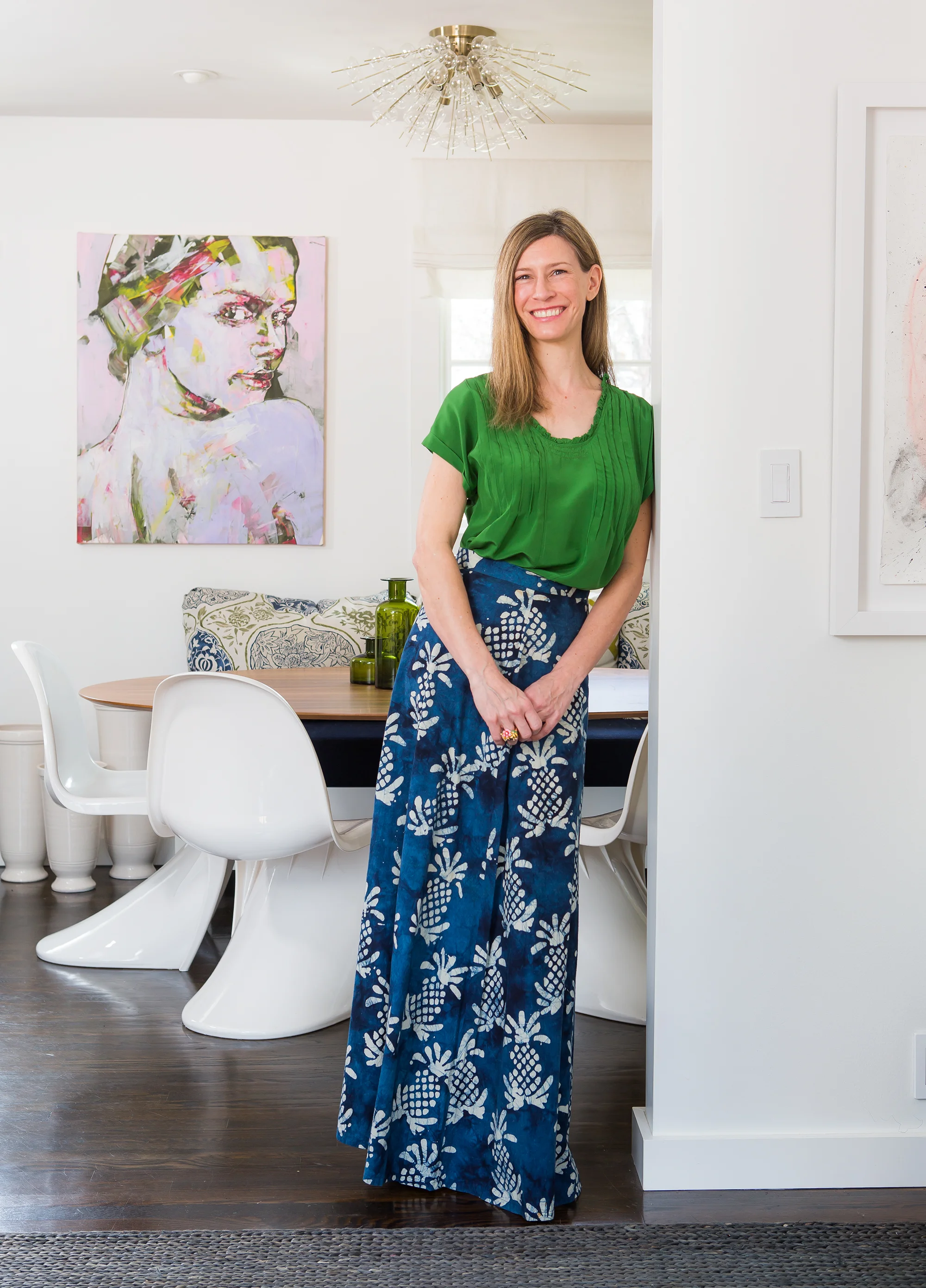
here's the new head shot i had taken with this event in mind!  do you think it makes me look southern???

my photographer, jeff herr, did a great job!  this is in my dining room and my skirt was made by my mom, like 40 years ago!!  she made the fabric, too!  it's special :)

anyway... here's a little tease of the essence of my space.  

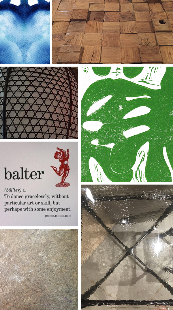
before i got word of who my chef would be, i was looking them all up (i could see the list on line) and thinking whoever i got i'd go visit and eat at their restaurant, get a feel for who they are as a chef and as a person, see their style, etc.  all things i would do with any design client.  these are all southern chefs, so we're talking north carolina, new orleans, georgia coast, tennessee...  easy enough to travel to.  well ha!  wouldn't you know, my chef is digby stridiron, from the british virgin islands!!  um, hell yes, i need to go visit!!!  unfortunately, this now requires a plane ticket, a bathing suit (ugh), and a tan (pasty white girl here).  and that little thing called time, which i don't have, hence the reason you haven't seen a blog post from me in over a month!!  anyway, digby's story is wonderful and inspiring and i'm so excited to create a space for him to showcase his talent!!  his restaurant is balter and i seriously want to go (and maybe not come back...). based on his website, i went with his use of local, sustainable, fresh food, in a beautiful, tropical locale infused with passion and art as my design direction. 

in case you want to join me, here's my inspiration pic...

yes please...

beijos,

beth


week 3 one room challenge...

if you were expecting some huge amount of progress, i'm about to really disappoint you! sorry.  i did, however, order the new door for the closet, change out the vent cover on the wall, scouted a side table alternative to the large, metal file cabinet, moved some furniture in the room and stared at it, and fortunately escaped spending a stupid, ridiculous, obnoxious (but probably completely worth it!!) amount of money on some insanely, sexy, leather fringe that i was considering putting on the day bed!  more on all of the above as we move through week 3's blog :)

i also scheduled my photographer to shoot the finished room, so now i'm reeeeeaaally committed to completing this!

reminder, here's the link back to callingithome.com's one room challenge!

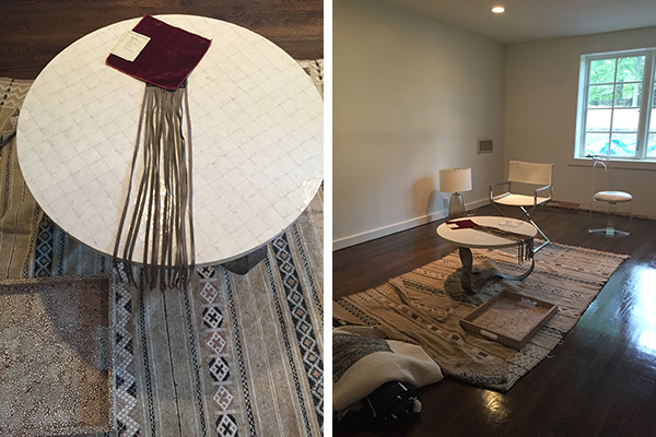
on the left is the table that was in my daughter's room, that i moved down a couple of days ago, but only tonight did she notice!!  and of course, wasn't happy i took it.  glad she has good taste ;)  on top of that table is the super sexy leather fringe from bradley at adac!!!!  i have coveted this stuff ever since i first laid eyes on it!!  it is smoking hot (and not cheap) and my plan was to use it on the daybed cover then repurpose it for some kind of tina turner inspired dress!!!  cause i'm crafty like that ;)  but alas, the fringe takes 3 weeks to get here and i will be posting the final post then, so it will remain a dream for now :(

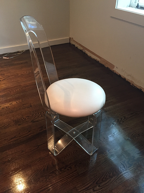
above we have the gorgeous, vintage, lucite vanity chair that i scooped up a while ago just knowing it would go somewhere!!!  it's in excellent condition, but i'm not sure the scale will work with the metal desk...stick around for that!

now on to a little shopping fun!!!  i decided that the large, metal storage cabinet is just not that special and can be moved into the closet (behind the new door :) and in it's place i needed a cool, new side table.  up to this point, i've pretty much shopped my own inventory and have been doing pretty good, but it was recently my birthday and i need a present... :)  anyway.  i'm withholding my resources until i decide which one i will go with, lest someone swoop in and buy the last one in stock and throw me into a challenge tailspin!!

here's me busting a move on the ugly vent situation!!  old vent cover on top, new, pretty vent cover on the bottom.  unfortunately, what i discovered when i went to screw in the new cover was that the metal duct is not cut symmetrically, so the lower left side sticks out past the wall (can you see the bigger shadow on the left?).  so now what should have been possibly the simplest thing in the room will now involve me donning safety goggles and attempting to cut back the metal myself :(  times like these, i could use a manly man boyfriend.  just saying.  but, i can do this!  other things i'm investigating are luscious velvet and a birch pole.  stick around!!!

beijos,

beth


the new south...

over a week ago i attended the opening for a juried exhibit of artists spinning their take on southern expression.  it was friday night and i ventured out to kai lin art gallery for a spectacular evening of art viewing!!  more than 200 artists submitted more than 1000 pieces of art for consideration!  i am over the moon happy to say i know one of the artists selected (steve mckenzie) and even got to take a selfie with him (see further down!!), cause who doesn't hope for a good celebrity selfie every now and then??!!  one would think i hit the wine bar running with the excess of crappy pics, but i've actually learned my lesson.  alcohol and art exhibits|auctions|or any event where art can be purchased do. not. mix.  one day i looked around my house and realized i have an art collection and not the foggiest idea of how it got here!  (that's not entirely true, but i have found i'm much more prone to give in to the temptations of playing the art patron when i've had any alcohol)...

left, "raspberry cream" by lauren kussro and right, "i saw that" by hwahyun kim

left, "raspberry cream" by lauren kussro and right, "i saw that" by hwahyun kim

the above two were my favorites!!  and either or both would fit perfectly in my office for the one room challenge crazy thing i'm doing!!

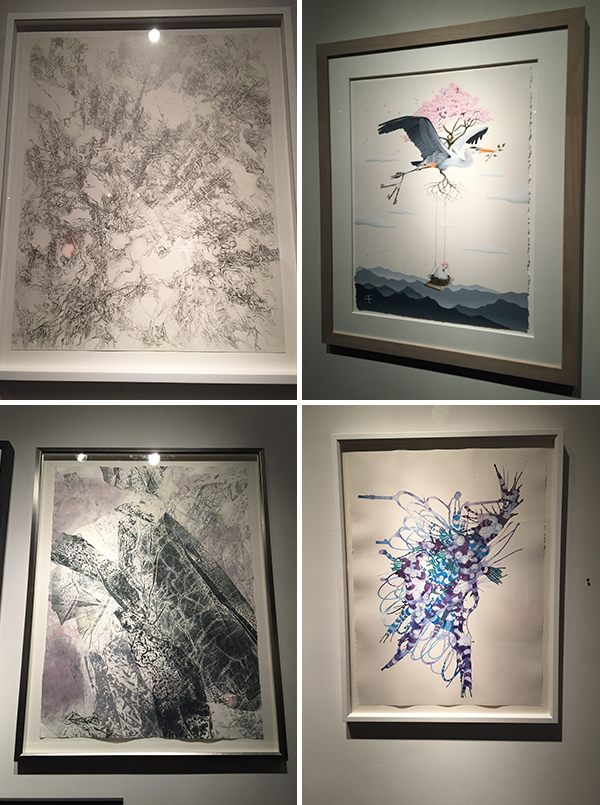
upper left, "i do not paint a novel...i draw poetry" by valentina custer o'roark, upper right, "above and beyond" by thomas turner, lower left, "zgubna postac III" by anna kenar, and lower right, "cluster" by allusion parker-shockley

upper left, "i do not paint a novel...i draw poetry" by valentina custer o'roark, upper right, "above and beyond" by thomas turner, lower left, "zgubna postac III" by anna kenar, and lower right, "cluster" by allusion parker-shockley

i loved the details and grey in these.

left, "biological fragment" by niki zarrabi and right, "dream #1" by hwahyun kim

left, "biological fragment" by niki zarrabi and right, "dream #1" by hwahyun kim

anything with plexi glass or a love theme gets my attention, as seen above!

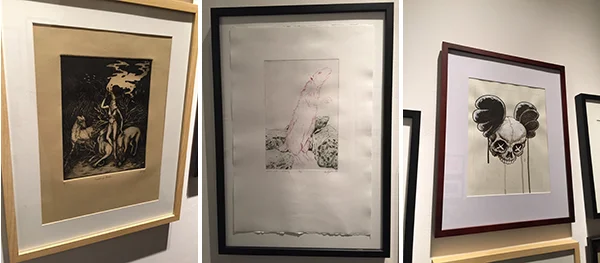
left, "preacher of hounds" by beatriz rodriguez, middle, "a scent of fir and mortality" by ashley l. schick, and right, "the new south" by adam wellborn

left, "preacher of hounds" by beatriz rodriguez, middle, "a scent of fir and mortality" by ashley l. schick, and right, "the new south" by adam wellborn

above we have art very specifically geared toward my clients in the amazing modern house (not the one that was just completed, but the one with the custom hemlock root chandelier and glass bubbles in the front window).  they have an appreciation for more macabre works of art and i love them even more because of it!!  we are slowly moving forward in creating their dream space and when i saw these i couldn't help but think these could go somewhere!!  especially the pink rat!  come on!!  it's a pink rat!  if that doesn't scream master bathroom wc, i don't know what does!!??

yay steve!!!!  here is his piece, "celebration"; also a shameless selfie and a group shot of other gallery goers :)

yay steve!!!!  here is his piece, "celebration"; also a shameless selfie and a group shot of other gallery goers :)

so proud of my friend and overall wonderful and talented guy, steve mckenzie!!!  one of his pieces was selected and i couldn't be happier for him!!

what's the best part about this piece right here??!!  see the itty bitty red dot to the right?? that means it's sold!!!!  and that, my friends, is how we keep the artists from starving, the galleries open, and a continued support of art in our communities!  the next time you are thinking you could use a little something something on your walls, go on, venture out to your local art gallery!!  you'd be surprised, not only in what you might be attracted to, but also by the affordability of gettin' your art patron on, while supporting actual people in the process :)

the show runs through may 14, 2016, so make sure you check it out!!!

beijos,

beth

week 2 one room challenge...

and i'm already behind!!!!  ugh.  seriously debating my sanity right now.  the good thing is i'm in the throws of moving and grooving on 2 awesome powder baths for 2 different clients, wrapping up some decorating on the modern house and another living room project, and fully designing 4 kitchens, 3 master baths, and 5 other baths for 4 separate clients.  damn, girl!  yeah, that's what i said!!  throw in some other smaller things...  ok! focus, focus, focus!!

my one room challenge is revamping my office space after recovering from water damage.  the floors have been pieced back together, restained, and are now dry!!  (they still smell, though)  i'm looking forward to hyper-organizing my samples (mostly tile and wallpaper).  i currently have things in a mix of baskets and boxes, but have always dreamed of an uber neat collection of matching containers.  we'll see what my budget allows down the line :)  most of the big things (like furniture) i'll be using are things i already have.  we'll see how nuts i get with the accessories!  here's a few pictures of some of the things i know i'll be working in...

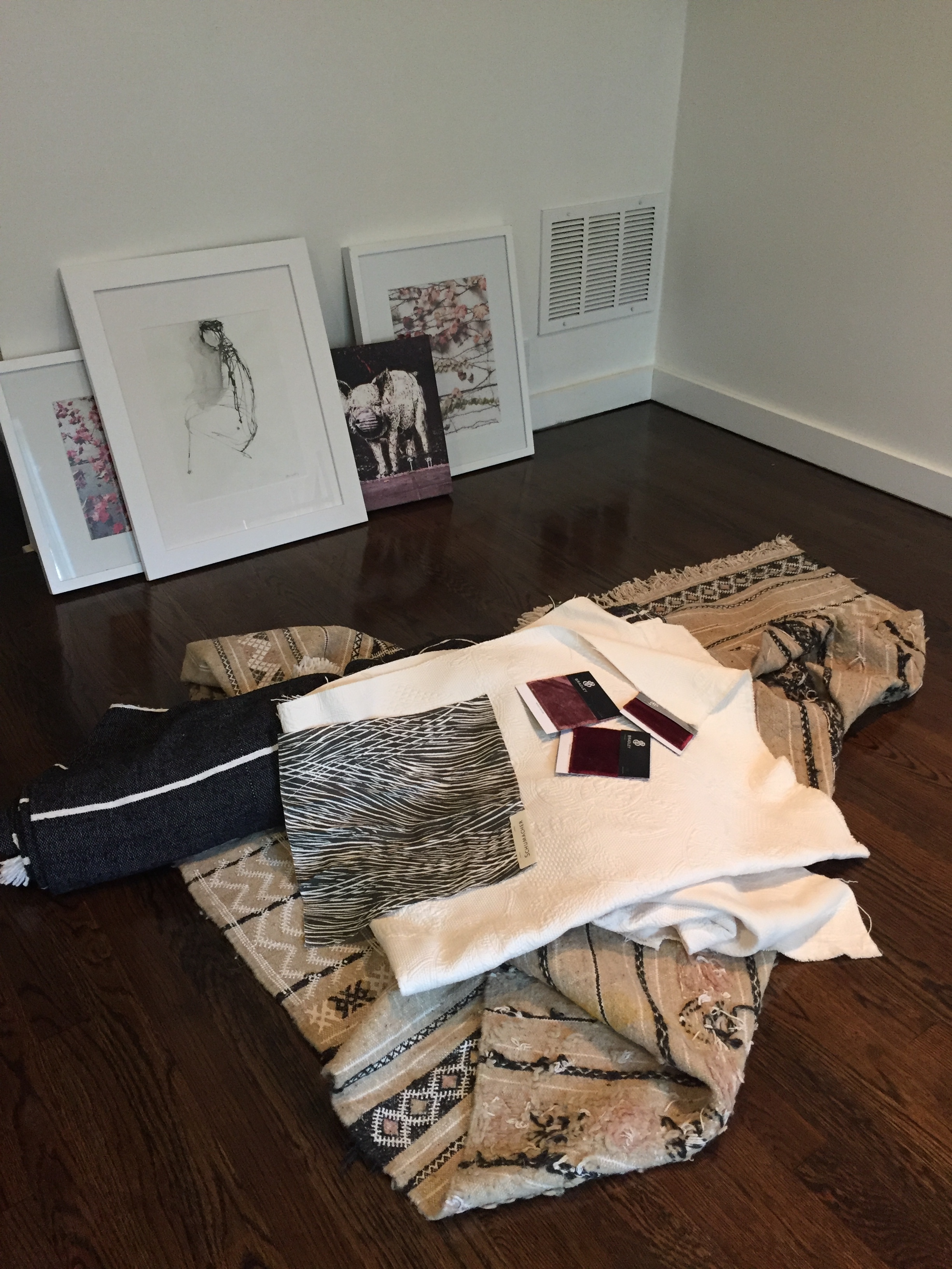
above are some of the jumping off points for the overall inspiration.  i'm digging the white, gray, and wine/pinky color combo!!  i think it's sophisticated and sexy!  i got the rug and gray throw in morocco last fall and wasn't sure if it would work for a client, but the longer i've stared at them, the more i want to keep them!!  i'm not sure if i'm going to do a window treatment, but i may do a simple shade in the gray and white "wispy" patterned fabric.  my office is on the bottom level of my split level ranch so there's not a ton of light coming in and no one can see in because of my back yard, so i don't really need anything on the windows, but it may just be the added ooolala of texture and color! the art against the wall is a mix of photos i've taken (on paper and canvas) and an ink piece from one of my favorite artists, holly irwin.  i adore the simplicity of it and it reminds me a lot of my mom, who had some skills with ink :)

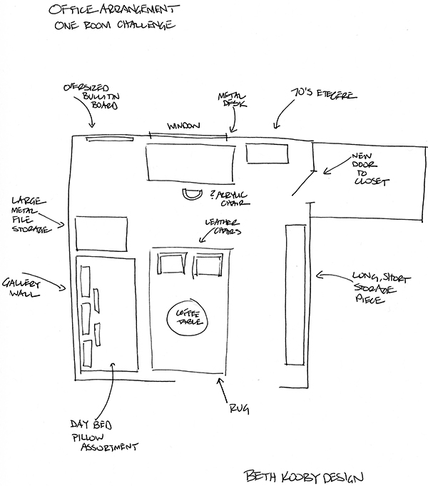
next, let's quickly go through my to do list (not too daunting ;) and my very loose interpretation of a furniture plan!  i say very loose, cause this is my space and i'm not trying to impress myself!!!  i've already done that ;)  hahahaha... ok.

ta da to do list!!

ta da to do list!!

obviously not to scale, but you get the idea.  desk by the window for what natural light there is, haven't decided on my chair yet.  i have a really groovy, vintage, lucite and white pleather vanity chair i may use.  i have 2 vintage chrome and white leather directors chairs that could work as well, but i'll probably put those by the day bed for more of a loungey, meeting area feel.  the coffee table i'm thinking of using is currently in my daughter's room.  the $1200 oly, shell top, fabulous metal curvy legged coffee table i bought when i was married, that really doesn't belong in her room...  it didn't work in my living room, or anywhere else in my house, but i can't give it up, so she's the lucky duck with the fancy pants table in her room!!  (she's actually taken really good care of it, too :). anyway, the long, short storage piece is currently an off white with a touch of patina on the edges unit that houses my collection of vintage radios.  i'd always planned to put up shelves on that wall to display the radios, but i'm not so sure.  full disclosure...  i'm getting ready to sell my house and i'm not sure i really want to go through the effort of shelves there.  perhaps more art!!??  i've always wanted an oversized bulletin board for inspiration photos and paint swatches and other designery-looking things artfully tacked up, so now's my chance!!  we'll see how that goes ;)  i'm making that myself, and while i'm rather handy with a power tool, there's no guarantee it won't turn out like some pinterest fail.

since my before shot is an empty room (and really, where's the fun in that?!)  i figured i'd throw in some bad photos of my poor furniture hanging out in the garage.  above left is one of the directors chairs!  sleekness!!  the upper right shot is my metal table (turned on it's side), which i had custom made many years ago, when i lived in new york.  it was my dining room table then, but has functioned as a work table since coming down south. shopping your own house to repurpose things is always a great place to start with any project!  on the bottom is the underside of the daybed that i had made for my dad when he came to stay with me over 2 years ago.  perfect example of not getting around to something in your own house!!  i always planned to do some sort of nice cover for the mattress, but, alas, who has time to do anything for themselves??  hence the absolute need to stress myself out crazy by doing this challenge.  time to get. it. done.  (and just think of everything i could have accomplished if i hadn't written such a ramble...).  

week 2 done-ish.  back to reality!  here's the link to check out all the other designers, invited and guest, in the one room challenge!!!

beijos,

beth

one room challenge, with crickets...

hello!  today is (was) my birthday.  i love my birthday.  i'm an aries, so i tend to be a little self-centered anyway (ok, add to that i'm an only child...), so to really have a day where it should be all about you, sign me up please!!  anyway, i'm also a fan of growth and rebirth and renewal and trying new things and living life!  so when i realized today, besides being my birthday, was the first day of the 6 week one room challenge, i thought, i need to do this!!!  i've loved stalking this challenge and the blog, callingithome.com, for quite some time, so what the heck?!  might as well join in!!! annnnndddddd...  it just so happens that i have one room that needs to be beautified!!

so the crickets reign in my room because it's empty right now and in reality, the windows are open because i'm dying up in here with the toxic fumes from the floor stain and polyurethane.  the crickets may actually be dead from the toxins permeating their little bodies.

ok, i know the suspense is killing you!!!  here's the room i'm making over as a guest designer:

to give you a little background, this space is my office.  or at least it was until i discovered some extensive water damage and what appeared to be an alien life form growing out of my base trim.  no shit.  after i had completed all my upstairs renovations, i proceeded to go through the pile of stuff i had redistributed to this level, and was attempting to pick up a magazine that was under a bookshelf along the window wall.  the magazine wasn't moving anywhere, so i gave it a bit of a tug, finally managing to pull it free.  attached to the magazine was this growth of a thing that left me in shocked horror.  honestly, i still really can't believe i didn't pass out.  i did calmly take it to my trash can, disposed of it, and texted my contractor, freaking out, begging, pleading, crying to please come save me from whatever life limiting specimen this thing was.  overly dramatic you say?!  i beg to differ.  i thought the world was coming to an end.  of course, i did have photos of the evil growth, but can't find them now :(

what you see above is major progress!!  i had to rip up the concrete slab that was just outside the windows and replace the drainage system, which wasn't deep enough to prevent water from slowly seeping up through the subfloor.  the hardwoods and trim and half the wall leading to the closet on the right had to be removed and have been replaced.  my guys did a great job of piecing the new hardwoods back in and getting the dark stain right!  the thing on the right wall is not a collector's piece of abstract art.  it is my cable modem taped to the wall because i'm inept at anything computer and didn't want to worry about having to reconnect anything.  pathetic, yes.  whatevs.

here's some in progress pics of replacing the hardwoods and the hardwood zamboni.  it has been way too long that my downstairs has been a disaster zone and i'm so excited to be moving forward!!!  add to that, the challenge of making it look super fab and blogging about it!!  let's go!  here's the link to follow along.  

So, every thursday, i will post an update on the room and how things are going!!  and in the end, the big reveal!!!

beijos,

beth

this is not glamorous...

i know you all think being a designer is an uber glamorous position in society and when you see me roll up in my jeans and chuck taylors you're a bit confused.  but let me help you out.  the end result is really glamour fabulousness in an affordable, i can't believe this is really my house, magazine worthy (wink) kinda way!  let's take a peak at some behind the scenes happenings at a current bathroom project...

i am working with a wonderful young couple, in a mostly renovated bungalow, with a young son and another on the way!!!  we are renovating the existing lower level bathroom to have a bit more storage capacity and to stylishly accommodate 2 boys and guests.  i got this, don't fret.  

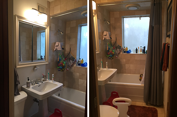
let's start with a few before shots to get you warmed up.

ok, really not too terrible to begin with.  but they are cool and hip and pedestal sinks suck. 

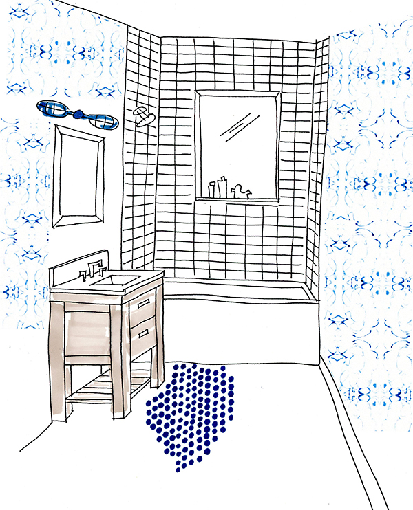
here's the pitch.  super duper fab modern wallpaper, simple, but more clean and crisp shower tiles, edgy, yet traditional, penny round floor tile in a beautiful saturated navy, and a custom vanity with an essence of craftsman!!  to quote my fabulous clients, "you knocked it out of the park on the first shot!".  well, thank you ;)

no making fun of my presentation sketch!!  and as reality happens some times, things will be slightly different in the end, thanks to things like vent ductwork and electrical blah, blah, blah.  but, you get the gist :)

here are some in progress pics...

i've said it before, and i'll say it again, i love demo.  it fascinates me what goes on behind walls and floors.  nothing too crazy here, but i also have a love affair with power tools, so seeing them in action is a big thrill ;)

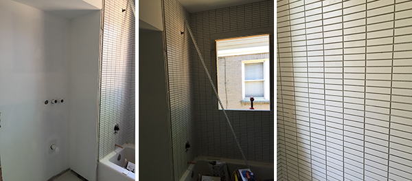
here's where we are now...

sooooooo completely digging the flat finish, modern, stacked mosaics from ann sacks in the tub|shower (all the way to the ceiling, thank you very much!).

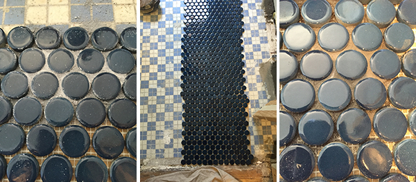
here we are deciding on the direction of the floor tile and the grout color.  yes, class, you can rotate the tile sheet 90 degrees and get a completely different look!  it's hard to tell, but we're going for the slightly darker grout on the floor. 

so, here's where we get to the really non glamorous part of my job.  Early this morning, I met with the contractor to discuss the grout and a few other things.  not in a posh office, but literally in the street, avoiding being run over by the mail truck and positioning myself so as to not lose my vision with the sun laser beaming itself right into my eye (true story). we were laughing as we both traded balancing tiles and grout samples and drawings while we each took pictures for reference.  yes, people, this is how the magic really happens.  on the fly, in the street, with an iphone.  sorry.

see the car tire in the background??  that's cause we're in the street!!  and i love it!!

it only got really, truly non-glam when i later rolled up at the house to meet with the tile guy, who was finishing his lunch outside (please picture we're in the south, where the devil incarnate is the pollen all around).  he rushes inside to greet me, pulling the tissue he has stuffed in his nose (i'm assuming to "block" the pollen - people go to all lengths here, trust me!) out.  ok, dude, i am not shaking your hand after witnessing that, but let's talk grout...

it's not such a glamorous process, but this will be one super cool bathroom!!!

beijos,

beth


thank you traditional home...

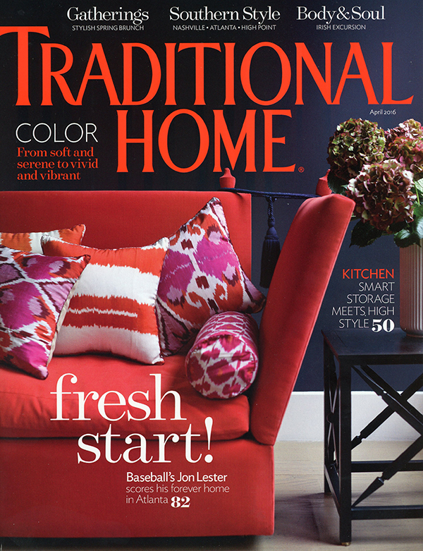
the april issue of traditional home magazine is out and per usual, includes a recap of last year's atlanta symphony orchestra's decorators show house and gardens.  i was so very fortunate to have designed 2 powder baths in the show house dubbed "chateau soleil"!!! and even more honored to have one of those baths included in the magazine!!!  such a big deal and crazy excited!!  i loved that bathroom.  i'll be doing another post about the makings of the room, now that this issue is out!  it was also in atlanta homes & lifestyles, the september issue, when they highlighted the show house!!  so i really am doubly honored!!  here's the link back to that post... the whole show house thing was such a tremendous experience.  i met so many wonderful people, worked my butt off, and got to create rooms that were completely driven by my own creativity!!  what artist doesn't dream of that!!  i also just want to pinch myself for being on the same pages as so many uber talented and seasoned designers!!  i mean, holy crap, my bath photo is in between parker kennedy, melanie turner, and stuart pliner (all of whom i've admired for years!!!). the little blurb about my space is also just under the photo of my major design crush's room, robert brown!!!  the first time i met him, the house manager almost needed to smack me upside the head for the shaking, squealing little teenager meets rock star, that i turned into for a few minutes.  it was kind of amusing and bob (that's what i can call him now cause we're tight like that ;) handled it like the personable, suave, gentleman that he is!!  sigh...

ok, enough of the sap, on to the pictures!

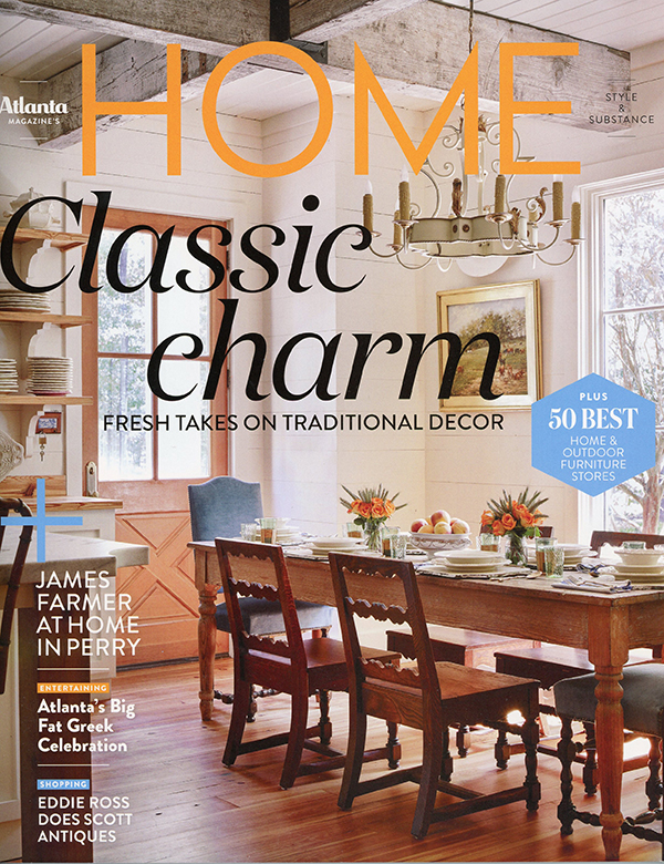
the cover, obviously ;)

the cover, obviously ;)

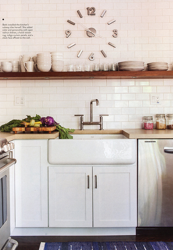
it really makes me so giddy to see my room in here!!!

it really makes me so giddy to see my room in here!!!

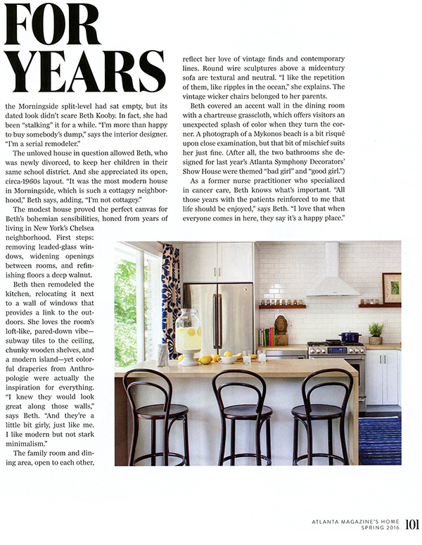
my little blurb right under robert brown's room photo!!!  fabulous!!

my little blurb right under robert brown's room photo!!!  fabulous!!

so there you have it!!  i am proud, i am honored, i am reminiscing about a fantastic experience, i am missing that bathroom like a dope, and i am having an incredible year so far!!!  stick around, cause there are a couple more things coming up that are super duper exciting!!!!!!!!

beijos,

beth
death of a showroom...

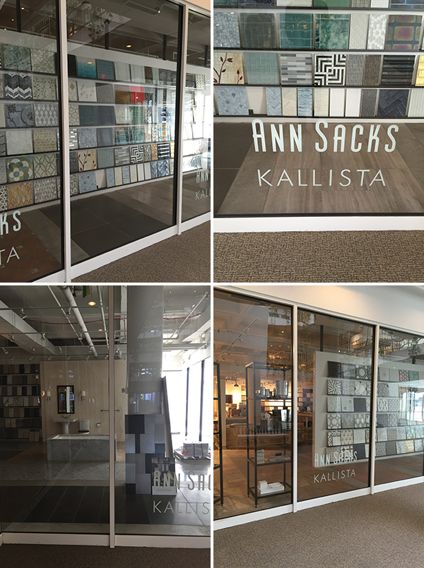
2 weeks ago i received a horrific email!!  i had sent my rep at ann sacks an email asking about a particular order and got back a blanket response that the atlanta showroom was closed as of feb 29th and if i needed any further assistance to please contact the miami showroom.  what????!!!!!  noooooooo!!!!!!!  while the thought of a really good excuse to road trip to miami briefly crossed my mind, i was more overcome with sadness at the loss of the showroom i have spent countless hours in over the past 10+ years!!!  and it was so sudden, so unexpected, so unnecessary!!!  why!!!  


whenever someone died in my family, my aunt mary was always the one who would pull together a photo collage of that person for display at the wake (chicago catholics = big families, lots of parties, and embarrassing photos).  as i stared at the email, i couldn't help but take my own photographic trip down memory lane of my beloved showroom...  my son literally "hung out" in one of their display tubs when he was a baby and crawling all over the place!  we called it a porcelain playpen, and a fancy one at that!  i have spent numerous hours staring at the shelves of tile sample boards, dreaming about the spaces those tiles might inhabit.  truly a love affair.  i had the same rep for years, susan cronin, and our kids have crossed into double digits together!  then came julie, christina, and lashae and there's always been lots of laughing, idea sharing, and hey, come in and see the fabulous new things!!!  seriously, i have tears.  sure, miami's fab and all, but it's just not the same as glorious tile and people who know me 15 minutes from my house!!!  big sniff.

so in aunt mary fashion, i give you my photo collage of the ann sacks atlanta showroom at adac...

we'll start with me pressing my nose on their window blubbering like an idiot :(  the lights were off, but there was one guy inside eyeing me like i was some kind of crying, creepy freak.

now on to a good number of shots i've taken through the years of favorite tiles, tiles that needed to go somewhere, one day, or tiles that had a very specific destination.  

and now a few of some extra special tiles...

next, i figured i'd throw in some finished projects where i used ann sacks tile...

the picture that's been saved over 10k times on houzz!!!!!  this blows me away!!   wall tiles lucian in oxygen. photo credit emily followill jenkins

the picture that's been saved over 10k times on houzz!!!!!  this blows me away!!   wall tiles lucian in oxygen. photo credit emily followill jenkins

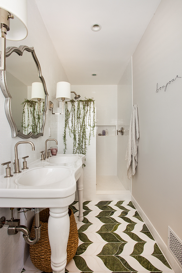
beau monde custom color marble floor in marilyn pattern.  crazy love!  the walls are in lume, white glass.  photo credit jeff herr photography

beau monde custom color marble floor in marilyn pattern.  crazy love!  the walls are in lume, white glass.  photo credit jeff herr photography

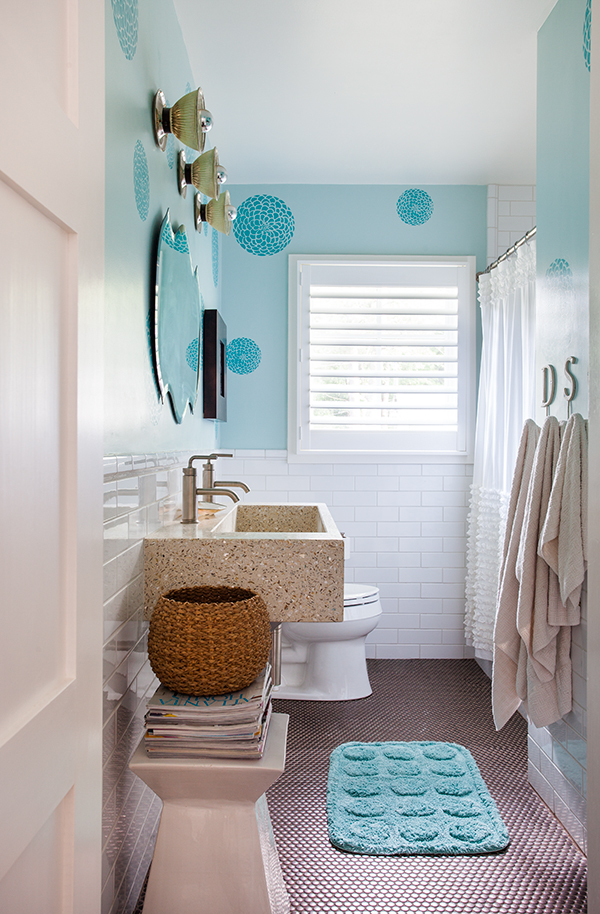
kids bath.  bronze, savoy penny rounds on the floor!  photo credit jeff herr photography

kids bath.  bronze, savoy penny rounds on the floor!  photo credit jeff herr photography

2015 atlanta symphony orchestras decorators show house and gardens, the bad girl bath ;)  lucian metallic in pewter, so damn sexy!!  photo credit emily jenkins followill

2015 atlanta symphony orchestras decorators show house and gardens, the bad girl bath ;)  lucian metallic in pewter, so damn sexy!!  photo credit emily jenkins followill

work in progress at maison zen glam, which is done now, but i haven't taken professional photos, yet.  foundation brick in a herringbone pattern in the kitchen and idris moroccan style tile in the master shower!!!

work in progress at maison zen glam, which is done now, but i haven't taken professional photos, yet.  foundation brick in a herringbone pattern in the kitchen and idris moroccan style tile in the master shower!!!

another current work in progress, coolest house in decatur!!  and that super sick profile ridge in bondi non-iridescent!!!  omg, it's so yummy!!!

another current work in progress, coolest house in decatur!!  and that super sick profile ridge in bondi non-iridescent!!!  omg, it's so yummy!!!

so, dearly beloved, we read this blog post, to commemorate and celebrate a treasured showroom via pictures.  i will always remember the time spent fantasizing, researching, loitering...  occasionally partaking in the free mini candies they kept out in a bowl on the main work table...

beijos,

beth


be steel my heart...

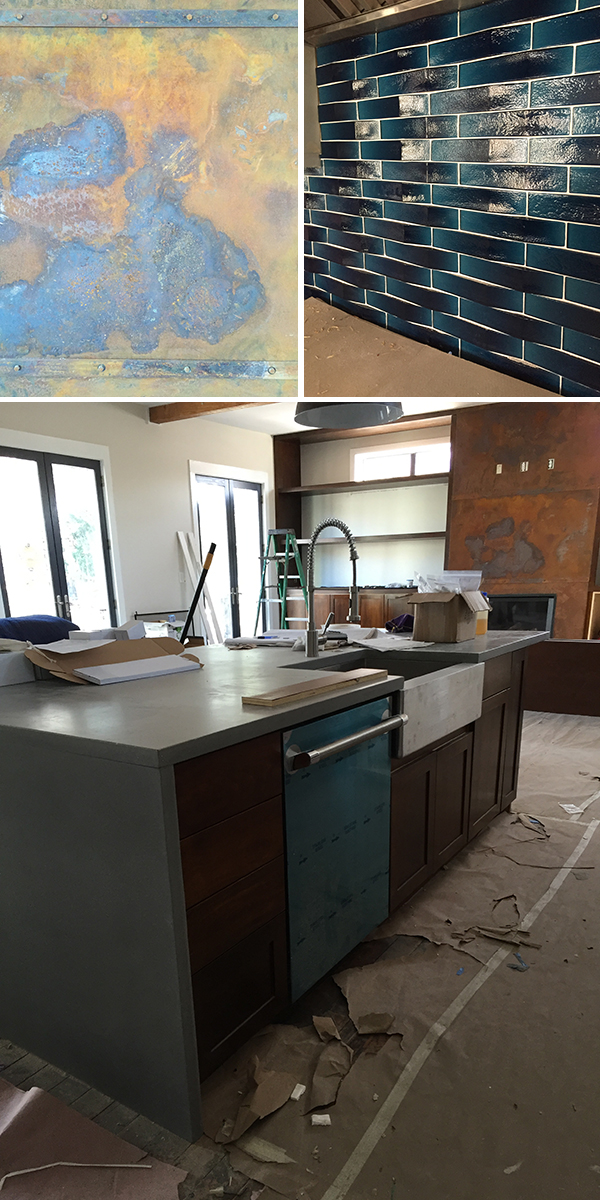
ok!!!!  the steel facade for the fireplace in the coolest house in decatur (also in the running for longest project ever) was installed this week!!!  clients are out of the country and we've been working on the degree of rusting for the steel via text and pictures.  really, how easy is that!!??  for crying out loud, it's hard enough to understand how hand made tiles may vary slightly from piece to piece, but rusting steel??!!  um.  well.  it's a total crap shoot basically.  it actually took me a good long while to accept that the metal is a lot more rusted than i was anticipating!  with the surrounding cabinets, the warmth is perfect though!  and the whole thing just looks amazing anyway, i'm really pleased!!!  and again, so very blessed to have clients that encourage me to think out of the box and do some stuff that's a bit over the top!!  please ignore the outlets that have been cut into the front (i'm crawling under my blankets and pretending that's not really happening and will try to get the professional photos taken before the big screen gets installed).

so here's two cool shots that look even cooler side by side!!  the surrounding cabinetry is still getting installed!  yet another little surprise, "hey guess what?!  we have windows in the midst of your beautiful cabinetry!!".  i love the light coming in, but not in the original plan, so try to overlook that as well ;)

here's the full frontal and the floor in front of it!  we are still searching for the hearth - will most likely be a lovely soapstone or slate slab!!  you can see the incredibly awesome reclaimed maple floors!!  love!!!!

for another perspective, here's looking at it from the kitchen and with the concrete island top and the custom cabs matching the fireplace cabs!  i. just. can't. stand. it!!!!  we weren't sure about the darker island (as opposed to maybe painting the island cabs grey to match the outer cabs), but I think my original design stands.  i'm digging it.  looks more like a furniture piece, which i like.  and so does my cabinet maker who stained about 30 samples til i was satisfied (no joke!!).

this fireplace has definitely stolen my heart!!  i really hope the homeowners love it as much as i do!!

beijos,

beth
she's so popular...

hello there!  how are you?  excellent, i hope!?  me??  well, to be honest, i'm a tad uncomfortable.  i was invited a couple of weeks ago to participate in traditional home's new trad talent hunt design competition.  trad home is the online version of traditional home magazine and more edgy, youthful, colorful, and dare i say, fun!!  i was so very honored to be asked, but kinda cringe at the thought of soliciting votes.  i'm just not any good at this sort of thing.  growing up, i was never. ever. the popular girl.  i was friendly with everyone, but seemed to carry the brunt of social and physical awkwardness for my small community.  in high school i started out as this pseudo punk rock chic turned cheerleader and even ascended to co-captain of the varsity cheerleading squad my senior year!  one might think this would afford me some popularity, but alas, no.  i was voted most creative though, a designation i wholeheartedly cherished!!  and so here we are, nearly 30 years later (damn.) and i'm pleading for votes, like it's homecoming or something!  i really would love nothing more than to be one of 2016s new trad designers of the year (they pick 10), really, truly, like, holy crap how awesome would that be!!?? so i will put it out there to the social media universe.  please, please, won't you vote for me (daily until march 15th), via facebook or twitter, and pass on the info to your friends, family, coworkers you harass with lame-ass memes and prayer requests??!!  thank you in advance for your support!  here's the link to vote for me.  please know that there are some super talented designers also in the running, whom i wholeheartedly support!!  such as parker kennedy and krista schwartz and tami ramsay.  so please feel free to vote for them, too!

i suck at taking screen shots, so here's a blob of the photos i selected that i think best represent what "new trad" is.

i'm really happy and proud of what i've accomplished in my time as full-time interior designer and again, am so very honored to be a part of this competition!!!  and really, isn't this much more fun than voting in our crazy primary elections!?!? ;)

beijos,

beth
home sweet home...

i've been thinking about what to write about this for over a week now.  the phrase "words cannot express" is about the only thing i'm coming up with!  but that really sucks when you write a blog.  the spring issue of atlanta magazine home hit the newsstands this week and i would love my writing about it to be even just slightly close to being as eloquent as the writing in there.  but, given how badly that sentence sucked, it probably won't, so i'm just going with a wild stream of consciousness here.  please bear with me and try to keep up :)

omg omg omg!!!!!!!  i've known my house was going to be in the spring issue for a good while now, but here it is, in front of me, real paper, gorgeous photographs, such perfect writing, omg including a mention in the editors letter, tears flowing, laughter too, because i laugh sometimes when i'm nervous or highly emotional (i laughed at my moms memorial service and the priest shot me a "you're definitely going to hell" glare, but i couldn't help it!).anyway, this is major awesomeness as an interior designer and was part of my whole goal of going back to being a nurse practitioner full time after my divorce and buying this house and making it special.all in all, i believed in myself and i planned and dreamed and worked hard and stayed up late and stressed and dreamed some more and i couldn't be more proud of myself.i am so very grateful to lisa mowry (field editor extraordinaire) and betsy riley (editor of atlanta magazine home) for also believing in me and giving me such an honor of such a freaking amazing spread!!!i do think, however, that the pic of my daughter and i, would have made a fabulous cover shot, but whatever, that james farmer, the male martha stewart, damn him, beat me out.  sigh.  i'm working on a pb+j recipe book currently and have plans for a children's picture book of cool tattoos, so the next magazine that's wanting to feature me can feel confident i. will. be. the next creative powerhouse 'round these parts and deserve to be the cover girl.:)  ok anyway!!!  on with the spread and it is sho nuf quite the spread!!!

betsy's writing is just so perfect.  ok, i'm crying again.  i worked so hard for so long in nursing and had so many phenomenal, life-stimulating, perspective-effecting experiences that to see moving into such a different arena could be also be celebrated and respected means so much to me.

so when i received my early edition and showed my daughter (pictured above with me:) she asked me in her sweet, tiny voice, "mommy, do you think, when it comes out on newsstands, you could buy me a copy so i can show my friends?" :))))))))))  for god's sake, child, i'm buying every copy in the city!

soooooo!!!!!!!  just beautiful photos, thanks to my awesome photographer, jeff herr!!  and apparently not very realistic, since my sitter asked where i put all the stuff that's usually all over the place??  um.  in the closets.  duh.

let me just say again how incredibly honored i am to be a part of such a wonderful magazine!  truly.  betsy and her staff are just fun, talented, nice, open people and i've just loved every issue since it's rebirth!!  (crying again)  it's real-life design at it's finest!  go get your copy before i buy them all...

beijos,

beth

love me tender...

going a little old school here with one of my favorite romantic songs on this celebration of love day...

love me tender, love me sweet
never let me go
you have made my life complete
and I love you so

love me tender, love me true
all my dreams fulfill
for, my darling I love you
and I always will.

love me tender, love me dear
tell me you are mine
i'll be yours through all the years
'till the end of time

love me tender, love me true
all my dreams fulfill
for, my darling I love you
and I always will

beautiful painting by holly irwin, titled, "still", available at dkgallery

beautiful painting by holly irwin, titled, "still", available at dkgallery

i wish you all happiness and love, everyday, and 'til the end of time :)

beijos,

beth
is that a finish line i see...

ahhhhh.  valentine's weekend.  the yearly patronage to all things "romantic", red, and chocolatey!  oh how i wish both of my wonderful couples competing in the longest house build ever were going to be sharing some sort of beautiful moment in their new homes. unfortunately, no such luck, that's not going to happen.  but, we are getting reeeeeeaaaaalllly close though!!!  and it's exciting!!!  check out some update pics...

since we're all feeling blue (and not romantic, red, and chocolatey), i'll start with my favorite pics in the hopes of raising some spirits!  holy mother of fantastic light fixtures!!!!! as you may recall, this is the modern house i've been working on for over a year.  we are now installing light fixtures, which surely means there must be an end in sight, right??!!  as i've said before, ordering anything online is always a gamble, but this.  oh this.  the first shot was when i was meeting with the electricians to make sure we were all on the same page :)  standing at the bottom of the stairwell, they look even higher up than they are and i had to sit a spell before i fell over... i didn't stay while they completed the installation, but after the builder called me to tell me this was quite possibly his favorite thing in the entire house, i had to come back to see the splendor for myself!!!  I am over the moon and more importantly, the clients love it, too :)  yay!

ok.  maybe it's a tie for my favorite thing so far?  this island.  pardon me, but holy shit, this is so incredibly gorgeous, there almost are no words!  and my pics don't do it justice.  i actually laid on it.  it's so pretty!  walnut is my favorite wood and i have been dying waiting to see this thing in reality.  i have sweated.  i have had many conversations about this with all the various people involved.  and i am elated to see it sitting there!  just waiting for some careless soul to drop a hand tool on it and f***ing ruin it!!!!! aaaaahhhhh!!!  ok.  deep breath.  that only happens in my house :(  the floors throughout the house are also spectacular, love them!!!

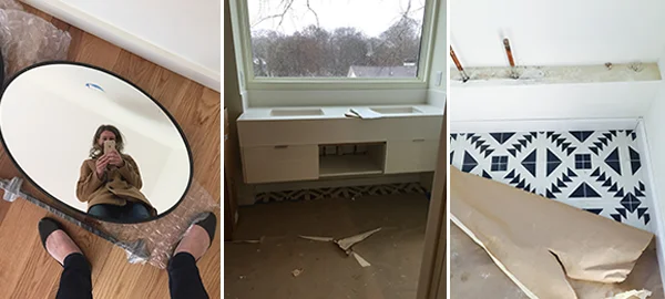
here we are in the master bath, which is inching toward completion!  the custom mirrors were delivered and i was being silly taking pictures with them :)  they won't stay on the bedroom floor, no silly!!  they'll hang from the ceiling, above the vanity, in front of the large picture window.  the vanity is a pretty straightforward design (by me :), but has proven to be one of the more complicated items to finish!!  wrong finish to the drawers, first counter not templated correctly, backsplash too thick, there's supposed to be a third drawer in the middle... when i was there yesterday, the plumbing was being installed and low and behold, they were installing the faucets for the other 2 bathrooms in here!!!! aaaaahhhhh!!!!  really. can't. wait. to see this room done.  correctly!  :)  finally, just a little reminder of the awesome floors in this room!!!

moving on to couple #2...

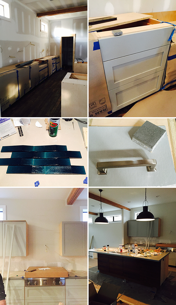
here we have the fabulous lights above the concrete island!!!  love!!!  the super cool, industrial, large spray faucet is installed and ready to hose down the entire room!  and then!!!  can you see it??!!!!  oh wait, there's a close up!!!!  my favorite, totally swoon worthy, glass, teal tile from ann sacks!!  lord help me, this tile!  every house (or maybe room ;) should have that something special that just makes you squeal with delight that you went for it!  this tile is that :)  i want to just live on the countertop, but again, what's more important, the clients love it!!!  yay again!

up next is the master bedroom and master bathroom progress.  the vintage-looking fireplace was installed and looks fantastic!!  the bathroom is coming along.  you may notice the wall patch just above the medicine cabinet?  the lights were hung too low the first time and when i returned, saw they were hung too high the second time!  sigh.  at this stage, no one really cares anymore, which is exactly when i turn into nagging nelly!! we've waited soooooo long...it has to be perfect!!!!  the awesome, tropical shower, complete with teak floor and split-faced stone wall!!!  oh take me away...

on the third floor, things are going in reverse order...you can see the cabinets aren't painted, but yet, countertops and appliances are installed.  more sighing.  this space is a super cool aspect of this house and will be awesome sauce when done!!! 

for now, i'm praying that by the time the next "holiday" is upon us, everyone will be green with envy at both these fantabulous homes!!!

beijos,

beth

the heat is on...

it's almost insane that this "classic" glenn frey song has been playing in my head as I've prepared to write this blog post for quite some time.  insane because, as some of you may be aware, he died this past week.  having grown up listening to the eagles and having a particularly memorable experience in a vintage aston martin while listening to one of their albums, I am immensely saddened by his untimely death. 

however, this blog is not about glenn frey and his song.  it's actually a continuation of the "race" between 2 of my projects for the title of "the longest project ever".  I blogged about the modern house that is near completion a bit ago, click here for a reminder...  this other house is possibly one of the coolest ever, because of it's originality.  it's in downtown decatur proper and is a commercial/residential space.  complete with 3rd and 4th floor roof decks with spectacular views and all kinds of unique touches, such as a teak floor and led lighting in the master shower, a steel facade on the main fireplace, a secret door bookcase, a garage door leading to the roof deck, and gorgeous reclaimed maple floors!!  their initial directive was to design a house that is "industrial, craftsman, rustic, and tropical".  looking at how things are coming together, i'd say we're doing pretty good as mix masters!

anyway, the blog title comes from a sign that is posted onsite.  i've wanted to post it to a certain blowhard's campaign instagram account, but i haven't yet.  i've got my own social media to deal with!

so, above, we have instructions in english, spanish, arabic, and farsi.  (i may have the last two confused, i'm rusty on my arabic and farsi)  this is what america looks like to me!  it is still a melting pot and i am proud to be working on a project where i am exposed to different cultures and different languages and everyone is working hard and honest and with the common goal of creating something fabulous!

ok, on to some photos of the actual house and progress!!

above are some exterior shots.  the upper left was taken literally over a year ago!!  the upper right is more recent and shows the new windows, new upper porch enclosure, there's a new front door, and the same leafless tree.  in the middle is the original back of the house, which is now the middle of the house and the stairwell next to it is that middle! the old window was filled in with some of the old brick from elsewhere on the old facade. on the bottom is the side facade in progress.  all of that is new.

here we have the main living room, with the reclaimed maple floors!!  the top 3 pics are the same space in various stages (clearly, I could have blogged about this sooner...).  the back wall gets a metal facade with metal bands and rivets and built in cabinets/bookshelves!  i'm holding my breath on this as the cabinet maker assures me he also happens to be a metalsmith.  oh really?!

on the other side of those doors is the kitchen.  if you were expecting another white kitchen, think again!!  (although i do love me some fresh, crisp, whiteness in my kitchen ;) this bad boy includes lovely light grey custom cabs with a walnut-esque wrap around one side and the back of the island!  the other leg of the island and all the countertops are a fabulous grey concrete from my peeps at dex :)  it's sublime.  fortunately for my man, steve, and the other installers, there was a crane on site the day of installation to hoist the top of the island up to the second floor and in through the doors!  talk about excitement.  it's getting cra cra in decatur!  the jacuzzi hot tub and the havc were also hoisted to the 3rd and 4th floor decks respectively.  in the middle you can see a small concrete sample.  the color name is "natural light", but don't let the name confuse you. the beer is cheap, but these countertops are not!

also above is a shot of the drop dead gorgeous tile that makes me over the moon giddy just thinking about it!!  oh how i have daydreamed about this tile being installed and given that we selected it about a year ago, i'm hoping i won't have to wait too much longer!!!  oh!!  that sultry, but elegant, teal glass rising up from the strong, slightly industrial concrete - oohlala what a dynamic duo!!  omg omg omg i'm so excited!!!  of course the tile guy and i have had a chat and he understands bad things will happen to him if this tile gets mucked up.  i'm not kidding :)

the lights over the island were also just installed and i have to say, i am so pleasantly surprised!  they were a great price, a lot of light for the buck, and they look perfect in person!  i'm always a little nervous when i order inexpensive things online.  it's kinda like asking for disaster and having to suck up the shipping costs.  but not this time, baby! wisteria for the win!!

moving from the more public areas to the more private areas, we come across the guest bath, with it's fun cement tile floors, stone shower, and slightly tropical (think british colonial caribbean.  loosely.  don't think too hard :).  another shot on the bottom of the fantastic reclaimed maple floors, that really only took an eternity to get installed.  i believe we may have waited for the trees to grow, flooring to be installed somewhere else, aged/beaten/weathered/whatever, then removed again and brought to us!! anyway, they are in and have i said they're fantastic!!??  there's a view looking down the hall into the master bedroom.

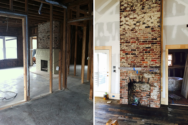
on the left is shortly after the initial gutting of the old house.  in the master bedroom we raised the ceiling (i'm not even really sure how high it is??  maybe 20 feet at the peak?!) and exposed all the brick on the fireplace.  on the right is a more current state of affairs. there's more to be done there, including installing the old fashioned looking gas fire insert, hearth, and uncovering the gorgeous walnut slab mantel piece!!!  yay!  

here's the super cool master bath.  the top left was a long time ago.  after finding the perfect round tub for the bathroom, i was on site to literally plot it out in the actual space. (dimensions were king here as there had to be enough room for the exceptionally large shower and for space to actually stand comfortably in front of the vanities)  no one else was there and it was starting to get dark.  i creeped myself out just a bit by being alone and then made it worse by taking pictures that look like an alien invasion was about to happen!!  of course, i had drawn everything out on paper, but for me it's so much better to be able to stand in a space.  so while some designers may be wonderfully proficient in computer drawings, i prefer arranging scrap pieces of 2x4s!  it also makes me feel like a tough chic on a construction site, especially when i get a splinter!  those fancy pants autocadders can't say they get injured much!  wusses ;)

on the bottom are some in progress shots of the biggest shower i've ever been in! possibly to be the wettest as well since there are jets, dual shower heads, and a waterfall!!  and when the mood is right, they can also turn on the led lights tucked into the niche (don't ask.  that wasn't part of my original design and it reminds me a little of the undercarriage of a pimped-out low rider car, but my client thinks it's awesome and wanted it and i'm ok with that!!).  

moving on up to the 3rd floor we have that secret bookcase i spoke about earlier.  there was going to be a lot of unused space above the old attic/roof of the old house, so the builder suggested creating a room (you step down into into it).  it's great for extra storage or stashing that drunk friend who needs to chill for awhile ;)  and who doesn't want their own passage to narnia or hogwarts or some other magical place??!!  the 3rd floor is technically the homeowners office and we'll leave it at that.  i will say the limestone bar will make a fabulous place for deal making over cocktails and the coolness factor of the garage door opening onto the roof top deck is sure to impress and handy if the meeting needs to be moved outside!

everyone is hoping this house will be done within a month, but until then there's still all kind of mad dashing, installing, rescheduling, praying things fit, and a few more decisions... the heat is on!

beijos,

beth

happy new year...

(ha!  it helps to hit send!!  to all my lovely subscribers, happy belated new years, the champagne musta started flowing a little too soon as this shoulda gone out yesterday ;)

this past year has been amazing and i am so grateful.  it was filled with incredible clients, new friends and colleagues, inspiration, and travel!!  i am living my dream and am super stoked to leap into 2016!  stay tuned for lots of pretty pictures (i have a few projects i'm hoping to photograph real soon!), 2 magazines in the spring, possible inclusion in 2 books, and a few other behind the scenes things that are boring for you, but exciting for me!  2016's gonna be a fabulous year!!!!!!!

beijos,

beth

it's the final countdown...

if you too, just started singing the 80's rock classic, well, then... i like you!!  and if you have no idea what i'm talking about, here's the link :)  oh, yes, pathetic, and that's how i like it as we approach the end of 2015!!  makes me feel like we've come so far!

this post has absolutely nothing to do with synthesized 80's music.  (you're welcome)  it has everything to do with my top 10 instagram pictures.  these being determined by number of likes.  i'm a very sentimental person, so going back through pictures is fun and emotional and time-consuming for me.  but just like revisiting 80's music (and occasionally finding a particularly ridiculous photo of myself) it's worth it, because it makes me smile, and that's a good thing! :)

here are the highlights of the year of beth kooby design on instagram, plus my 3 favorites...
above we have a close up of an awesome glass bubble chandelier at bungalow classic. that's my go-to place for a good dose of pretty!  the root chandelier and insanely sexy wallpaper shot was the #1 favorite!!  not the most artistic shot, but reminds me of how incredibly fortunate i am to be doing what i love and that i have clients that allow me to push some boundaries and do things that are edgy but beautiful!!!  the bottom shot is from my recent trip to paris.  strolling along the seine.  god bless my iphone for this perfection.  i personally can't get enough of this shot.

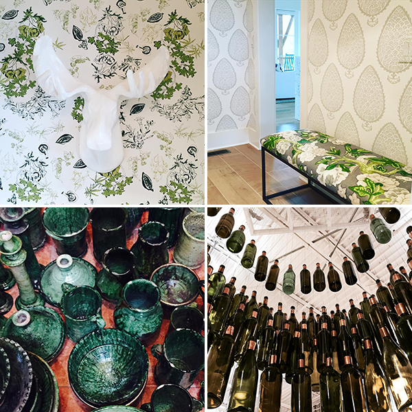
i so love this moose on the hip, english-ish wallpaper, in the powder room of maison zen glam!!  and the next shot is in the pantry, which i threatened i was going to move into, because i knew it was going to be soooooo awesome!!!  on the bottom is the proof i have a thing for multiples :)  on the left are the ceramics i went absolutely gaga for in morocco and are now neatly cataloged in my inventory!  and on the right is a pic of an anthropologie display.  they hit it every time with their store decorations and there was no other perfect way to usher in the holiday season than an alcohol-inspired chandelier!!

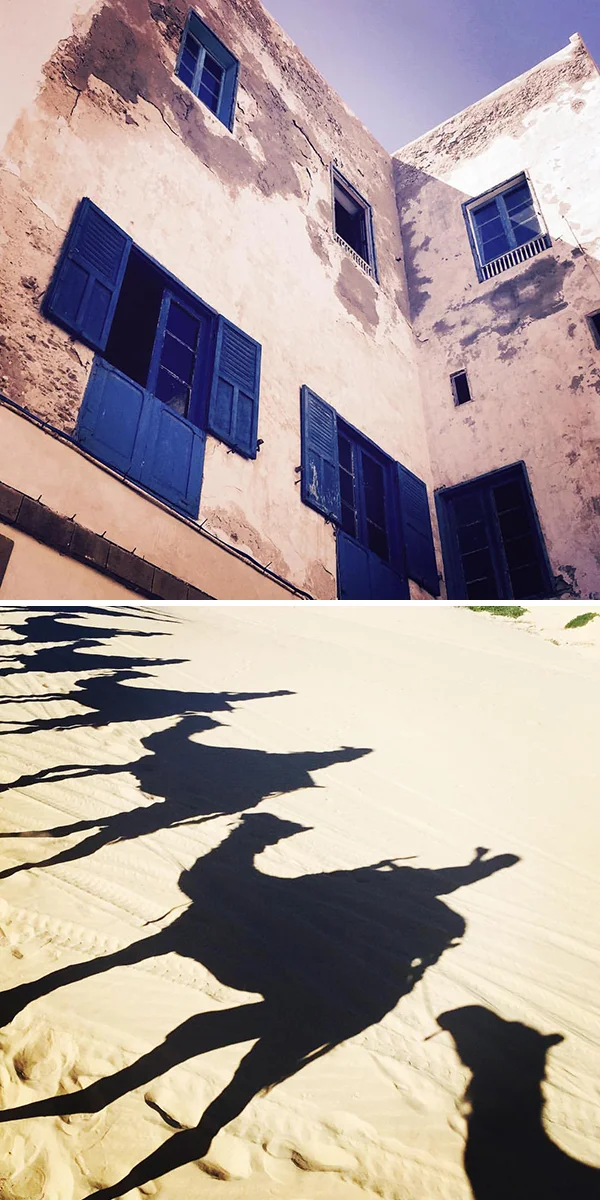
it seems like only yesterday i was basking in the moroccan sun...  but it was actually about 3 months ago now that i began plotting my retirement to the mediterranean town of essaouira.  the stucco and that blue are just sheer perfection!  i love, love, love shadow pictures and this camel shadow picture (i'm on the very last camel) is no exception!!! what a fabulous memory!

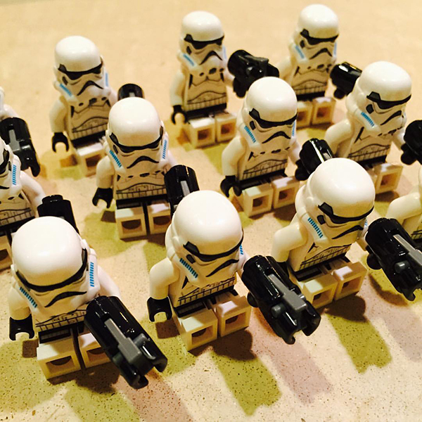
this pic right here was the #2 favorite!!  seriously.  i learned if i wanted to really ramp up my followers on instagram, all i needed to do was hashtag star wars.  seriously.  crazy people.  ok, that's it for the public vote!  now on to my personal favorite instagram pics of 2015!!

here we have what i affectionately dubbed the "egg drop flop".  i got to volunteer at my son's school for the egg drop out the window project and this is one of the more artistic shots ;)  but it also reminds me how very wonderful it is that i now have the flexibility in my schedule to allow me to witness such incredible scientific events!!  on the bottom is a shot peering into the bottom of a bucket with sheet rock nails.  yeah, that's right, those are sheet rock nails and they couldn't be lovelier!!  beauty is truly everywhere, you just have to look :)

my final fav was taken at dex industries.  the fabricators of ridiculously fabulous concrete stuff!!!  the natural light from the skylights above makes this look like some kind of highfaluting professional shot!!  combine that with all the fantastic memories of creating things with these wonderful people and it brings me to tears!!  i laugh so hard with lauriel whenever i'm there, one might want to do a breathalyzer!  the gritty, behind the scenes messiness, is gorgeous to me and should be in a museum somewhere!!!  (and i'm very full of myself ;)

so that's it!  the top 10 plus 3 beth kooby design instagram pics of 2015.  have a fantastic new years eve rockin' out to some kickass synthesizer music and maybe some wine coolers!!

beijos,

beth 

the force awakens, but does it cook...

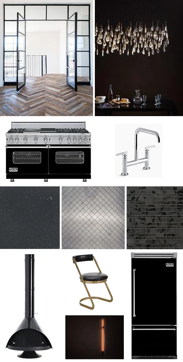
i've always wanted to design a dark and sultry kitchen.  with all the hoopla over the release of the new star wars movie combined with some swanky black tiles i recently saw, i thought it might be fun to fantasize about designing a kitchen fit for the dark lord himself. wwdvd?  let's take a look...

i've always been crazy about steel doors and windows, so those are going somewhere! maybe leading out to the space deck?  maybe just part of the architecture?  i think wood floors might be gentler on his knees, which surely take a beating with all the combat and cape lugging he does.  that ochre light is one of my favs and reminds me of a bunch of sperm.  perfect for the father of the year!  (inappropriate sometimes i am).  a big ass viking stove in black is perfect for cooking for the masses of storm troopers and drones. the bridge faucet by kohler reminds me a little bit of a starfighter jet, but it's also beautiful. i would definitely propose concrete countertops in charcoal and a combo of versailles mesh mirrored tile and black selvaggio tile, both from ann sacks.  sexy, sexy, sexy.  and what man doesn't want to amp up his sex appeal while making sure his soufflé doesn't flop? ;)  the selvaggio tile is somewhat reminiscent of the deathstar to me (see picture below).  of course i'm using the black malm fireplace somewhere because, well, it looks just like his helmet and that's just funny to me!  i love that dining chair from dwell.  it has that look of blasting into lightspeed that i think dinner guests would appreciate.  down on the bottom is a sconce i came across and gosh golly if it doesn't look just like, well, you know :)  lastly, more black viking appliances!!

i think darth's gonna love it.  look how comfortable he is offering a nice glass of cab?!  he just needs a fabulous place to entertain!  and hopefully this one doesn't get blown up.

may the first course be with you!!!  (i am cracking myself up ;)

beijos,

beth

ho ho home for the holidays...

a couple of weeks ago, i had the joy of attending the opening night party for the atlanta homes & lifestyles home for the holidays showhouse!  thanks to a few glasses of wine and socializing, i didn't actually get to really "see" much of the house.  these things happen and it was a really wonderful night, except i couldn't work up enough courage to introduce myself to one of my major design crushes, john oetgen.  he was right there, in front of me, but i don't do small talk well and randomly introducing myself to some icon of design would have ended in me sounding completely incoherent or tripping on something, neither of which would have left a positive impression, so i forwent (i may have made that word up ;) the whole experience entirely!

anyway.  this past weekend, i finally made it back for a proper tour and managed to drag my son with me!!  he loves it when i force design on him.  really.  ok, on to some pics!

we'll start with some gorgeous art.  it is beyond thrilling to me to have witnessed the evolution of art in the showhouse since i moved here in 2003.  art in atlanta has broadened it's range so much as well, it's really exciting!  you could be big time or local and boom, there you are, for thousands to see.  what i like the most is the mix of edgier, more contemporary art, with the traditional.

let's continue with some of my favorite red moments.  joel kelly, joel kelly, joel kelly.  you make a sexy room, my man.  the study just oozed sultry and i wanted to roll around in it! he was pleasant to talk to as well. :)  i like a nice bath and fancy smelling liquids at the ready always speak to me!  thank you carole weaks.  jessica bradley, how do i love thee for putting a rosary in a soap dish - i never really knew what to do with that thing!  love the color in the bdjefferies table setting downstairs!  and so healthy!  the upstairs studio, by barbara marshall howard, was a bit overwhelming to me, but totally embraces what a showhouse should be (in my opinion).  elegant, but over the top, bold and courageous, thought provoking, controversial even.  i'm still not really sure what this room is about but i love that hat thing on what i think is a piece from alan avery?  thank you, steve mckenzies, for the whimsical dresser!!  this rug, by judy bentley, is the epitome of au currant pattern meets christmas!  well played, lady!

here we are in the greenish section...  john oetgen's dining room is elegant, fun (you don't see the pink chairs in this pic!), and has a wonderful collected vibe to it!  steve mckenzies tear drop light fixture in the back stairwell is simplistic, but fills the space beautifully!  the peacock rug in joel kelly's study continues to ooze sexiness.  (and i did roll around on that rug when no one was looking!  almost knocked some stuff over but it was worth it ;)  the scale with the little owls was one of my favs!!  these were in kerry howard's fabulous laundry and mudroom.  my grandma collected owls and seeing these brought back wonderful memories :)  holy culinary dream world batman, this kitchen by robert brown is simply to die for!  i love everything about it.  i want (someone else) to make me a romantic dinner while i lounge at one of the two islands, looking glamorous, sipping my glass of expensive wine...  sigh.  the pretty presents are on the first island - my love bought me some very large pieces of jewelry this year!  in the middle on the bottom row is melanie millner's uber cool kids bedroom!!  last is a rug in mallory mathison glenn's preppy color explosion suite!  fabulous!!

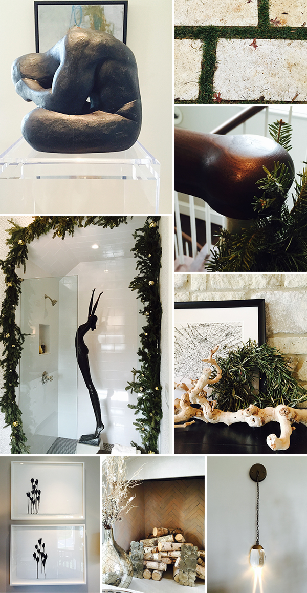
onto the white.  (see what i did ;)  i am a huge fan of sculpture, mostly because it's not a skill i have, but also because of the textural quality to it.  this piece!!  i just want to put my arms around him and say "it's gonna be ok".  that and "have you been working out?" moving on.  the front grounds were lovely, limestone pavers outlined with green, yes please!  just look at this gorgeous rounded, but modern, walnut handrail!!!  throw in some white balusters and evergreen accent and good god, i'm on the stairway to heaven!! back in melanie millner's bathroom and following a very loose religious theme, i'm singing jeff buckley's "hallelujah" in my head.  quite possibly my favorite moment in the entire house!  i love everything about this!  the sculpture is simply stunning, the evergreen is festive and organic, simple, but elegant tile.  all of those together, visual perfection!!! james wheeler's covered terrance was also elegant and included the perfect vignette photo op!  artwork in the upstairs hall by chris holt reminds me of hearts, but is actually tulips :)  the master bedroom fireplace, by carole weaks.  and finally, perhaps my favorite lighting company, ochre, on display thanks to barbara westbrook!

what a beautiful showhouse!  happy holidays :)

beijos,

beth

the race is on...

i have two projects that would make for a lousy hgtv special.  why?  because they're based on reality ;)  they've taken much longer than 1 week (a 30 minute episode) to finish. i have been working on these two full houses (ground up people) for a year now. yes, a year.  i am so ready for them to be completed and not because i'm ready to be done with my clients.  no. no. no!!!!  both of these houses are so ridiculously awesome in their own right, i just can't wait to see them in their total fabulousness!!!  seriously.

first up is a modern house i've shown you before.  a loooooong time ago.  we've made some progress and i am hoping they might actually move in within the next 2 months!!  

so, we now have not only sheet roc, but painted sheet roc!  the exterior is painted! windows are in and trimmed.  the beautiful hardwood floors are in, but you can't see them cause they're covered up!!!  no peaking!!  above you have the exterior, the uber awesome atrium above the stairwell, the stairwell, and the patio doors off the great room (i was a little infatuated with the shadows and light effects here...).

there is so much gorgeous white i can't stand it!!!!  it's my favorite white, which very coincidentally happens to be benjamin moore's "color of the year" for 2016, "simply white" - yeah, duh, it's been my fav for like 9 years or so?!  if you follow me on instagram, you may have seen this floor before?!  it's crazy sick!  the wife originally was hoping to see it in the kids' bathrooms, but it wound up in the master!!  the empty space with the beautiful window is where the master vanity will be, along with a multi glass bubble chandelier and 2 custom, oval, iron mirrors!  i really cannot wait to see this space completed!! :)  you know i like a niche in the shower.  well.  this one is wall to wall, mack daddy gorgeous beyond in the tub/shower room!  oh yes.  the lower right shot is in one of the kid's baths.  simple white, super cool grey penny rounds on the floor and beautiful natural, custom wood vanity - perfection!!!!

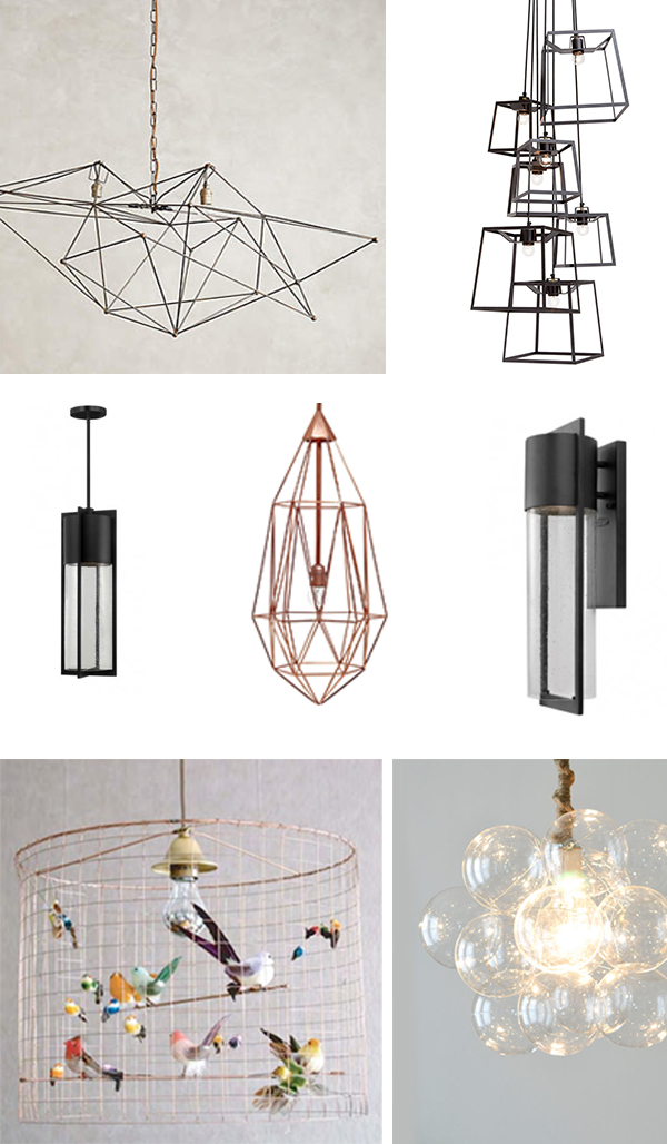
above are some of the lighting selections for this fab house!  starting from the top left, dining room, stairwell, exterior front entrance, powder room, exterior sconces, daughter's bedroom (cacacrazy about this one!!), master bath...

i will profile the other contender in the "who's house will take the longest to finish but could actually be done in the next 2 months" in another post (so soon, i promise!  hang in there!!).

beijos,

beth