and i'm already behind!!!! ugh. seriously debating my sanity right now. the good thing is i'm in the throws of moving and grooving on 2 awesome powder baths for 2 different clients, wrapping up some decorating on the modern house and another living room project, and fully designing 4 kitchens, 3 master baths, and 5 other baths for 4 separate clients. damn, girl! yeah, that's what i said!! throw in some other smaller things... ok! focus, focus, focus!!
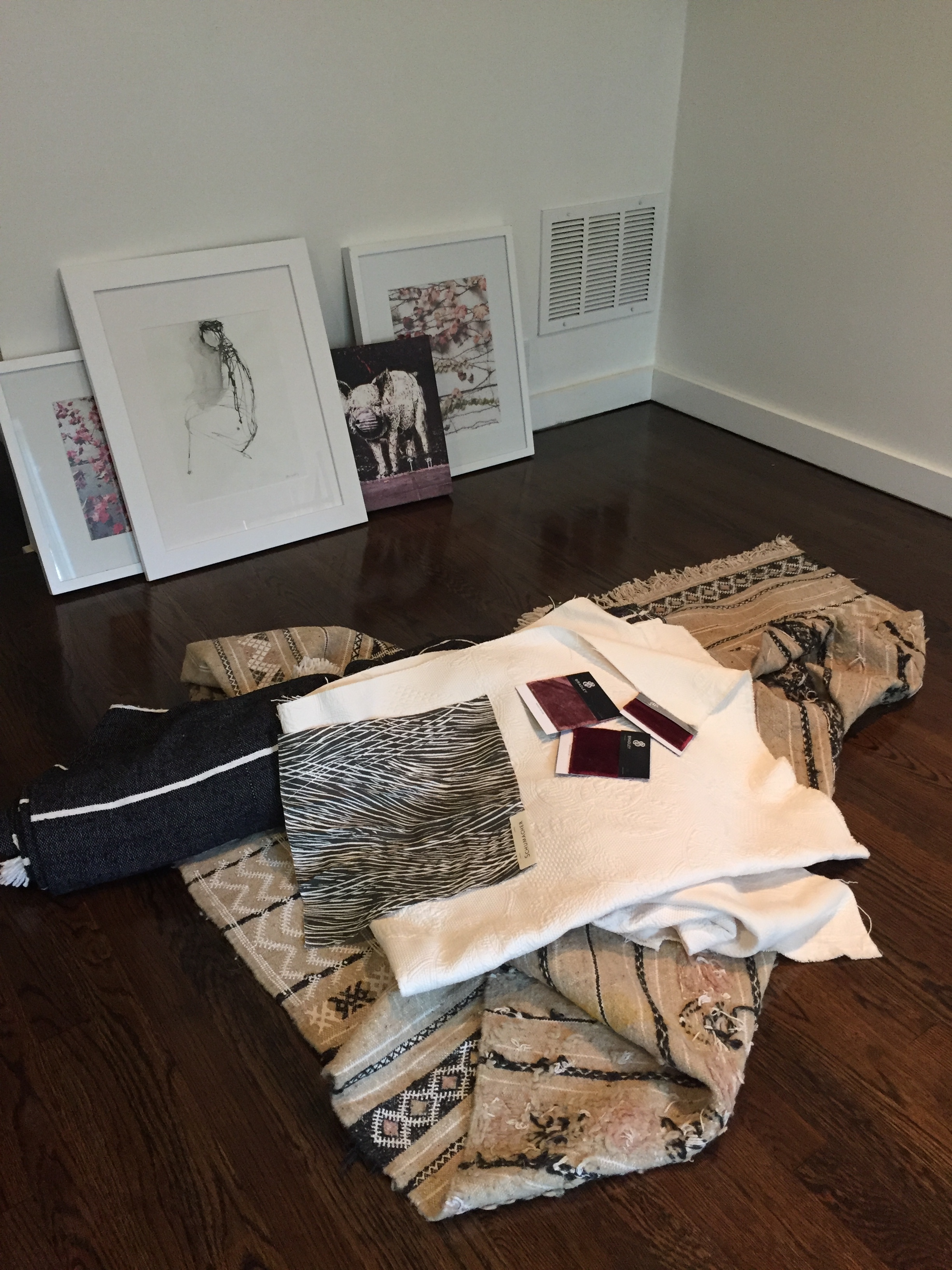
my one room challenge is revamping my office space after recovering from water damage. the floors have been pieced back together, restained, and are now dry!! (they still smell, though) i'm looking forward to hyper-organizing my samples (mostly tile and wallpaper). i currently have things in a mix of baskets and boxes, but have always dreamed of an uber neat collection of matching containers. we'll see what my budget allows down the line :) most of the big things (like furniture) i'll be using are things i already have. we'll see how nuts i get with the accessories! here's a few pictures of some of the things i know i'll be working in...
above are some of the jumping off points for the overall inspiration. i'm digging the white, gray, and wine/pinky color combo!! i think it's sophisticated and sexy! i got the rug and gray throw in morocco last fall and wasn't sure if it would work for a client, but the longer i've stared at them, the more i want to keep them!! i'm not sure if i'm going to do a window treatment, but i may do a simple shade in the gray and white "wispy" patterned fabric. my office is on the bottom level of my split level ranch so there's not a ton of light coming in and no one can see in because of my back yard, so i don't really need anything on the windows, but it may just be the added ooolala of texture and color! the art against the wall is a mix of photos i've taken (on paper and canvas) and an ink piece from one of my favorite artists, holly irwin. i adore the simplicity of it and it reminds me a lot of my mom, who had some skills with ink :)
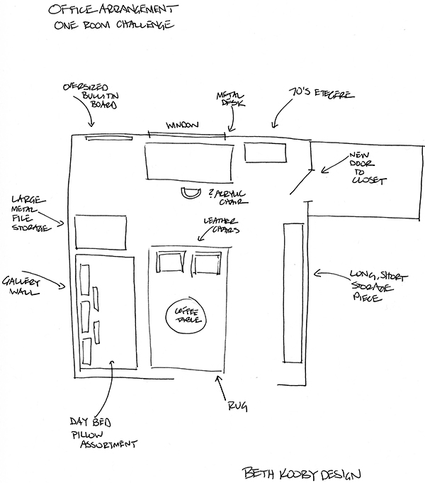
next, let's quickly go through my to do list (not too daunting ;) and my very loose interpretation of a furniture plan! i say very loose, cause this is my space and i'm not trying to impress myself!!! i've already done that ;) hahahaha... ok.
ta da to do list!!
obviously not to scale, but you get the idea. desk by the window for what natural light there is, haven't decided on my chair yet. i have a really groovy, vintage, lucite and white pleather vanity chair i may use. i have 2 vintage chrome and white leather directors chairs that could work as well, but i'll probably put those by the day bed for more of a loungey, meeting area feel. the coffee table i'm thinking of using is currently in my daughter's room. the $1200 oly, shell top, fabulous metal curvy legged coffee table i bought when i was married, that really doesn't belong in her room... it didn't work in my living room, or anywhere else in my house, but i can't give it up, so she's the lucky duck with the fancy pants table in her room!! (she's actually taken really good care of it, too :). anyway, the long, short storage piece is currently an off white with a touch of patina on the edges unit that houses my collection of vintage radios. i'd always planned to put up shelves on that wall to display the radios, but i'm not so sure. full disclosure... i'm getting ready to sell my house and i'm not sure i really want to go through the effort of shelves there. perhaps more art!!?? i've always wanted an oversized bulletin board for inspiration photos and paint swatches and other designery-looking things artfully tacked up, so now's my chance!! we'll see how that goes ;) i'm making that myself, and while i'm rather handy with a power tool, there's no guarantee it won't turn out like some pinterest fail.
since my before shot is an empty room (and really, where's the fun in that?!) i figured i'd throw in some bad photos of my poor furniture hanging out in the garage. above left is one of the directors chairs! sleekness!! the upper right shot is my metal table (turned on it's side), which i had custom made many years ago, when i lived in new york. it was my dining room table then, but has functioned as a work table since coming down south. shopping your own house to repurpose things is always a great place to start with any project! on the bottom is the underside of the daybed that i had made for my dad when he came to stay with me over 2 years ago. perfect example of not getting around to something in your own house!! i always planned to do some sort of nice cover for the mattress, but, alas, who has time to do anything for themselves?? hence the absolute need to stress myself out crazy by doing this challenge. time to get. it. done. (and just think of everything i could have accomplished if i hadn't written such a ramble...).
week 2 done-ish. back to reality! here's the link to check out all the other designers, invited and guest, in the one room challenge!!!
beijos,
beth


