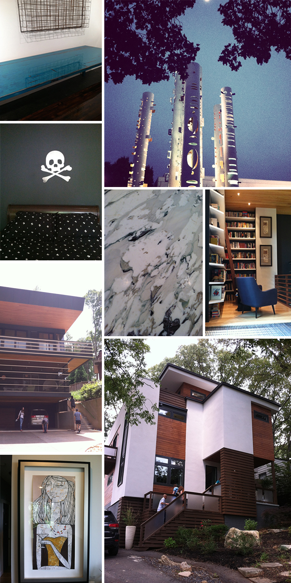
so i'm about 2 months late on this post, but you know, i've been do'in stuff. like starting a brand new life and all. anyway! back in june "design is human" week 2014 happened and you should know about it, if you don't already. it is the brainchild of bernard mccoy and elayne deleo and is the fusion of all things contemporary | modern architecture | design | product | philosophy | media | education | artistic promotion | outside the box thinking appreciation. there are lectures, films, product promotions, an opening night party, studio tours, and the ever popular home tour! here are some photos (actually, quite a few, take a seat and pour a drink). this year, i seemed to be more impressed with the art on the walls over the architecture itself, but still thrilled that we have something like this in good ole southern atlanta!!
soon, i will be photoshop savvy enough to get numbers on the pictures, but not just yet, so just try to follow along...
the opening night party at adac (atlanta decorative arts center) was fantastic! here there were various vendors of modern design phenomenalness and alcohol and good looking uber cool people. lots of schmoozing with architects and industry people, great night!
on to the pictures. that table top is insane! it was made by jpmcchesney and the color is simply divine. the next shot is of the windowed columns outside adac. moving on we have pics from the home tour (i only had a few hours of baby sitting so I was racing around town like a madwoman and only made it to about half the houses on the tour :( ). toxic kid room, the bed linens have the same skull and cross bones motif - ridiculous! the kitchen counter material, gorgeous. the library, accessible across an industrial grate "overpass", if you will. so, not only was i wearing a dress and flashing my undies to everyone below the grate, but it was reeeealy uncomfortable on the feet to walk on this thing. nice concept, but just not very comfortable. the street shot of the "witter" house. street shot of the "sanders" house. at this point i've surmised this year is all about the art, i'm not so dazzled by the architecture. although the exterior of the sanders house was nice, the inside was very expected. favorite art piece.
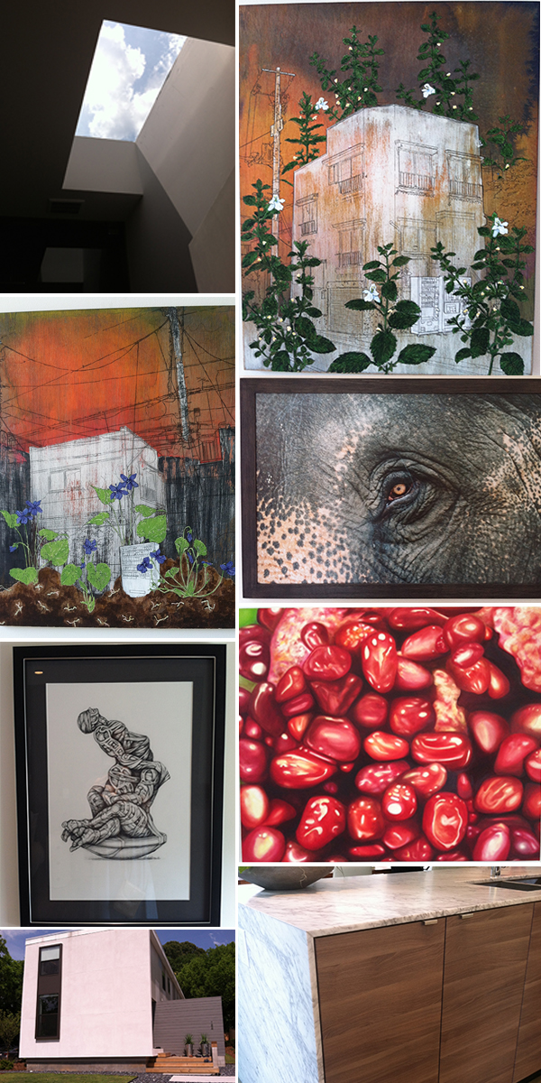
moving on, we have a large collection of little alien forms at the custer house, which was built, like 12 years ago and still manages to be oh so au currant!! kudos to my friends at tac studios for making modern classic :). there's a totally rad cocktail table and a light fixture that looks like side show bob in his golden years. next there were 3 houses side by side by the same architect on pearl street. the roof top garden on one was exciting as was the beautiful concrete wood transition between different levels in the house. the chess set was fun and tour goers were encouraged to play their best move! more crazy awesome art.
still on pearl street. who doesn't love a nice skylight?? except when they're leaking of course. otherwise a glorious way to spend time in the loo. more stunning art! i believe most of the pieces in the pearl street homes came from the gallery saltworks. beautiful kitchen island and house facade.
saving the best for last! my favorite of the homes i made it to (again, sadly, only about half the homes on the tour). this one is the work live space of modern architect, bill carpenter, of lightroom. it's my favorite because i'm jealous, envious, i'm coveting his space. i don't have many pictures because it's kinda awkward to be oohing and aahing and snapping photos while the owner is right there. and i had my kids with me that day and was terrified they might break something or burn the place down... the first shot is the top level roof deck, high above the hustle and bustle of decatur proper, so peaceful. love! the under stairs that i just thought looked neat, very raw and industrial, functional, works well with the very deliberate furniture and art choices thoughout the living space. see the transition on the floor from the living space to the wet | work space?? see it??!! the same thing happens going into the bathrooms!! crazy in love with the distinction between the spaces!! (from the practical standpoint, i'm assuming there's a hardier finish on the hardwoods that might get wet (the ones in the kitchen and bathrooms), and therefore stay more protected...). to top it off, there's a vintage ford parked in the driveway. get outta here, i'm moving in!!
beijos,
beth


