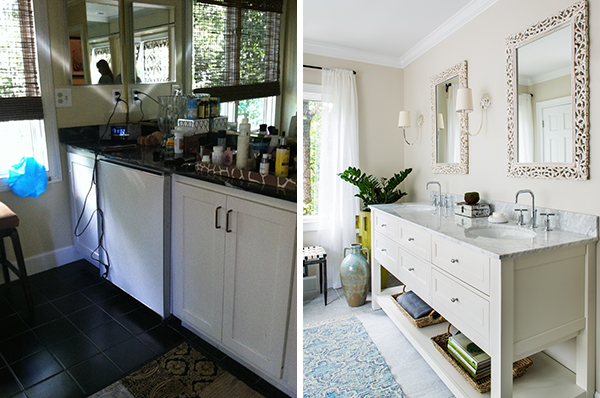
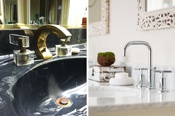
and they want their faux black marble, brass, and lucite back. hey kids! it's finally time for some before and after shots, a throw back thursday, a lesson in please dear lord, don't let this ever happen again! like. ever. even i'm a little amazed at the beautiful transformation of this master bathroom! this is my "on the ridge" project and i could not be more thrilled with the outcome!! the homeowner has great, eclectic taste. colorful, fun, and a little bit exotic. but, she's thinking about resale in the future and wanted a master bath that was gender neutral, but soothing, a little more classic, but could carry her own personality. i think we've accomplished that! let's have a gander...
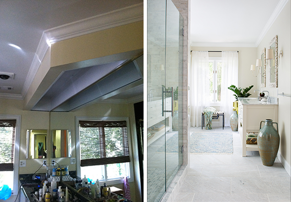
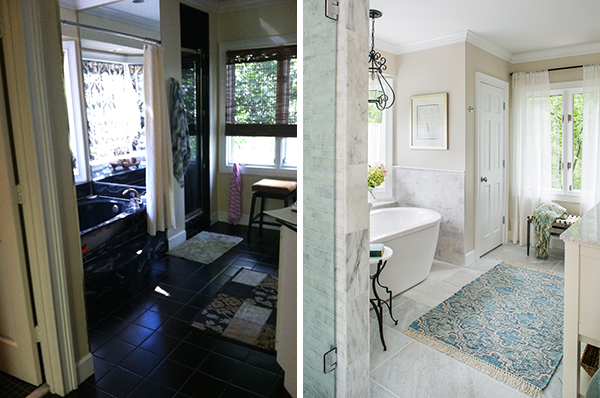
oh my word. just in case you're not certain, the pre shots will be on the left and the post shots will be on the right. upfront, please allow me to thank my photographer, jeff herr, for the beautiful post photos. the pre shots are all from my totally non-professional iphone.
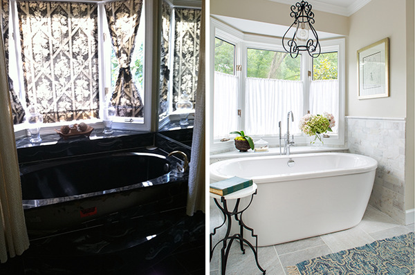
so. we had flourescent lighting, faux black marble counters and tub. lots of mirror. a fridge. yes, a fridge (it's actually a pretty sizable bath) and black tile everywhere!
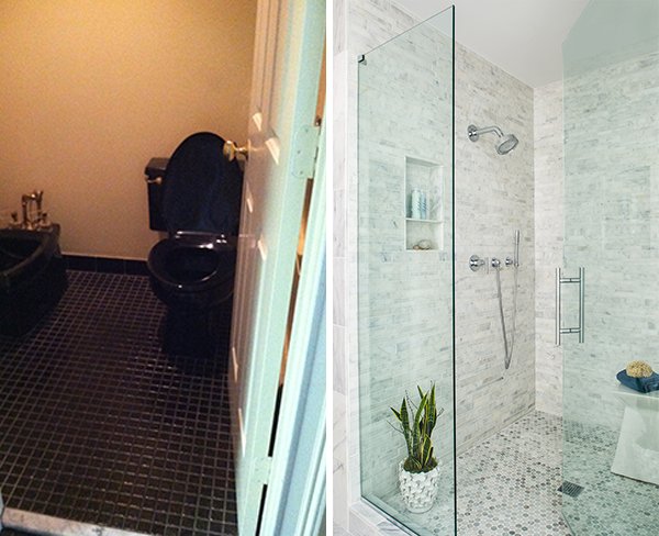
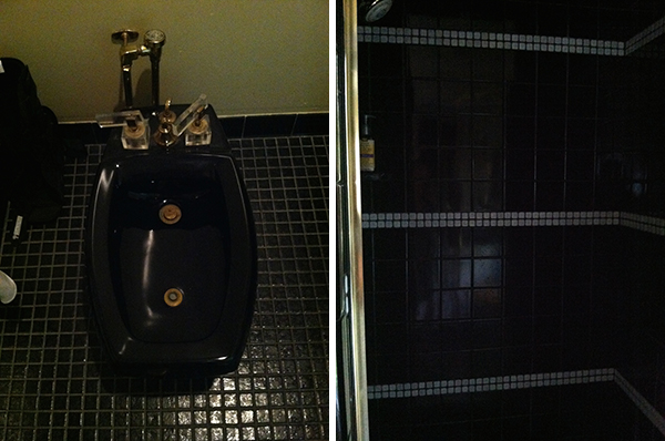
the tub stayed in the same location, but i swapped the old shower (in the far corner) for a linen closet and moved the shower to the old toilet and bidet room (a black bidet with brass and lucite handles - oh yes!!)
the only thing black we kept were some black iron accents, as seen in the gorgeous (and slightly girly) anson ribbon chandelier by urban electric co. and the small side table. even though she's in a fairly secluded location, privacy in the bathroom was still a concern. i used gauzy cafe curtains in the bay window to keep the light coming in and the peeping toms frustrated ;)
speaking of a black bidet and black toilet and black tile... there they are, in all their dark splendor! i'm a tad biased, but i like the new, marblelicious, over-sized shower much more! it only seemed to take forever to get the shower door installed. i'm still not sure what happened there, but it's up!! and functional. and looking like a spa!! (you may think the plant in the shower looks silly, but i'm a huge fan of life and green and i think it's refreshing :)
more great lighting with the sconces. i actually found the mirrors at world market and the vanity is from pottery barn! yeah, that's right - looking like champagne taste on a beer budget, baby! and we kept that beer cold in the mini fridge!!
well. on the left we have some bold design for it's time. loving the right!!!
on a final note, i give you a close up of the bidet. i have traveled to europe and i've worked in healthcare and i should be old enough, but for the life of me, i still don't really understand the purpose of this thing. why not just get in the shower?? which happens to be the pic on the right. perhaps sitting on a black fire hydrant is preferred to standing in a dark cave with a trickle of water moistening one square foot of your body at one time?
beijos,
beth
