.

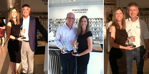
me and an award and some good looking people...

this week started off absolutely swell as i received my trophy from atlanta homes and lifestyles as one of their bath of the year winners!!!!  i'm not sure how to express the gratitude and excitement i have over this?!  it's tremendous and i am so deeply honored, it's just wonderful!  and just to remind everyone, this win was the impetus for quitting my "reality" job and pursuing my "fantasy" job full time.  

i was joking that a trophy for bath of the year might perhaps be a golden toilet or maybe even a silver bidet.  so i was pleasantly surprised when i saw the real deal and it's beautiful!!  a special thanks goes to oldcastle surfaces for creating such a lovely piece.  it is glass, etched with my particulars (last name spelled correctly and all), with a pretty little accent of stones and sparkly mosaics.  i tried to take some pictures, but thanks to the glass, i fear it needs it's own glamour shots session to get it right. complicating a solid shot are the fingerprints and some lipstick marks.  don't ask.

anyway...here are a few shots of some beautiful people and fellow winners!!

stan dixon (hottie), mary kathryn timoney, jo rabaut, georgia rappole, matthew quinn, me, and john coulter

stan dixon (hottie), mary kathryn timoney, jo rabaut, georgia rappole, matthew quinn, me, and john coulter

porcelanosa hosted the party and let me just say i closed the place down, thanks to nicole, rep extraordinaire, who gave me a tour of the showroom and sent me home with 50 lbs of catalogs!!  never mind the free wine.  there's even a complimentary trip to their plant in spain if i can somehow manage to spec porcelanosa products in, like, 15 projects.  no sweat.  

me and brad hanner, important person at ah&l, me and matt quinn, and me and robert soens, my contractor for my winning project

me and brad hanner, important person at ah&l, me and matt quinn, and me and robert soens, my contractor for my winning project

so above we have some of the good looking males in attendance.  brad is really lovely and we had some nice bonding time over all the insane tile offerings on display in the showroom!  matt and i go back to a very funny time when my ex husband and i were attending the opening night gala for a showhouse in atlanta.  i overheard someone giving "congratulations" to my ex (who is a surgeon, no where close to the design industry) and when i asked him about it he asks me who matthew quinn is.  um, why? well, he says, apparently i must look like him, because everyone keeps congratulating me on such a nice job.  matt and his team had done a few of the kitchens and baths in this particular showhouse.  i proceeded to scold him profusely for impersonating a design god!  it's funnier when i tell that in person.

robert is my contractor who was in charge of making the winning bathroom happen and i'm so grateful to him!  not only is he a good friend, but he gets my style and my obsession with perfection.

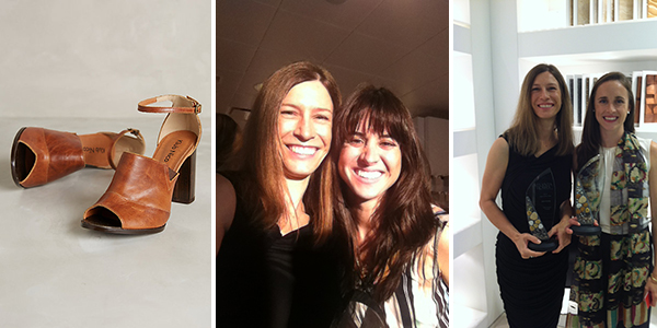
the kick ass shoes i wore, me and kelly carlisle, favorite gal at matthew quinn (now a published kitchen designer extraordinaire in her own right!), and me and georgia rappole of jo rabaut design

the kick ass shoes i wore, me and kelly carlisle, favorite gal at matthew quinn (now a published kitchen designer extraordinaire in her own right!), and me and georgia rappole of jo rabaut design

these shoes are perfect, a little tough, a whole lot sexy, and comfortable as all get out! they make me 4 inches taller too, which is icing on the cake.  actually it's the bride and groom on the cake!  they're about that tall, right?  

i love kelly.  she used to work over at matthew quinn collection, his hardware "jewelry" shop and was so on top of things!  not only did she know everything about everything, she was quick to respond with quotes and has fun with an impromptu sing-a-long to the oldies but goodies in the showroom (this is something i look for in my reps).  we had so much fun chatting and singing whenever i came in the shop.  she moved on up to the big house, design galleria in adac and i haven't seen her in about 2 years.  i can't say how nice it was to see her.  happy, looking good, in love with a great guy, moving up in the design world!!!  so thrilled for her and even more thrilled to have her back in my life!

georgia on my mind, girl!!  she works with jo rabaut and together they created one of the other winning baths.  georgia and i had a class together at scad and she is just a super cool chic!  she is also speaking at scad this friday to all the new students and their parents!!  i'm so proud to know her in many ways!  it's also always fun to see people who knew you way back when.  like when you had crew cut short platinum blond hair, a la billy idol.  she actually told me she prefers me with that blond crew cut look!!  hmmm. given that we have very similar hairstyles now, i think she's angling to live vicariously through my crazy hair bravery.  

again, such an honor, this award.  i can only hope to continue to produce the level of work that would deserve such recognition again.  as you can read above, the other winners are the real deal and are completely established as known talents in the industry! wow.  wow.  and more wow.  i am so excited for tomorrow!

beijos,

beth

are you being served?

if not, you're about to be.  in client vivid's brand spanking new fabulous dining room!!! that's right people, we finally found the perfect chairs!  bet you'll never guess where?!   go on... guess!!

target target target!!!  i was flying through the other night (with rowdy kids in tow and probably in flip flops completing the white trash look) and just thought i might take a gander at the offerings in the furniture section.  and there it was, in all it's glory.  perfect size, perfect shape, perfect color, ridiculously ridiculous price.  the target angels were harmonizing a perfectly pitched angelic version of "whomp there it is".  i'm not sure how much i've extolled the virtues of modern technology, but as martha would say of my iphone, "it's a good thing".  i quickly sent some pictures (actually it wasn't quick at all because for some reason my phone wasn't sending the 4 shots i was trying to send via text, and after i reattempted to send about 3 more times, and almost sentenced my phone to death by foot stomp, i had to revert to emailing the pics individually). this all took maybe an extra10 minutes, but when you've found the perfect chair after sitting on 30 of them, one gets a tad impatient...

anyway, client vivid, being equally excited about the chair and the price, on a sunday night, drove her butt around town and called various targets securing 9 of these chairs (we only need 8 but at this point she's going into full tactical mode and getting an extra in case one of the others is damaged or something - impressive actually).

ok.  enough about the chair.  we had a super fun time at crate and barrel ordering the table and the super cool end chairs and the light and some cute little owl pillows (for the fall ya know)!  she also had that wonderful moment where she saw her dining room as it will be.  elegant, exciting, comfortable, within budget, the first thing people will see when they enter her house.  this makes me really happy.  truly.  

on to decorating!!  as we were rearranging almost all of the store displays, we found some wonderful options for the centerpiece. I had one of those weird design epiphany moments of, hey, green gum balls would look incredibly fantastic on your dining room table!!  and she's considering it!

or possibly, gorgeous succulents in a sexy low metal planter.  stay tuned for the final reveal to see which made the cut :)

zeff-gumballs.jpg

                                                                        or

zeff-succulents.jpg

oh, decisions, decisions...

beijos,

beth

junk in the trunk

this week finds me deep in the storage issues (just where do we put that junk in the trunk??).  i met with clients in the fine city of decatur, where i am designing their new master suite (which includes a lot of reconfiguration - read, remove one bathroom and a small closet to create the new master bathroom and remove another small (and oddball) powder bath to create a new master closet).  i love change and this project has tons of it!! to make the whole thing even more exciting is they went for the custom design vanity i proposed.  this is like icing on the cake, i already get to design a beautiful new bathroom, but then add in the custom vanity - ooooooo child, i'm in heaven!!  they kept asking me where they would store all their bathroom junk.  well, given that i truly actually think about all this stuff, i've got this covered!  get rid of everything you own, except for a toothbrush and bar of soap.  

just kidding :)  although really not necessarily bad advice to take a look at what you really use and what you just hold on to thinking maybe you might need this one day, even though you can't remember it's original purpose...  or it expired in, like, 2009.

my mentality has definitely been influenced by my time in new york city, where i routinely edited all my stuff to the bare essentials.  that said, i do understand that some people need 15 towels, including the ones with holes in them.  it's ok.  those are going in the crawl space storage area, not your beautiful new master bathroom.  i'm here to help.

moving on to client zen glam!  we are in the throws of full throttle kitchen and pantry design (as well as the rest of the house, so the architect can draw the final master plan now that we finally made it through the sticklers of the serenbe design review board!!). we are also wrestling with where to put everything that worked in a larger space in maine.  no worries, i have this under control as well.  i'm an aries and i looooove a good challenge!  look at the pretty lights we'll have over the island.  everything else will surely fall into place.  :)  right?  right.

one of my favorite moments this week was a conversation with mrs zen glam.  we had just finished our whirlwind appointment with our appliance/plumbing specialist, ordering things like sub zero fridges and viking everything else (!!!) when the topic turned to junk in the trunk.  like, big booty junk in the trunk.  every week i adore this woman even more and this conversation just added to the love fest!  she was describing a woman she had recently seen and i was able to match the high level of banter with my own observations of a recent photo of kim khardashian's rear.  life is good when you have people around you that don't take things too seriously and appreciate all forms of beauty, from sub zero to big booties!

beijos,

beth


musical chairs...

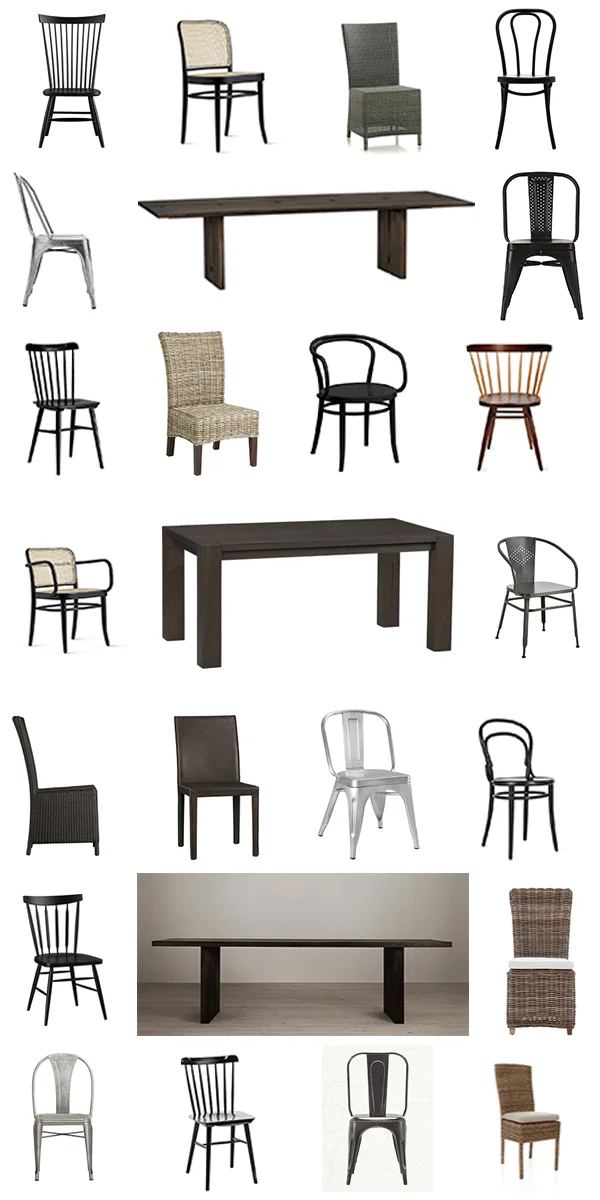
you all remember the childhood game of musical chairs, right??  somebody's mom is manning the record player (yeah, i'm that old ok) while kids walk around a decreasing number of chairs, mom lifts the needle, music stops, and you have to sit on a chair or you're out.  we're kind of playing that over at client vivid's house!  only, it's not the bee gees playing, it's kid bop, and it's really only myself and mr and mrs vivid that are doing the sitting.  see we are trying to pick the perfect dining room chair.  so far, there's been no violence for the last chair, but there has been a lot of joking about the body type requirements to come to a dinner party at the vivid's.  all our top chairs seem to be sized for vogue models and that's just not working so well.  how many chairs could you have possibly looked at you might ask?  take a gander below at some of the top contenders! there would be more except some of the websites wouldn't let me copy the image... can i get workman's comp for carpel tunnel butt??

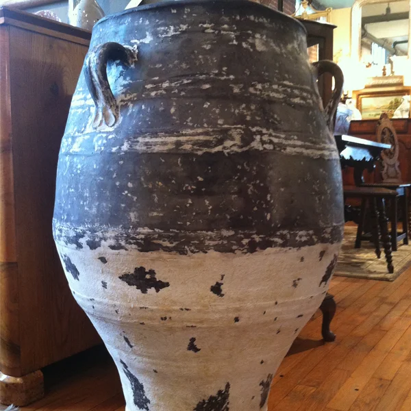
the good news is we have a table!!  the big sur (i really like saying that ;) in the charcoal finish from crate and barrel!  and we have a light, also from c+b, the clive chandelier. and we have what every stylish dining room is just screaming for.  a beautiful, large, aged, planter!!  

this is where unruly guests will be placed when they become too...unruly.  or if they don't fit in the chairs.

beijos,

beth
all hail modern atlanta...

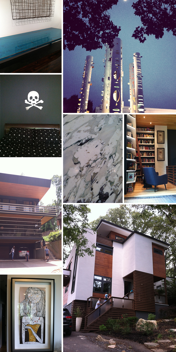
so i'm about 2 months late on this post, but you know, i've been do'in stuff.  like starting a brand new life and all.  anyway!  back in june "design is human" week 2014 happened and you should know about it, if you don't already.  it is the brainchild of bernard mccoy and elayne deleo and is the fusion of all things contemporary | modern architecture | design | product | philosophy | media | education | artistic promotion | outside the box thinking appreciation.  there are lectures, films, product promotions, an opening night party, studio tours, and the ever popular home tour!  here are some photos (actually, quite a few, take a seat and pour a drink).  this year, i seemed to be more impressed with the art on the walls over the architecture itself, but still thrilled that we have something like this in good ole southern atlanta!!

soon, i will be photoshop savvy enough to get numbers on the pictures, but not just yet, so just try to follow along...

the opening night party at adac (atlanta decorative arts center) was fantastic!  here there were various vendors of modern design phenomenalness and alcohol and good looking uber cool people.  lots of schmoozing with architects and industry people, great night!

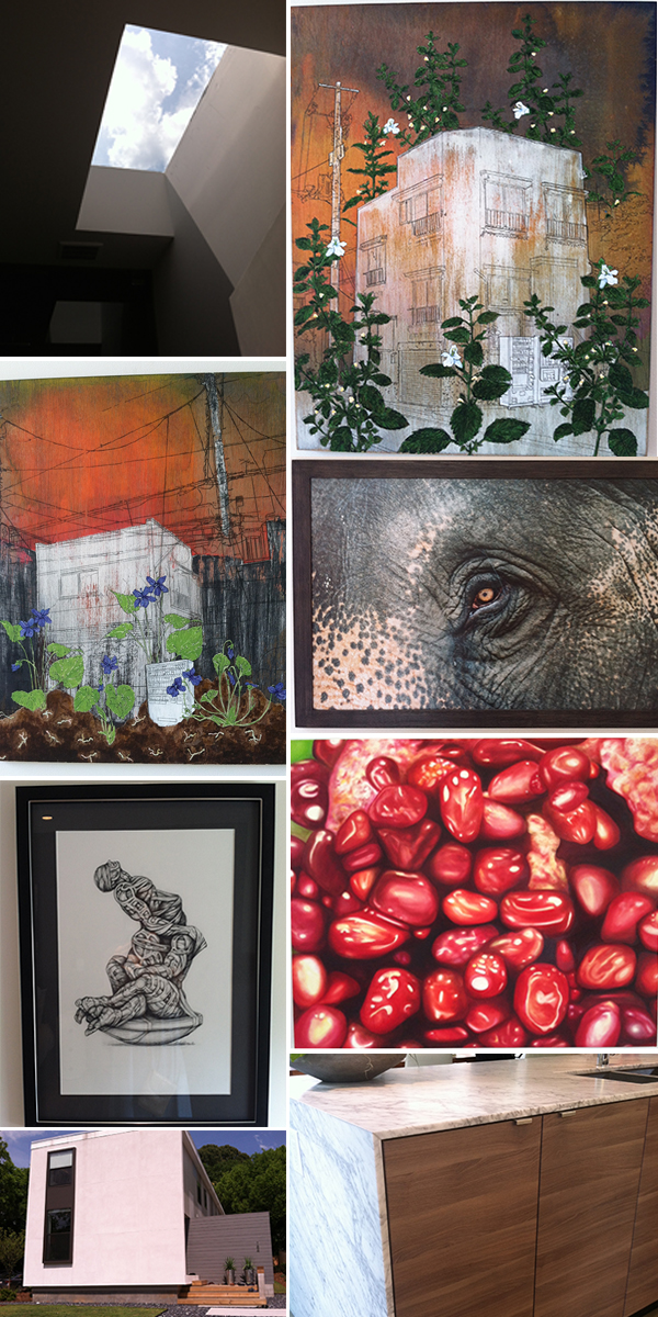
on to the pictures.  that table top is insane!  it was made by jpmcchesney and the color is simply divine.  the next shot is of the windowed columns outside adac.  moving on we have pics from the home tour (i only had a few hours of baby sitting so I was racing around town like a madwoman and only made it to about half the houses on the tour :(  ). toxic kid room, the bed linens have the same skull and cross bones motif - ridiculous!  the kitchen counter material, gorgeous.  the library, accessible across an industrial grate "overpass", if you will.  so, not only was i wearing a dress and flashing my undies to everyone below the grate, but it was reeeealy uncomfortable on the feet to walk on this thing.  nice concept, but just not very comfortable.  the street shot of the "witter" house. street shot of the "sanders" house.  at this point i've surmised this year is all about the art, i'm not so dazzled by the architecture.  although the exterior of the sanders house was nice, the inside was very expected.  favorite art piece.

MA#2.jpg

moving on, we have a large collection of little alien forms at the custer house, which was built, like 12 years ago and still manages to be oh so au currant!!  kudos to my friends at tac studios for making modern classic :).  there's a totally rad cocktail table and a light fixture that looks like side show bob in his golden years.  next there were 3 houses side by side by the same architect on pearl street.  the roof top garden on one was exciting as was the beautiful concrete wood transition between different levels in the house.  the chess set was fun and tour goers were encouraged to play their best move!  more crazy awesome art.

still on pearl street.  who doesn't love a nice skylight??  except when they're leaking of course.  otherwise a glorious way to spend time in the loo.  more stunning art!  i believe most of the pieces in the pearl street homes came from the gallery saltworks.  beautiful kitchen island and house facade.

saving the best for last!  my favorite of the homes i made it to (again, sadly, only about half the homes on the tour).  this one is the work live space of modern architect, bill carpenter, of lightroom.  it's my favorite because i'm jealous, envious, i'm coveting his space.  i don't have many pictures because it's kinda awkward to be oohing and aahing and snapping photos while the owner is right there.  and i had my kids with me that day and was terrified they might break something or burn the place down...  the first shot is the top level roof deck, high above the hustle and bustle of decatur proper, so peaceful. love!  the under stairs that i just thought looked neat, very raw and industrial, functional, works well with the very deliberate furniture and art choices thoughout the living space. see the transition on the floor from the living space to the wet | work space??  see it??!! the same thing happens going into the bathrooms!!  crazy in love with the distinction between the spaces!!  (from the practical standpoint, i'm assuming there's a hardier finish on the hardwoods that might get wet (the ones in the kitchen and bathrooms), and therefore stay more protected...).  to top it off, there's a vintage ford parked in the driveway.  get outta here, i'm moving in!!

beijos,

beth

i'm not a designer, but i play one on tv...

ok, well, i actually am a designer, but lately i've been pinching myself over the whole reality of it all and how fantastic things are going so far.  do you remember the show beverly hills 90210?  silly me, of course you do!!  it was like, omg, the total dream of every teenage girl at the time to live that life, like totally.  (ok, maybe that's a tad too valley for beverly hills, but stay with me).  no worries, tori spelling is not guest blogging! she's got enough on her plate.  poor thing.  

anyways, a bit ago i mentioned i was about to begin a dream project that i was pinching myself over!!!  yes, yes??  do you remember??!!!  ok, well, it's not in beverly hills, it in...

this adorable pillow can be found at twig in serenbe, check out their wares on instagram!

this adorable pillow can be found at twig in serenbe, check out their wares on instagram!

and, i may as well have my own show, because this is big, and wonderful, and fabulous, and my clients couldn't be nicer and cooler!!  the american people should be watching to see if i muck it all up!!  just kidding, there'll be no mucking. although, that is a recurrent nightmare of mine, but again, got that therapist on speed dial...

i am so incredibly blessed to be a part of this project, dubbed project zen glam!  last week i met mrs. zen glam at the property and reality finally sunk in.  there is no dress rehearsal, no editing later in the studio, this is the real deal, a full house to design and it. will. be. awesome.

i'll talk more about serenbe later, in case you've not been.  you should go.  it deserves it's own prime time show!

so, what makes mrs zen glam even more fabulous is how much i adore how she thinks. she pinned this pic on pinterest and given the magnificent reality show/drama/comedy we're about to embark on together i think it just perfectly embodies this project.

in keeping with the tv theme going on here... do you remember the commercial for some line of plumbing fixtures, where the couple is meeting with their architect and the wife pulls out a faucet from her purse and states, very dryly, "design a house around this". or something like that?  well, during our meeting, mrs. zen glam pulls out of her purse an itsy, bitsy, raspberry-colored crepe myrtle flower petal and says "and I want this color in there".  i actually appreciate this, but my mind immediately went to that commercial and i wondered for a second if, by chance, i was actually filming a commercial or if this was indeed reality?  it was too early in the day for wine, so, indeed, it must be reality!

so here's the fantabulous property site, where the house will be built!!  check out the lake in the back!!  it is truly lovely and i'll be moving into the pantry.  she's ok with this.  :)

serenbe-lot.jpg

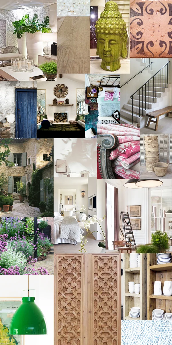
the general aesthetic of the house is to be french moroccan with a lot of zen and a bit of bling.  there will be 10' ceilings, glorious concrete, beautiful views, french oak floors, gorgeous color, driftwood stuff, a phenomenal lucite coffee table (that i already purchased and it's ridiculously cool!!)... OMG, i can't wait to show the after pictures!!!! to tide you over, here's a melange of some inspiration shots, which may look more like design chaos, but trust me, it will all come together!!

serenbe-inspiration.jpg

beijos,

beth

hey kids, it's back to school time!!

in honor of my kids' return to school tomorrow, i'd like to share something i'm quite proud of.  my son's room.  at the beginning of summer i vowed i would have his room completed by the time school started.  meaning not just looking good, but functional as well.  not too hard unless your child has literally 10,000 $%*@%$# legos.  :)  

most of the design has been done for a while, but i was having a hard time devising a way of storing all his $%*@%$# legos (oops, did i say that again?).  i knew i was planning a photo shoot and really wanted his room to be special and a little different (as if the colors aren't a drastic change from my usual palette).  

i was actually stressing over this, then one day, had what i'll refer to as a moment of sheer genius... the vintage machine tool storage unit in the garage!!!!  i've failed miserably at organizing all my small tools, screws, tooly bits of things and the like in this unit like martha stewart might do, so why not haul that rusting, spider condo, metal piece onto my son's room?!  

perfecto!  he was ecstatic, i cleared some space in the garage, and i think it not only looks really cool in a boy's room, but it's monumentally functional.  he labeled all the drawers himself for all his various colors and types of legos, plus other stuff.  genius i say. just don't open the closet, we weren't photo shooting that side of the room ;)

pasadena-dylan-1.jpg
pasadena-dylan-2.jpg
pasadena-dylan-3.jpg

again, special thanks to my photographer, jeff herr, for these awesome photos!

beijos,

beth

get your before and after right here!

don't you just love a good before and after series?  i sure do!  i love this one especially since it's my own master bath.  looking at the before shots brought back more than a few nightmares, but don't worry, i have a crisis hotline on speed dial so all is good;)

anyway, take a gander at the before shots.  i'll spare you large photos and just give you essence of horribly ugly, dear lord why would anyone do this to a bathroom...

oh, where to start?  you can't see the floral border atop the hunter green striped wallpaper (so sorry).  the tiles were set by someone who apparently had never set tile before and may have been blind so nothing lined up.  the icky shower door slammed into the towel bar frequently.  friends were fighting over who would get the brass rope light fixture (no, not really).  wobbly pedestal sink with no room for anything, leaky toilet...where's that hotline number??!!!

or... could just cast my eyes on the new and improved bath that exists today :)

pasadena-masterbath-side.jpg

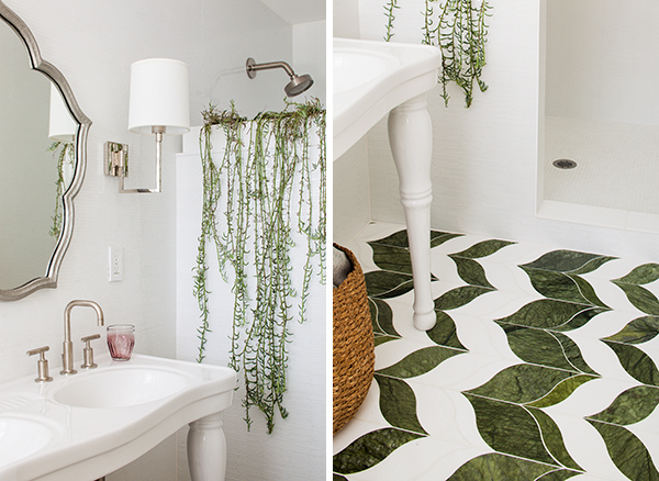
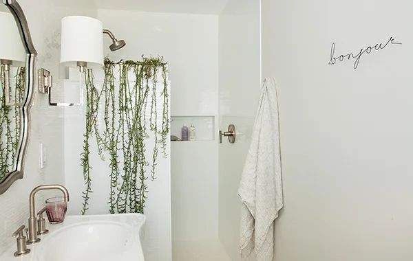
ahhhhh.  much better if i do say so myself.  white glass wall tile, drop dead gorgeous marble floor tile, double pedestal sink, (here's to wishing i will someday actually need a double :) pretty sconces, foliage with little leaves that match the shape of that gorgeous floor tile, (yes, i planned that, cause that's how i roll) and a whole lot of clean, crisp, peaceful loveliness!  double ahhhhh.

beijos,

beth

a bathroom for my dad...

last fall my dad came to live with me for 2 months while he underwent his cancer treatment at emory.  preparing for this major life hurdle for most might have involved quiet reflection, stocking up on some extra towels or pillows, actually buying the tv i promised him (i don't have a tv in my house), etc.  

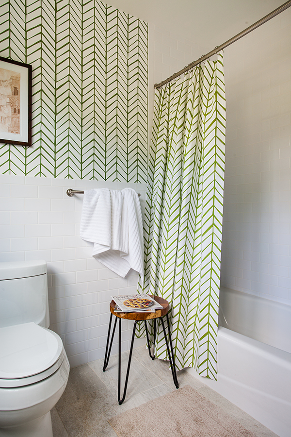
but, no, not this crazy child.  i thought it best to plunge into a full throttle renovation of my downstairs bath because that's what an insane person would do.  my dad loves to spend time outdoors and with his garden and flowers.  so i went with a fresh, lively look that might lift his spirits and feel like a garden of sorts.  i never got the shutters on the windows, so it was truly kind of like being outside.  he has previously had an outdoor shower so he's used to the concept of public nakedness.  :)

things were not completely done by the time he finished treatment (of course they weren't you crazy person, because you started a month before his treatment began and then couldn't have anything happening while he was here feeling shitty!).  but......here are the professional shots of the completed space, which i simply adore.  sometimes i just stand in there and gawk in awe of the beautiful cabinet designed by moi and built by my fabulous cabinet artisans extra-ordinaire, bob and kyle.  o.m.g.

my dad likes it too.

pasadena-guestbath-front.jpg
pasadena-guest-bath-side.jpg
pasadena-guest-bath-back.jpg

a very special thanks to my wonderful photographer, jeff herr.

beijos,

beth

my week in texture

this past week felt a little time-poor, but texture-rich.  


over the weekend i had a nice lunch meeting with my favorite contractor.  the table tops at varuni napoli looked so similar to a table i'd seen at modern atlanta week it gave me an excuse to chat up the super fine owner, who's accent i could barely understand (really matters not when you look that good), but who did confirm the tables were by jp mcchesney.  i skipped a world cup party to keep working and had everything nice and tidy for the meeting, only to change my mind on a few things at the last minute and fling myself back into the time crunch!  the meeting went wonderfully and the next day we found a gorgeous grey extra large and in charge planter for somewhere in the house!! the patina is perfect!  the next day we found the living room rug (at a lower cost than the rug i'd originally proposed - score!), which is not only beautiful to look at but feels lovely on the tootsies.  i also came across a ridiculous driftwood wall art piece for client zen glam that is really amazing (and it's also sinking in that i'm really working on this project!!!!!!!!)...breath...then threw the kids in the car to head to grampa's house on the lake.  more time-poorness thanks to dsl, but the texture here was extra special as my kids had a blast doing cannon balls off the dock and even found a deserted bird's nest! doesn't get much better than that!

blog---texture-b+w.jpg

can you match the image to the texture?? 

beijos,

beth

and the winner is...

since i've just recently started my blog, i figured i might try the lure of a free room design to bulk up my subscription list.  not too shabby of a thought since you all came on board and i sincerely appreciate it.  i hope you're enjoying yourselves so far, cause i sure am! last night was the totally random drawing for the free room design out of a pretty glass container by yours truly with thousands of pretty pink balloons released for added drama!!!  i know...i can't stand it either, get on with it already!!!

names-in-glass-with-balloons.jpg

and the winner is...


congratulations jenny!!!!  you have won yourself a free room design by moi and i couldn't be happier for ya!  thanks to all for your love and support and if you did not win today, for pete's sake dry your tears, pick yourself up, and just revel in the thought that at least you made my day when you subscribed :).  that's gotta be worth something, right?

beijos,

beth

welcome back from vacation!

hello there!  even though i was basking in the sun and frolicking in the surf with my kids last week, this week is off to a pretty stellar start!  while on vacation, i was managing some delicate construction issues for client professor smarty pants long distance, so that was tricky and slightly stressful.  but!!!  when i visited the site on monday, work on the 2 story library in a super cool loft, my expectations were exceeded (which is reeeeealy hard to do)!  here is chris, construction god, who i may need to marry, in the lower level of the library, note the custom bookcases with 2" trim behind him (size does matter people ;).  you can also get a glimpse of the fantastic urbanscape from the upper level of the library, where client professor smarty pants will sip his perfect drink and become... smarter.

Bowman-loft-library.jpg

on the way back from the beach i received a message i had to read about 4 times before believing it!!  i'm meeting this week with a new client that needs help with her entire house.  yep, that's right the entire house, new construction.  if there ever was a dream project this is probably it.  she is wonderful and we seem to be in total sync style-wise. o.m.g.  more on this later, please send some positive energy our way as this is a tremendous opportunity and i am waaaaay beyond excited!!!!!!!!!!!!!

moving on through the week thus far.  i had day 2 of photo shooting at my casa with my super photographer, jeff herr.  the next sets of shots are definitely not professional, they are i phone especial, including one action shot of jeff laying down on the job!

buddha-and-clouds.jpg
pasadena-photo-shoot.jpg

cheers to all the new subscribers joining me on this fantastic journey.  thank you so much for being here!

beijos

beth

asheville arts and crafts

i recently took a quick jaunt to asheville nc with my daughter.  even though i'm from north carolina, i've never been to asheville.  i had to check it out because, quite frankly, i'm getting pretty tired of listening to sooo many friends rave about how fantabulous it is.  the food is delectable, the art galleries are numerous, the scenery gorgeous.  ok, yeah, all that, but what i was drawn to was... the graffiti!!  

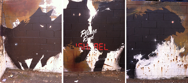
below are some of my favs from west asheville and the river arts district.  one of the tags is dated 2010.  in my mind that is now called "public art", not graffiti, if it's been up there for 4 years!  graffiti artists vandalize property, they move stealthily through the night diving behind dumpsters when the cop car headlights get too close.  graffiti is illegal, it's reactionary, it challenges authority, it's pissing on your territory, it gets painted over again and again by angry proprietors.  right?!  not anymore i'd say.  well maybe it's still technically illegal, but a lot of the "graffiti" i've seen in the past many years is truly art.  no one is painting over this stuff and most of it seems to just up the ante on the coolness factor of a neighborhood.

what i find most enjoyable about graffiti (or used to, before it all became "public art") was the transience of it.  coming across something incredible was to really live in the moment, because the next time you took the train or rode your bike down that street, past that one building, what you saw before would be gone.  painted over in some bad color match by some pissed off proprietor.  but you could conjure up what was there the last time, maybe you could still make out a faint remnant of the past under the new coat of paint.  or maybe not.  but you revel in knowing you saw something great and maybe if you're lucky, you'll see something equally fantastic around the next corner!

light and bright

light and bright is exactly how i'm feeling right now!  i had a very productive meeting with a new client AND a lunch meeting with a tremendously talented modern architect today (all in one day - craziness!)!  oh, and then there's this...

i am so deeply honored to be one of this year's atlanta homes and lifestyles bath of the year contest winners i just really can't find any suitable words!!!   i happened to be on the phone with my beyond fabulous cabinet maker (who built the cabinetry in the winning bath) when i opened the magazine for the first time.  he got an ear-full of joyful blubbering.

the two other winning firms are well-known talents and i have respected their work for some time.  one of the other designers, georgia rappole, was in one of my classes at SCAD!  go SCAD!!  i submitted an entry this year with the intention of just maybe getting an honorable mention (like back in 2009 - see here).  i made a pact with myself that even if i got just a little blurb of validation then i was going for it (the whole pursuing interior design full time thing, you know :).  and how bout them apples, i'm an actual winner!!!  check it out...

AH&L 2014 articlepg2.jpg
july 2014 issue!!beijos,beth

july 2014 issue!!

beijos,

beth